Start#
|
Introduction#
Welcome to the documentation for UMO Folio for Tumblr.
UMO Folio is a single-page, responsive, portfolio theme for Tumblr, created with illustrators, designers and photographers in mind.
UMO Folio is not your typical Tumblr theme and you should be aware of some of its particularities:
- UMO Folio portfolio section offers support for Photo, Audio and Video posts only. Quote posts will be shown as testimonials. UMO Folio does not support Text, Link, Chat and Answer posts, but does support static user-created Pages.
- UMO Folio portfolio section will display all of your projects at once, no pagination links will be shown. UMO will show the first page of posts and load the rest in subsequent Ajax calls. This is so the portfolio filter works as transparently as possible, and no posts are accidentally hidden from view. This means that UMO Folio is probably best suited for a portfolio comprising perhaps no more than 15-25 items, unless you’re totally cool with a very tall portfolio section!
- User created Pages will be linked to on a dropdown menu on the main navigation if enabled, and will open on a new tab/window.
- On desktops, UMO Folio is mostly a single-page affair, barring static pages. On mobile (tablets and phones), project details will be opened on a new tab by default, as the combination of the Ajax project expander and scrolling via touch can prove to be less than an ideal user experience. You have the option to turn the Ajax expander on for mobile, however.
- UMO Folio lets you add a link on the main menu pointing to a second Tumblr blog that can function as your Blog or journal. We think UMO Folio's layout doesn’t lend itself too well to blogging, so you should use a secondary blog as your journal.
- UMO Folio doesn’t make extensive use of post tags. Tags are used to filter projects on the Portfolio section, but they are not displayed on the posts themselves. Keep this in mind if tagging posts is really important to you.
Features#
UMO Folio includes the following sections, which be switched on and off:
- Homepage: greet your visitors with a custom logo—or avatar—and message. Full page background image cycler with up to five images.
- About: introduce yourself or your company and let visitors know what you do best. “Skills” widget can be turned on and off.
- Services: be boisterous about your skill-set and expertize! Display up to six services boxes with their own image or icon, title, description and external link. An optional “swiper” lets you group your services into an horizontally scrollable widget.
- Portfolio: filterable portfolio grid chock-full of options! Filter your projects using smooth transitions and show their details in-page with the Ajax-powered project expander. Choose between landscape, portrait and square thumbnails, with rounded, circle or square shapes, flat or with shadows.
- Team: Display up to six team members, with custom avatars, name and job position, description and the social links of your choice. An optional “swiper” lets you group your team members into an horizontally scrollable widget.
- Testimonials: populate your testimonials section by simply creating “quote” posts on your dashboard. Testimonials will be swipeable both on desktop and mobile thanks to the awesome Swiper jQuery plugin.
- Clients: a simple widget that lets you display up to six client logos.
- Contact: show your contact information and let people get in touch with ease using Tumblr’s own “Ask me anything” box.
- Footer: display icons for all of your social profiles, an integrated Twitter feed, and Dribbble, Instagram and Flickr photostreams.
UMO Folio comes with tons of options to let you customize colors, background images and typography.
UMO Folio supports notes and Disqus comments on project details, either when viewed on the Ajax expander or permalink page.
UMO Folio support most modern browsers, including Internet Explorer 9.
Installation#
Login to your Tumblr account, and once on your dashboard, click on the Account icon on the top-right corner of the page.
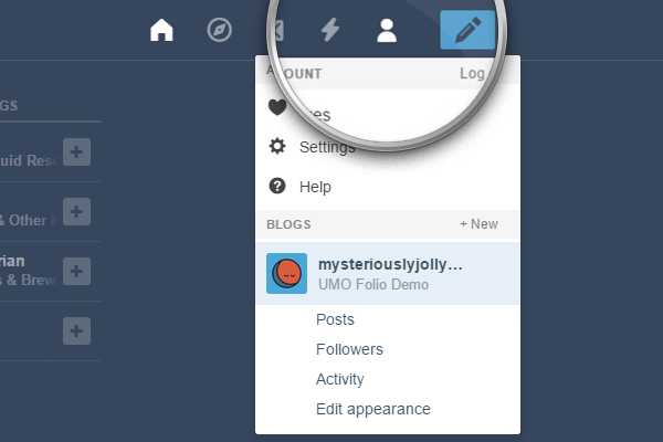
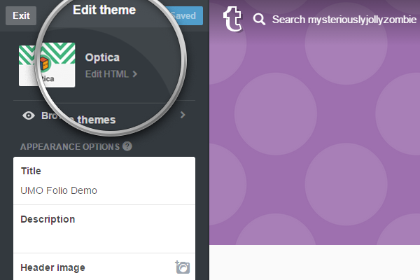
From the drop-down list, select the blog where you want to install the theme, and then click on Edit appearance.
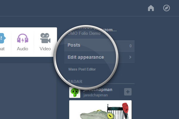
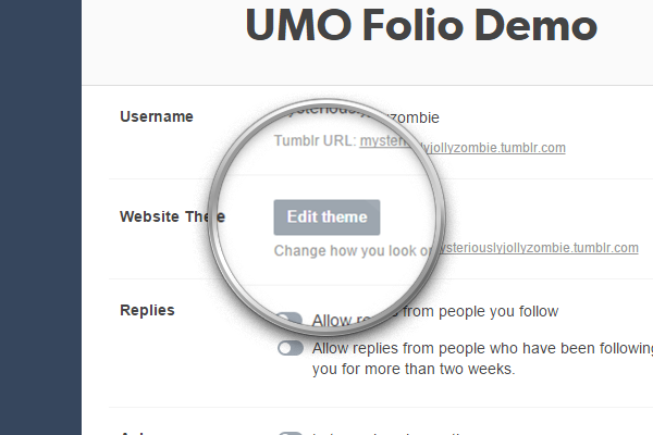
Once on the Settings page, click on the Edit theme button.
Click on the Edit HTML link, right below the current theme name.
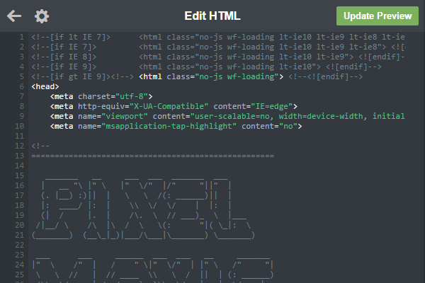
Open the .zip archive you downloaded and locate the file pixelmoxie-umo-folio-1.2.3.html or pixelmoxie-umo-folio-1.2.3.txt inside the theme folder. Open the file with a text editor of your choice.
If you’re on Windows, Notepad++ is a free and lightweight text editor. If you’re on a Mac and you’re using TextEdit, follow the steps outlined on this article to set up TextEdit to work with HTML files. Or you could download TextWrangler—a no-frills text editor for the Mac—and give it a try.
Copy the contents from the file you just opened and paste it on the HTML editor, replacing the old theme code on its entirety. It’s important that the code looks pretty much as in the image below, or the theme won't install properly; if it doesn’t, your text editor probably parsed the code and what you pasted isn't the raw HTML markup. Make sure your text editor is properly configured to work with HTML files and that the code isn't altered.
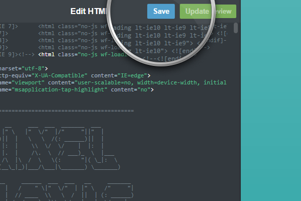
Click on the Update Preview button, and once the preview is updated, click on the Save button and reload the page.
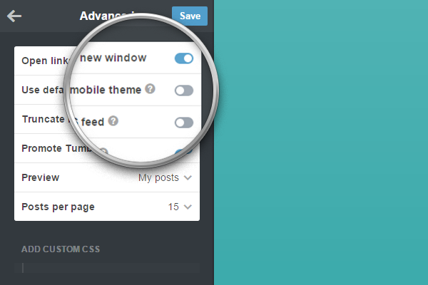
Before you start customizing your theme and populating your portfolio, click on Advanced options at the bottom of the customizer.
Make sure Use default mobile theme is off, or the theme will not be used when viewing your blog on mobile devices. You should also set the Posts per page to fifteen, the maximum possible value, so that your portfolio projects load as quickly and seamlessly as possible.
Customization#
Before diving into all the customizations options, a few words of advice: UMO Folio has lots of them, and it’s easy to get lost. Unfortunately, Tumblr doesn’t allow us to group our options into more logical layouts, but here’s a tip that has saved us tons of time when customizing a theme and looking for that particular option: use your browser Find function. We’re fond of Google Chrome, and it’s just a matter of pressing Ctrl+F (Windows, Linux, and Chrome OS) or ⌘-F (Mac) to quickly open the find bar.
Common Options#
Each section of UMO Folio has its own ins and outs, but most of the main blocks have many options that are common to them all, except perhaps the site footer.
Enable Or Disable Sections#
To enable or disable the different sections from showing, you can toggle the switches labeled:
Enable Section Home
Enable Section About
Enable Section Services
Enable Section Portfolio
Enable Section Team
Enable Section Testimonials
Enable Section Clients
Enable Section Contact
Enable Custom Section Positions#
Since version 1.0.3, you can alter the default order of each of the theme sections. To do this you need to enable the option Enable Sections Custom Positions. The custom order for each section is set by the options:
About Section Order
Clients Section Order
Contact Section Order
Portfolio Section Order
Services Section Order
Team Section Order
Testimonials Section Order
These options are empty by default. To move a section up or down on the stack, enter a positive or negative integer, for example: -10, -5, 0, 5, 10. The lower the value, the higher the section will be placed, and viceversa.
Background Options#
It’s important to understand the different elements that make up the background for each section. Think of them as onion layers: the first one is the background image, if you choose to use one; the second is a gradient that goes from a very dark grey to transparent and that “masks” the background image so that the section title is more easily read; the third one is an “overlay” or “tint” layer, which color is the same as the section background color and has a certain opacity, only letting through part of the background, so that the contents on top are legible.
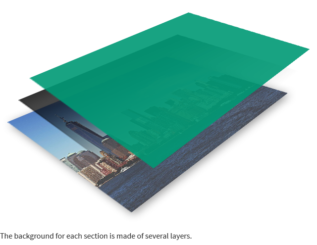
For each section, you can specify: the background color, the background image, its position, size and attachment attribute, the gradient opacity, and the tint opacity.
Background Colors#
You can define the background color for each section. This color will also be used for the “overlay” layer that sits on top of the section’s background image.
To do so, use the following color pickers:
Section About Bg
Section Clients Bg
Section Contact Bg
Section Portfolio Bg
Section Services Bg
Section Team Bg
Section Testimonials Bg
An exception is the site footer, which background color will be the one set as Footer Bg.
Background Images#
For each individual section, you can upload an image to use as a background:
About Bg
Clients Bg
Contact Bg
Portfolio Bg
Services Bg
Team Bg
Testimonials Bg
Background Image Size#
For each section, you can set the size of the background image:
About Bg Size
Clients Bg Size
Contact Bg Size
Portfolio Bg Size
Services Bg Size
Team Bg Size
Testimonials Bg Size- Cover
- The image will be scaled keeping its original proportions so the entire section background is covered by it. You can upload images as large as you want, but images that are 1920x1080 pixels are probably optimal for most screen sizes. You can save your images with lower quality settings to—they will be mostly obscured by the “tint” layer, so the artifacts will be unnoticeable.
- Auto
- The background image is shown at its original size. This option is best used if you want to tile your image as opposed to scale it to fit.
Background Image Position#
The values are either Center, Top, or Bottom and are self explanatory.
The corresponding fields for each section are:
About Bg Position
Clients Bg Position
Contact Bg Position
Portfolio Bg Position
Services Bg Position
Team Bg Position
Testimonials Bg Position
Background Image Repeat#
The fields for each section are:
About Bg Repeat
Clients Bg Repeat
Contact Bg Repeat
Portfolio Bg Repeat
Services Bg Repeat
Team Bg Repeat
Testimonials Bg Repeat- No Repeat
- Best used if you're scaling the image to fit or if the image blends seamlessly into the background color.
- Repeat
- This will make the image tile. Best used when the size is set to Auto.
Background Image Attachment#
Possible values are Scroll and Fixed. This will control whether the background image for each section scrolls with the page, or remains fixed.
The fields for each section are:
About Bg Attachment
Clients Bg Attachment
Contact Bg Attachment
Portfolio Bg Attachment
Services Bg Attachment
Team Bg Attachment
Testimonials Bg Attachment
Gradients Opacity#
As mentioned before, the second onion layer that contributes to the background appearance is a gradient that goes from dark grey to transparent, top to bottom. The more opaque this gradient is, the less of the image will show through at the top, where the section title sits.
You can individually set the opacity for each section gradient, it should be a value between 0 and 1, and you can really fine-tune it, entering a value of 0.96, for example.
For most sections, the opacity is set to 1 by default, except on the homepage section, where we want the background images to show through unaffected, and on the contact section.
The relevant fields are:
Homepage Gradient Opacity
About Gradient Opacity
Services Gradient Opacity
Portfolio Gradient Opacity
Team Gradient Opacity
Testimonials Gradient Opacity
Clients Gradient Opacity
Contact Gradient Opacity
Overlays Opacity#
The third onion layer is an overlay that “tints” the entre background: the background image and the gradient sitting underneath. The overlay will have the same color you set for each section background, and by setting its opacity, you can control how much of the background shows through. You must enter a value between 0 and 1, and can go as grainy as something like 0.96, for example, to let the background image show through so very slightly.
The relevant fields are:
Homepage Overlay Opacity
About Overlay Opacity
Services Overlay Opacity
Portfolio Overlay Opacity
Team Overlay Opacity
Testimonials Overlay Opacity
Clients Overlay Opacity
Contact Overlay Opacity
Shadows Between Sections#
If the option Show Shadows Between Sections is enabled, a subtle box-shadow will be used as a separator between sections.
Disabling Background Gradients and Tints#
Since version 1.0.2, UMO includes options to disable the backgrounds gradients and tints. If you’re using large image backgrounds, and gradients and tints are enabled, scrolling can become choppy or less smooth sometimes, especially on less powerful devices. Enable Disable Background Gradients and Disable Background Tints to remove the gradients and tints for all section backgrounds, respectively. Keep in mind that you’ll need to edit your background images accordingly, to provide contrast between the background and the overlaying content and ensure readability.
Text Options#
Text And Links Colors#
The background for each section can be bright or dark, depending on the background color and image that you choose, so you need to be able to set the color of the text for each section to achieve good contrast and legibility.
The following options will determine how text and links will appear on sections set to have dark or light text:
| Variable name | Description | Default value |
|---|---|---|
| Dark Text | Text color for sections which Text Color is set to dark | #494f50 |
| Light Text | Text color for sections which Text Color is set to light | #e6e6e6 |
| Dark Links | Link color for sections which Text Color is set to dark | #f55e47 |
| Dark Links Hover | Link color for sections which Text Color is set to dark, on mouseover | #f88877 |
| Light Links | Link color for sections which Text Color is set to light | #00f6ff |
| Light Links Hover | Link color for sections which Text Color is set to light, on mouseover | #66faff |
Then, for each section, you can display dark text on a light background, or light text on a dark background, by setting the following options to either Dark or Light:
About Text Color
Clients Text Color
Contact Text Color
Portfolio Text Color
Services Text Color
Team Text Color
Testimonials Text Color
Sections Headings#
Using the following fields, you can type the title you want to appear at the very top of each section:
| Variable name | Default value |
|---|---|
| About Section Title | About Us |
| Services Section Title | Skills <em>&</em> Services |
| Portfolio Section Title | Selected Works |
| Team Section Title | Meet the Team |
| Testimonials Section Title | What They Are Saying |
| Clients Section Title | Our Clients |
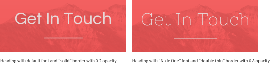
| Contact Section Title | Get In Touch |
Depending on viewport size, the font size for these headings will be something between 42px and 60px. The font family shown on headings by default is Questrial (not a Google font), but you can override it if you specify a Google Font family and weight using the following fields:
Headings Font Family
Headings Font Weight
You can also change the style of the border underneath the headings, and control its opacity:
| Heading Border Style | Solid, Double, Thin, Thin Double, Skinny Thick |
| Heading Border Opacity | Defaults to 0.2 |
By default, section headings are center-aligned, but you can align them to the left by switching off the option Center Section Headings.
Arrows And Buttons#
Arrows and buttons are used sparingly through different sections of the site. For example: the arrows on the Homepage and Testimonials sections and the buttons on the Services blocks (if you enter the options to show a link to an external page or resource.)
Arrows and Buttons can be displayed on three different styles: Solid, Hollow, and Translucent. And buttons can be Square, Rounded or Extra Rounded. Additionally, you use a very subtle dotted or striped pattern to overlay over the button background.
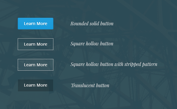
To set their appearance, look for the options:
Buttons Style
Arrows Style
Buttons Cornes
Buttons Pattern
Arrows Pattern
You can also set the background and text colors buttons will have on sections set to have dark or light text.
Solid Buttons
| Variable name | Description | Default value |
|---|---|---|
| Dark Btn Bg | Background color for buttons on sections set to dark | #3b3f44 |
| Dark Btn Bg Hover | Background color for buttons on sections set to dark, on hover | #474c52 |
| Dark Btn Text | Text color for buttons on sections set to dark | #adadad |
| Dark Btn Text Hover | Text color for buttons on sections set to dark, on hover | #c7c7c7 |
| Light Btn Bg | Background color for buttons on sections set to light | #35ade9 |
| Light Btn Bg Hover | Background color for buttons on sections set to light, on hover | #189bdc |
| Light Btn Text | Text color for buttons on sections set to light | #e6e6e6 |
| Light Btn Text Hover | Text color for buttons on sections set to light, on hover | #ffffff |
Hollow Buttons
| Variable name | Description | Default value |
|---|---|---|
| Dark Hollow Btn | Text and border color for buttons on sections set to dark | #444444 |
| Dark Hollow Btn Hover | Text and border color for buttons on sections set to dark, on hover | #222222 |
| Light Hollow Btn | Text and border color for buttons on sections set to light | #e6e6e6 |
| Light Hollow Btn Hover | Text and border color for buttons on sections set to light, on hover | #ffffff |
Translucent Buttons
| Variable name | Description | Default value |
|---|---|---|
| Dark Translucent Btn | Background color for buttons on sections set to dark | #444444 |
| Dark Translucent Btn Hover | Background color for buttons on sections set to dark, on hover | #222222 |
| Light Translucent Btn | Background color for buttons on sections set to light | #e6e6e6 |
| Light Translucent Btn Hover | Background color for buttons on sections set to light, on hover | #ffffff |
You can set the Google font family to be used on buttons, as well as the font size and weight:
| Variable name | Default value |
|---|---|
| Buttons Font Family | Open Sans |
| Buttons Font Weight | 600 |
| Buttons Font Size | 16 |
Please refer to the Google Fonts section of this documentation to learn more about using Google Fonts.
The arrow icons—and other small icons though the site, like the close buttons—are inline SVG elements, which means that they will look sharp independently of screen resolution and screen pixel density. The icons can be very thin—the default setting—or slightly thicker, if you turn the Use Thicker Icons option on.
Even though the settings for arrows and buttons will affect only a handful of element on the site, you can still use buttons on static pages you created if you need a big chunky link pointing to an external resource, for example.
To do so, simply add a link when creating or editing a page, and then edit the HTML source to give it a class of button.
You can add additional classes to control the way the button look, like hollow, translucent, rounded, rounded-more, small, pattern-dots and pattern-stripes.
For example:
<a href="#" class="button rounded translucent pattern-stripes" target="_blank"></a>Home Section#
The Homepage or Home Section is the first one your visitor will see, so take advantage of that fact to make a great first impression.
You can show or hide the Home Section by toggling the Enable Section Home switch.
The Home section features a full page image background cycler than can have up to five background images. To upload your images use the options Slideshow Img [1-5]. Because images will be scaled to cover the entire viewport, we recommend you upload fairly large images. A resolution of 1920x1080px will be probably enough, but you can upload larger images if you want.
Keep in mind that the larger the images, the longer they will take to load. It’s a good idea to compress your images even further after exporting them from your graphic editor software using these online tools: Compress PNG and Compress JPG.
If you upload more than a single image, the will cycle automatically, and you can set the interval between each one in milliseconds (Slideshow Interval), which is 5000 by default. Remember this is should be set in milliseconds, so try not to enter something lower than 3500.
Because you probably want the images on the Home section background to be displayed in all their glory, the Home Gradient Opacity and Home Overlay Opacity values should be set to 0 or something fairly low, like 0.1.
The fields Home Logo and Home Logo Hires allow you to upload a logo, custom avatar, or any other image you want—to be displayed on the homepage—in their standard and high-resolution versions (for high density displays.) This image shouldn’t be much larger than 500px wide. The retina version should be twice the size of the standard one, and it’s entirely optional.

Use the option Welcome Message to type the message you want displayed underneath the image or logo here. You can use <br> tags to create line breaks, as in the default value:
welcome to umo:<br>a beautiful, single page portfolio<br>theme for tumblr.
You can set a custom Google font-family and weight for this message using the fields Welcome Font Family and Welcome Font Weight.
Use the Welcome Text Line Height option to control the separation between lines, so they either overlap or have a gap between them. The default value is 1.45, but that is optimized for the default font (Source Sans Pro). If you use a different one, you might need to adjust this value by eye.
If you toggle Use Italic On Homepage on, your choice of font for the welcome message will be overridden with the font family set by Italic Font Family, same thing for font-weight.
Finally, the text color for the Home section is set, as in all the other sections, by the option Home Text color, which can be either dark or light.
The Loading Splash Screen#
Even though it’s not directly tied to the home section, the loading splash screen is the first thing you’ll see while the site web fonts load. The splash screen and loading animation will cover the contents when the page loads, and as soon as the Google Fonts are loaded, the site will be revealed.
You can change the splash screen background color and the animation spinning circles color.
| Variable name | Description | Default value |
|---|---|---|
| Section Home Splash | Loading splash screen background color | #374149 |
| Section Home Anim | Spinning circles color | #d2d0c6 |
About Section#
Use the About section to tell people about who you are and what you do, or to display information about your company or business.
There are two main blocks to this section: the About Widget, and the Skills Widget.
About Widget#
The About Widget contents will be taken from your blog description, and the title is set using the About Widget Title option.
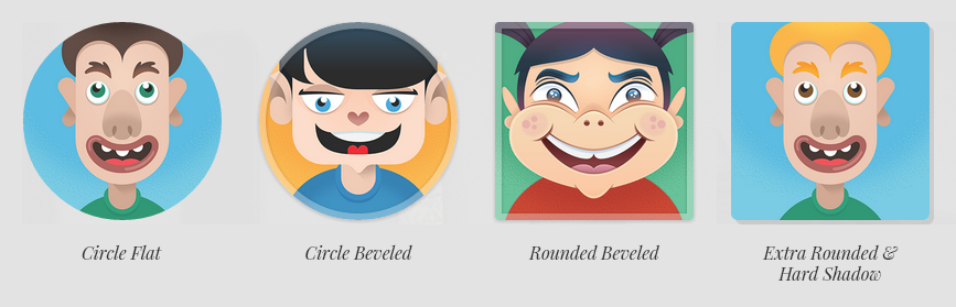
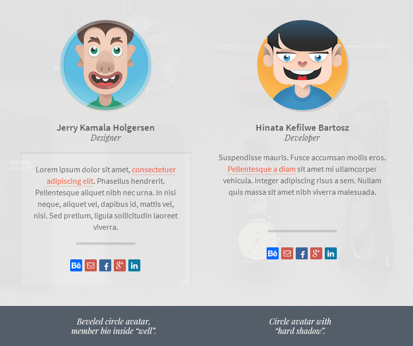
If you upload a Custom Avatar it will be shown here as well. The avatar style is set by the option Avatar Style, and the available styles are: Circle Flat, Circle Beveled, Square Flat, Square Beveled, Rounded and Extra Rounded.
If you enable Use Hard Shadow On Avatars, a choked but subtle drop shadow will be used. Keep in mind that these settings will also affect the avatars on the Team section.
If the Custom Avatar isn’t present, the default avatar shown on your blog’s Settings page will be shown instead. If you don’t want to display an avatar at all, enable the option Hide About Section Avatar.
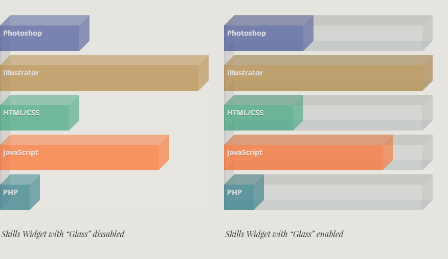
Skills Widget#
The Skills Widget can be toggled on and off (Enable Skills Widget), and its title is set by the Skills Widget Title option.
To display the skills graph, you need to paste the widget content into Skills Widget Contents. formatting the contents is actually not complicated. For each skill you want to display, you should enter the skill name, color (in hexadecimal format) and percentage, separated by spaces, and skills should be separated using commas.
You can use the example below—the default value—as a starting point. Compose the skills data using a simple text editor and then paste it on the required field.
If you need to enter multiple words for your skill name, you can do so separating the words with underscores, e.g., Graphic_Design.
Photoshop #4f5c9d 40%,
Illustrator #b88b47 100%,
HTML/CSS #42a780 35%,
JavaScript #ff702d 80%,
PHP #307e89 15%,
Graphic_Design #ff4940 35%
Keep in mind that the colors will be dimmed by the use of different transparency values. If Show Skills Glass is checked, a translucent jewel case will be shown wrapping each bar.
You can define the font family, weight, size and text color of the skills labels:
| Variable name | Default value |
|---|---|
| Skills Label | #f5f5f5 |
| Skills Font Family | Open Sans |
| Skills Font Size | 14 |
| Skills Font Weight | 400 |
The orientation of the bars can be horizontal or vertical (Skills Widget Horient), and when using vertical bars you can set the maximum height of the widget with the option Skills Bars Height, which is 300 by default.
About Section Text Widget#
If you don’t wish to display the Skills Widget, you can optionally place a Text Widget on that space. Toggle the visibility of the text widget using the Enable Text Widget 1 switch (the Skills Widget needs to be disabled).
Use Text Widget 1 Title and Text Widget 1 Content to set the widget title and content. You can use HTML tags on the widget contents, or you could enter JavaScript code or an <iframe> to display external resources, like ads, for example.
If both the Skills and Text widget are disabled, the About widget will occupy the entire width of the section. If the option Enable Widget Columns on, then the contents of the About widget will flow into two columns, in browsers that support CSS multi-column layouts.
Services Section#
The Services Section allows you to present up to six services or skills, or you could use these blocks creatively to display something else, like your personal workflow or design process, for example.
You can define how many columns will be use to display your services on different viewport sizes:
| Variable name | Available values | Default value |
|---|---|---|
| Services Cols Small Tablet | 1, 2 | 1 |
| Services Cols Tablets | 1, 2, 3 | 2 |
| Services Cols Desktop | 2, 3, 4 | 3 |
| Services Cols Large Screen | 2, 3, 4 | 4 |
You can also enable or disable the services swiper (Enable Services Swiper). When the swiper is on, your services blocks will be grouped inside a touch-enabled widget, and will be laid out in a single row, no matter how many of them you have. Then you can swipe through them horizontally. On phones and tablets—or any touch capable device—the swiper will react to touch events. On desktops, the swiper will react to mouse events (you can click and drag to slide), and optionally, to the mousewheel and the keyboard arrow keys.
If Enable Swiper Keyboard is on—it is by default—you can use the left and right arrows on your keyboards to make the service swiper scroll.
If Enable Swiper Mousewheel is on, the swiper will react to the mousewheel when it has focus. We recommend to use this option with care, as users may not like the widget interfering with normal scrolling behaviour.
Entering Services Info#
For each service block you can upload a custom image, or use a webfont icon, or both! If you upload an image and specify an icon as well, the image can be used as a background for the icon.
To upload your services images, use the fields Service Img [1-6].
Each service figure (the container for the image and/or icon) will have a background color as well. To set the background color for each service, use the Service [1-6] color pickers.
For the webfont icons, you can choose between the Font Awesome icon library or the Linecons set of outlined icons. The latter will be selected by default, to use Font Awesome instead, enable the option Use Font Awesome Icons.
Then, for each service, you can type the icon name using the fields Service Icon [1-6].
Click here for a list of all available Font Awesome icons, and here for the included Linecons glyphs.
Enter the services names using the fields Service Name [1-6].
Keep in mind that the service name needs to be non-empty for the service to display at all.
The descriptions for your services should go into Service Description [1-6], and if you want to display a button linking to an external page or resource, you can enter the button text and URL using the options Service Btn Text [1-6] and Service Btn URL [1-6].
More Options#
Some cool things to do with the services blocks:
You can set the style for the service figure container. It can be a Square, Circle, a Rounded or an Extra Rounded square (Services Style).
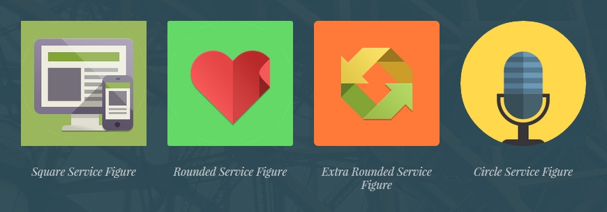
If you enable Disable Services Colors, the services figures will have a transparent background. This can be useful if the images you uploaded are irregular in shape (like the not-quite-a-perfect-circle ones used on the demo), and you don’t want the background color to sneak underneath.
The service image size can be set to either Cover or Auto (Services Img Size). Set it to Auto if, for example, your images are small icons that should not be resized and are displayed against a solid color background. Set it to Cover if you want the image to fill the entire figure background.

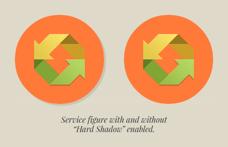
If you enable Use Hard Shadow On Services, a choked but subtle drop shadow will be set on each service figure.
If Center Services Contents is on, the figures, titles, descriptions, and buttons will be centered-aligned. Otherwise they will be left-aligned.
If Use Italics On Services is on, the services descriptions will be set on italic type.
The icons used on the demos come from the Flat Design Icon Sets by Pixeden, and you can get them here:
http://www.pixeden.com/media-icons/flat-design-icons-set-vol1
http://www.pixeden.com/media-icons/flat-design-icons-set-vol2
http://www.pixeden.com/media-icons/flat-design-icons-set-vol3
http://www.pixeden.com/media-icons/flat-design-icons-set-vol4
Portfolio Section#
Every Photo, Audio and Video post you create and save as public on your dashboard will be displayed on the portfolio section of your site.
When setting up the portfolio, make sure that under the Advanced options section, Posts per page is set to fifteen. This will enable the portfolio items to be displayed as quickly and seamlessly as possible.
Out of the box, UMO Folio displays all projects details on the page at the same time; it doesn’t make use of pagination or click-for-more post loading. The initial 15 posts (first page worth of posts) will be displayed normally, and after that, the remaining projects will be retrieved using Ajax calls. Each call will retrieve a maximum number of posts equal to the Posts per page value you set, that’s why we recommend you set it to 15, the maximum Tumblr will allow.
However, since version 1.0.1, you have the option to bypass this behaviour and load more posts on demand, with the click of a button. This can be useful when you have tons of items on your portfolio—dozens, and even hundreds of posts. We don’t recommend using this theme with portfolios this big, but if you do, enabling this behaviour will avoid too-long waiting times while all the portfolio items are retrieved.
To enable this alternate behaviour, make sure Enable Load On Demand is checked. The portfolio section will show the first fifteen posts or so, and instead of loading the rest automatically, a “Load More” button will be added underneath the portfolio grid. To change what this button says when it's enabled, while posts are loading, and when there's nothing left to load, use the following options:
| Variable Name | Default value |
|---|---|
| Load More Text | Load More |
| Loading Text | Loading, please wait |
| Loading End Text | Nothing more to load |
The appearance of this button will depend on the values you set for the options Buttons Styles, Buttons Pattern, and Buttons Corners, as well as the colors set for each button style.
Keep in mind that this behaviour may be confusing to some users. If the portfolio filter is engaged (showing only posts tagged “design”, for example), when you click the “Load more” button, if the posts retrieved aren’t tagged “design” they will be added to the grid, but they will be hidden. They won’t be visible until you change the portfolio filter to show everything. This kind of interaction can be frustrating, so use this feature at your own risk.
Portfolio Grid Columns#
You can control how many columns are use on the portfolio grid for different viewport sizes:
| Variable name | Values | Defaults |
|---|---|---|
| Grid Cols Small Tablet | 1, 2 | 2 |
| Grid Cols Tablets | 1, 2, 3 | 3 |
| Grid Cols Desktop | 1, 2, 3, 4 | 4 |
| Grid Cols Large Screen | 1, 2, 3, 4, 5 | 5 |
You can also choose the proportion or aspect ratio of the portfolio thumbnails from a set of predefined values:
| Variable name | Values |
|---|---|
| Thumbs Ratio | 4:3, 16:9, 1:1, 9:16, 3:4 |
- 4:3
- 16:9
- 1:1
- 9:16
- 3:4
The Portfolio Filter#
As soon as all your portfolio projects are loaded, you will be able to filter them using smooth CSS3 transitions, thanks to the fab Isotope jQuery plugin.
To enable the filter, you need to enter a value for the options Portfolio Filters and Portfolio Colors. The values entered on Portfolio Colors will also be used to color-code the grid thumbnails.
Let’s say you want to filter your items using five different categories. You then would enter you filter categories as a string of comma separated values into Portfolio Filters, for example:
design, illustration, websites, typography, photographyThe filter values must be alphanumeric—don't use special characters or punctuation.
Then on Portfolio Colors you will also enter a string of comma separated values. Each value can be a single color, or a color pair. If you enter a pair, the two colors will be displayed as a gradient on the thumbnails overlay. The total number of single colors or color pairs doesn’t need to match the number of filters. If you enter, for example, only three colors, after the third one is applied to the filters, the first color will be applied again, and so on.
Colors can de defined as hexadecimal values or named colors, for example:
#33aec6 #31cee1, #d0405e #ce598b, #3cc074 #3ad9ac, #d37b2f #d1ab45, #935caa #8f80d3Or:
slategray peachpuff, mediumorchid mediumslateblue, red orangered, green blueWhen you first install the theme, the default colors will be:
#33aec6 #31cee1, #d0405e #ce598b, #3cc074 #3ad9ac, #d37b2f #d1ab45, #935caa #8f80d3, #cf4e41 #cd6c60, #ddb822 #dcd432, #5574d9 #52a2eb, #8bb146 #87cf68, #57697a #5492b4This values will get you covered for the first ten filter categories—we don’t think you’ll need more than that—and will produce the following gradients on the grid:
The options Thumbs Top Gradient and Thumbs Bottom Gradient will set the default colors for the portfolio filter and grid. This will be use on the Everything category on the filter, and on the rest of the buttons as well, if you leave the Filter Colors field empty.
| Variable name | Description | Default value |
|---|---|---|
| Thumbs Top Gradient | Top color stop for the default thumbnail gradient | #57697a |
| Thumbs Bottom Gradient | Bottom color stop for the default thumbnail gradient | #5492b4 |
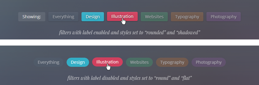
If the option Display Filter Title is enabled, a text label will be shown before the filter buttons. The default text for this label is Showing, but you can change it using the option Portfolio Filter Title, while the label for the Everything button can be changed with the option Portfolio Filter Everything Label.
The Filters Text color picker will let you define the text color for the filter’s buttons.
The Filters Style dropdown will let you choose between Flat, Shadowed, and Gradient styles for the buttons, while their shape can be set with the Filters Corners dropdown—Round, Rounded, Extra Rounded, or Square.
The font family, weight and size for the filter’s buttons can be set using the following options:
| Variable name | Default value |
|---|---|
| Portfolio Filter Font Family | Open Sans |
| Portfolio Filter Font Size | 14 |
| Portfolio Filter Font Weight | 400 |
Portfolio Grid Thumbnails#
We already explained how you can define how many columns to use to display your projects for different viewport sizes, and how you can set the aspect ratio, or proportions of the thumbnails, now we’ll go through some additional options.
Setting The Thumbnail Titles#
The Thumbs Titles color picker will let you define the text color for the thumbnail titles.
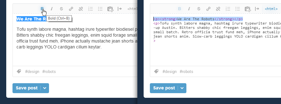
Photo, Audio and Video posts don’t have a dedicated Title field in Tumblr, so we need to fake them. Fortunately, this is very straightforward: simply type your project name or title at the very top of the post caption and make that paragraph bold. You can do that easily on the visual editor using the Bold button (Ctrl + B), or if you’re using the HTML editor, by wrapping the text in a <strong> tag.
Featured Images For Photo Posts#
For Photo and Photoset posts, the single image or the first image on the set will be used for the thumbnail. In most cases this will probably be fine, but there may be times when you want to display a different image on the thumbnail, one that you don’t want to be shown when looking at the project’s details. We’ll call this a featured image.
Featured images are only related to photosets, because as long as you upload an extra image to a Photo post, it becomes a set anyway. You can enable this option for all Photo posts by toggling the Enable Photosets Featured Img switch on, or you can do it on a post-by-post basis, by adding the _featured_img tag to your posts.
For any photoset the has this tag, the first image will be shown on the thumbnail, but it will be hidden when viewing the post details. This allows you to better art-direct your projects, by using a featured image with a different aspect ratio that fits better on the grid, for example.
Setting A Featured Image For Audio And Video Posts#
While Photo posts obviously have images that we can use on the thumbnails, we need to take additional steps for audio and video posts.
It’s actually quite simple, but you will have to host the image somewhere. Maybe the image you want to use is already online, so you can simply copy its URL. If it’s not, you can host the image using Tumblr itself. You can create a dummy Photo post and set it to private (so it doesn’t show up on the website), and upload your cover images there. Then you can right-click (or ctrl + click on a Mac) the image on the browser and copy the image URL. Or you could use Tumblr’s static file uploader to upload your image and grab the URL from there:
http://www.tumblr.com/themes/upload_static_file
Once you have the image URL, you can use it to insert an image on the Audio or Video post caption right below the fake title you created before. That’s it! This image will be used for the portfolio grid but it won’t show up when viewing the project’s details.
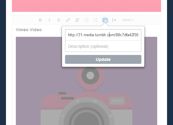
If you omit this step, UMO Folio will grab the default poster image for YouTube and Vimeo videos, but’s it’s actually faster and more reliable if you specify an image using this method.
Thumbnails Appearance#
The following options will control how the post thumbnails and titles will look on the grid.
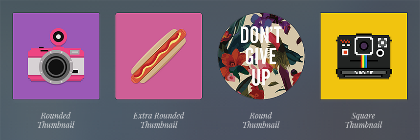
Thumbs Corners#
Rounded, Extra Rounded, Round, or Square.
The Rounded and Extra Rounded options will give the thumbnails a border radius of 3px and 6px, respectively, while the Round option will make them look like circles, so make sure to set the Thumbs Ratio to 1:1 or your thumbnails will look a little weird.
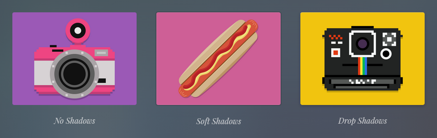
Thumbs Shadows#
No Shadows: thumbnails will be flat.
Soft Shadows: thumbnails will have very slight 1px shadow and inner glow.
Drop Shadows: thumbnails will have a more obvious drop-shadow effect.
Thumbs Title Position#
Position of the thumbnail title: top-left or centered.
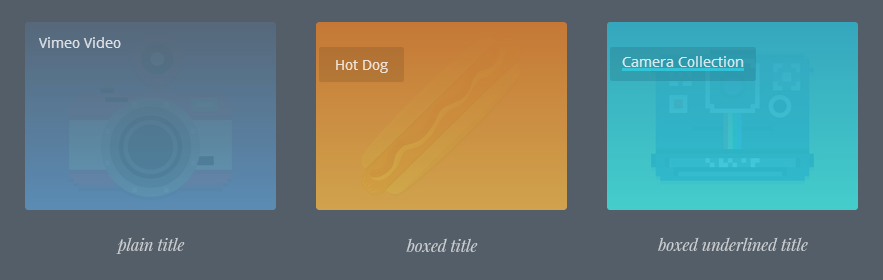
Thumbs Title Style#
Plain, Shadowed, Boxed, Boxed Shadowed, Underlined, Underlined Shadowed, Boxed Underlined or Boxed Underlined Shadowed.
Hide Thumbs Titles#
Enable this options if you want the project titles not to be visible on the grid.
Move Titles Outside Thumbs#
Enable this option to take the titles outside the overlay and underneath the project thumbnail.
Thumbs Overlay Opacity#
Controls how opaque the thumbnail overlay will be. Default value is 0.9.
The following options will let you specify a font family, weight and size for the thumbnail titles.
| Variable name | Default value |
|---|---|
| Thumbs Title Font Family | Open Sans |
| Thumbs Title Font Size | 14 |
| Thumbs Title Font Weight | 400 |
The Portfolio Expander#
When you click on a thumbnail, UMO Folio will retrieve the project details using Ajax, and the information will be shown in what we call the portfolio expander. If the option Enable Ajax Expander is disabled, the project's details will be opened on a new window tab instead.
When viewing a project on its own page, as opposed to inside the expander, the page title on top will read Project Details by default. You can change this text using the option Portfolio Permalink Title.
Please notice than on viewports that are 1024px wide or less (phones and tablets), the default behaviour is to bypass the Ajax expander and open the project details like regular links.
This is so because we think this makes for a better user experience, as scrolling the contents inside the expander may conflict with the natural scrolling behaviour of a touch-enabled device. The option Open Projects In New Tab will dictate whether the page will open on the current tab or in a new tab/window.
You can, however, enable the Ajax expander for mobile, by checking the option Enable Ajax On Mobile.
Expander Colors#
The expander has its own set of color options, and they are:
| Variable name | Description | Default value |
|---|---|---|
| Expander Bg | The expander background color | #282e33 |
| Expander Controls | This color will be applied to the image galleries arrows and bullet navigation, and to the expander close button. | #687078 |
| Expander Text | Color for the text inside the expander | #9299a0 |
| Expander Links | Color for links inside the expander | #f55e47 |
| Expander Links Hover | Color for links inside the expander, on mouseover. | #f88877 |
| Loading Animation | Color for the animation spinning rings, while the project loads. | #9299a0 |
| Modal Overlay Bg | Background color for the overlay that sits behind the notes and comments modal window. | #1b1f22 |
| Share Box Bg | Background color of the sharing box. | #cccccc |
Other Options#
Other options that controls the appearance of the expander are:
Expander Corners#
Whether the expander corners will be rounded, extra-rounded, or sharp.
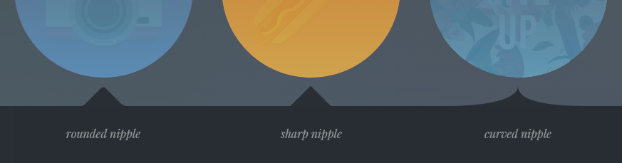
Expander Nipple#
The style for the expander's nipple—the arrow that grows from the expander and points to the corresponding thumbnail.
Hard, Rounded or Curved.
You can specify the font family and weight for the expander headings (project titles) using the following options:
| Variable name | Default value |
|---|---|
| Expander Headings Font Family | Open Sans |
| Expander Headings Font Weight | 600 |
Displaying Comments and Notes#
You can toggle the display of post notes and Disqus comments using the switches Show Notes and Show Comments, respectively.
If Show Comments is switched on, please make sure to enter your Disqus Shortname.
When showing comments or notes, a large button will be shown on the expander below the project description, and comment and notes will open on a modal window when this button is triggered. You can change the default legend for this button on the field Notes Button Label, the default value is Comments & Notes.
If you have enabled Notes, but Disqus comments are disabled, and there are no notes to display, a notice will be shown when opening the modal window. The default notice will say There are no comments or notes to display, and you can change this message using the option No Notes Text.
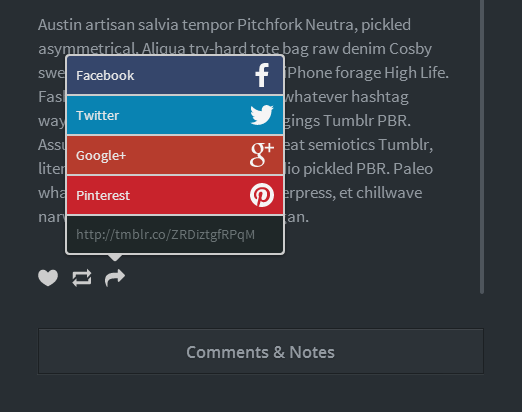
Like and Reblog Buttons#
Tumblr’s Like and Reblog buttons, plus a Share button, will be displayed on the expander at the bottom of the post caption.
The sharing actions will be displayed on a large tooltip when the Share icon is clicked or tapped. Please keep in mind the the
You can choose the Like, Reblog and Share icons color using the Tumblr Buttons Color dropdown. The available options are Grey, White and Black.
Disabling CSS Transforms#
UMO Folio uses Isotope to lay out the portfolio grid. Isotope uses CSS transitions and transforms to position and animate the portfolio thumbnails and the expander, when available, to take advantage of GPU acceleration.
There are some cases when CSS transforms can cause problems though. We encountered an issue with embedded Vimeo videos in Safari, for example, when entering fullscreen mode. It seems that Safari’s HTML5 video implementation and CSS transforms don’t play well together, and fullscreen mode is broken for the Vimeo player. If you experience this issue, you may want to enable Disable CSS3 Transforms. The portfolio grid animations won’t be as smooth this way, especially on mobile devices, but it’s the only solution to the above problem, at least for now.
Team Section#
The Team section lets you add up to six team members. You can define how many columns will be used to display your team members on different viewport sizes:
| Variable name | Values | Default |
|---|---|---|
| Team Cols Small Tablet | 1, 2 | 1 |
| Team Cols Tablets | 1, 2, 3 | 2 |
| Team Cols Desktop | 2, 3, 4 | 3 |
| Team Cols Large Screen | 2, 3, 4 | 4 |
You can also enable or disable the team swiper (Enable Team Swiper). When the swiper is enabled, your team blocks will be grouped inside a touch-enabled widget, and will be laid out in a single row, no matter how many of them you have. Then you can swipe through them horizontally. On phones and tablets—or any touch capable device—the swiper will react to touch events. On desktops, the swiper will react to mouse events (you can click and drag to slide), and optionally, to the mousewheel and the keyboard arrow keys.
If Enable Swiper Keyboard is on—it is by default—you can use your keyboard’s left and right arrows to make the team swiper scroll.
If Enable Swiper Mousewheel is on, the swiper will react to the mousewheel when it has focus. We recommend to use this option with care, as users may not like the widget interfering with normal scrolling behaviour.
Entering Team Members Info#
For each team member you can upload a custom avatar. To upload your avatar images, use the fields Team Avatar [1-6]. Keep in mind that this images need to be square. A size of 200x200px will probably be enough, but you want the avatars to look sharp on high-density displays, you can make your images 400x400px.
For each team member you should enter the name, job title and biography, using the fields:
Team Name [1-6]
Team Job [1-6]
Team Bio [1-6]
For each team member you can enter a different set of social media icons and links. It’s actually quite simple, you need to write the name of the social media service and then the corresponding URL, and separate each pair of values with commas, as in the example below:
behance http://www.behance.net/JohnDoe,
email mailto:johndoe@mycompany.com,
facebook https://www.facebook.com/John.Doe,
googleplus https://plus.google.com/u/1/+johndoe/posts,
linkedin http://www.linkedin.com/profile/view?id=12345678
Below there’s the whole list of available services:
bandcamp, behance, blogger, delicious, deviantart, digg, dribbble, email, etsy, facebook, flickr, forrst, foursquare, github, googleplus, instagram, lastfm, linkedin, myspace, picasa, pinboard, pinterest, quora, rdio, reddit, rss, skype, soundcloud, spotify, squarespace, stumbleupon, tumblr, twitter, vimeo, wordpress, youtube.
You can change how the avatars look with the Avatar Style dropdown—the available styles are: Circle Flat, Circle Beveled, Square Flat, Square Beveled, Rounded and Extra Rounded.
If you enable Use Hard Shadow On Avatars, a choked but subtle drop shadow will be used. Keep in mind that these settings will also affect the looks of the avatar on the About section.
If Center Team Contents is on, the avatar, names, job titles, bios, and buttons will be centered-aligned. Otherwise they will be left-aligned.
If the option Place Bios Inside Well is enabled, the team members bios will be wrapped inside a padded container with a soft border and inset-shadow.
The options Use Italic On Team Jobs and Use Italic On Team Bios will control whether normal or italic text is used for the team members job titles and bios.
Testimonials Section#
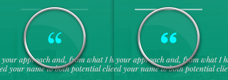
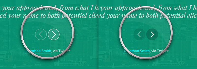
The Testimonials section will display your clients’ testimonials on a swipeable widget. To add testimonials, simply create Quote posts on your Tumblr dashboard. The Quote text will be shown at the top of each block in larger type, and the Source on the footer.
Use the Testimonials Accent color picker to change the color of the left quotes icon that’s displayed on each block. The default value is #00f6ff
If Use Alt Quotes is enabled, the icon displayed will have an alternative, lighter, less bold style.
When the Use Italic On Testimonials option is on—it is by default—the quote text will be displayed using the font settings you defined for Italic Font Family and Italic Font Weight.
The appearance of the left and right arrows will depend on the values you selected for Arrows Style and Arrows Pattern.
Clients Section#
The Clients section consists of a simple widget that will allow you to display up to twelve client logos. To upload your logo images, use the fields Client Logo [1-12].
The logo images will be displayed as inline-block elements. They don’t need to have a specific size, but a max-width of about 220px would be ok for most cases. If you want to restrict the maximum width of the images to a particular value, use the option Client Logos Max Width. If this option is set to 0 or left empty, the logo images will be display at their natural width and height.
Additionally, if you enter a URL for a particular client, that logo will be wrapped in a link pointing to said URL. To enter the URLs for each client logo, use the options labeled Client URL [1-12]
Contact Section#
The Contact section will allow you to display your contact information and Tumblr’s own Ask box, so people will be able to effortlessly ask you questions.
Set the Contact Widget title using the Contact Widget Title field, and enter your contact details on the Contact Widget Content field.
You can use the example below as a template. Change it on a plain text editor to fit your needs; you can use <span> tags to create labels and <br> tags to insert line breaks, while the <em> tag renders text using italics:
<span><em>address:</em></span> <br>
4216 Quiet Pony Walk <br>
Slick Rock, NY <br>
12382 <br>
United States <br>
<br>
<span><em>tel:</em></span> +12 345-678-90 <br>
<span><em>fax:</em></span> +12 345-678-90 <br>
<span><em>email:</em></span> <a href="mailto:sayhi@somecompany.com">sayhi@somecompany.com</a> <br>
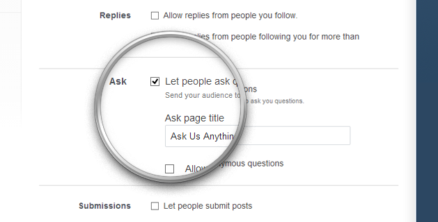
<span><em>twitter:</em></span> <a href="//twitter.com/pixelmoxie">@pixelmoxie</a>To display the Ask Me Anything box, go to the Settings page for you blog and make sure you have enabled the Let people ask questions checkbox. You can change the legend that shows above the box from there as well (Ask page title).
Footer Section#
The Footer Section houses your social media icons, Twitter feed, and Dribbble, Instagram and Flickr photostreams.
The Footer Section has its own set of color options:
| Variable name | Description | Default value |
|---|---|---|
| Footer Bg | Footer Background color | #292e32 |
| Footer Links | Text color for links inside the footer | #f25353 |
| Footer Links Hover | Text color for links inside the footer, on mouseover | #f2f2f2 |
You can set the footer text to be bright or dark, depending on the color you set for the background (Footer Text Color).
Displaying Social Media Icons#
To display social media icons for your favorite services, first make sure the option Show Social Icons is enabled, then simply enter the corresponding profile URL in the field URL [Service Name].
The available services are:
ArtStation, Bandcamp, Behance, Blogger, Delicious, Deviantart, Digg, Dribbble, Email, Etsy, Facebook, Flickr, Forrst, Foursquare, Github, Googleplus, Instagram, Lastfm, Linkedin, Myspace, Picasa, Pinboard, Pinterest, Quora, Rdio, Reddit, RSS, Skype, Soundcloud, Spotify, Squarespace, Stumbleupon, Tumblr, Twitter, Vimeo, Vine, Wordpress, and Youtube.
You can set the size of the social icons using the Social Icons Size select box (large, small, or tiny.)
Displaying Your Latest Tweets#
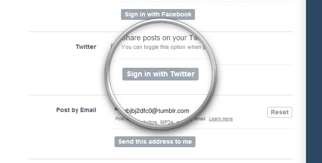
To enable the Twitter Widget, you need to be signed into Twitter from your Tumblr account. Go to your Settings page and select the blog you installed UMO Folio on.
Scroll down to the Twitter field, and if you aren’t signed in already, click on the Sign in with Twitter button. You will be asked to authorize Tumblr to use your Twitter account. Click on Authorize App and you’ll be redirected back to your Settings page.
Use the option Twitter Count to limit the numbers of tweets that are displayed on the feed.
If the option Enable Tweets Swiper is on, your tweets will be grouped inside a swipeable widget, otherwise they will be stacked on a single column.
If you don’t wish to show your Twitter feed, you have the option to display a Text Widget in its place. To do so, toggle the option Enable Text Widget 2 on, and enter the widget title and content using the fields Text Widget 2 Title and Text Widget 2 Content. You can use HTML tags on the widget contents or use it to place any HTML code you want.
Displaying Your Dribbble, Instagram and Flickr Photostreams#
First of all, make sure the option Show Photostreams is switched on.
Dribbble Shots#
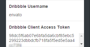
In version 1.2.1, the Dribbble widget was updated to work with the new Dribbble API. In order to display your Dribbble shots, you’ll need an additional piece of information—a Client Access Token.
head over to https://dribbble.com/account/applications/new to register an application. Fill in all the fields and submit the form. You can enter your portfolio URL for both Website URL and Callback URL.
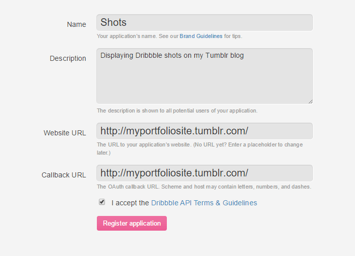
After registering the app, you’ll be presented with a few pieces of info—a Client ID, a Client Secret, and a Client Access Token. Copy the value of your Client Access Token and paste it into the Dribbble Client Access Token field. Finally, type in your Dribbble Username.
Instagram#
For Instagram, you need to enter your Instagram Access Token. To get your token, visit the following address, and click on the Retrieve my details bro! button down the page (make sure you’re logged into your Instagram account first):
http://projects.craftedpixelz.co.uk/jqinstapics/
When you’re redirected back, you should see the fields for your User ID and Access Token. You only need to grab the token, it should have the following format:
309546888.674061d.879f8f19f2a94b29ad5d9fb7135bb658
Flickr#
For Flickr, use this tool (http://idgettr.com) to get your Flickr User ID. Just enter the address of your photostream or and it'll find the number for you.
Photostreams Common Settings#
You can control how many images are shown on each feed using the options Dribbble Count, Instagram Count and Flickr Count.
Photostreams can show large images—default behaviour—or smaller ones. Set this option using the Photostream Thumb Size select box.
If the option Group Photostreams is enabled, your image feeds will grouped on a tabbed widget. Otherwise they will be stacked on s single column.
If you don’t wish to display the photostreams, you have the option to display a Text Widget in the place they would be. To do so, toggle the option Enable Text Widget 3 on, and enter the widget title and content using the fields Text Widget 3 Title and Text Widget 3 Content. You can use HTML tags on the widget contents or use it to place any HTML code you want.
Footer Copyright and Credits#
By default, the site copyright will be shown using the following format:
©Copyright-Years BlogName - All rights reserved
If you wish to display something different, enter your own text into Copyright Text.
The theme credits will be displayed on the bottom-right corner of the footer. If you want to show some other text on that space, enter your own text into Credits Text (enter a single whitespace if you want it to be empty).
Navigation & Header#
UMO Folio features a navigation bar that sticks to the top of the page once you have scroll a certain amount down the page.
Colors#
Below are the color options for the navigation and header.
| Variable name | Description | Default value |
|---|---|---|
| Header Bg | The header background color | #374149 |
| Navigation Links | Navigation links color | #f3f3d8 |
| Navigation Links Hover | Navigation links color on mouseover | #f55e47 |
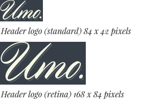
Header Logo#
Use the following fields to upload the standard and high-resolution versions of your logo. The second one is intended to be shown on high-density (retina) displays and it’s optional.
Header Logo
Header Logo Hires
It’s recommended that your logo is between 42px and 48px tall. The high resolution version should be twice the size of the standard one. If your logo is taller than that and doesn’t fit into the page header, you can modify the header height using the following options:
- Header Static Height
- The header’s height when it isn’t sticky, i.e.: when you are at the top of the page. Defaults to
72px - Header Sticky Height
- The header’s height when it’s stuck on top of the page. This value should always be smaller than the header static height. Defaults to
60px
Navigation Links Labels#
You can enter the text for each link on the navigation menu. The links will only show up if their corresponding section is enabled.
About Menu Label
Services Menu Label
Portfolio Menu Label
Team Menu Label
Testimonials Menu Label
Clients Menu Label
Contact Menu Label
Displaying Links to Static Pages#
If you have added pages using the Add a page button at the bottom of the customization sidebar, links to these pages will be shown on a navigation menu item with a dropdown menu if you enable the option Enable Pages Dropdown.
The menu item that triggers this dropdown will read “Pages” by default, but you can change that label using the option Pages Menu Label.
User created pages will open on a new tab/window.
Showing a Link to Your Blog#
UMO Folio is intended to be used as a portfolio solution, and not really for blogging. A UMO Journal edition is in the works for this purpose and hopefully will be out soon. If you want to link your portfolio to your blog, you can place an item on the navigation menu. Use the options Blog Menu Label and Blog Menu URL to set the text for the menu item and the URL pointing to your blog.
Using Static Pages#
Although UMO Folio doesn’t support Text, Chat, Link and Answer posts, it does support static, user created pages.
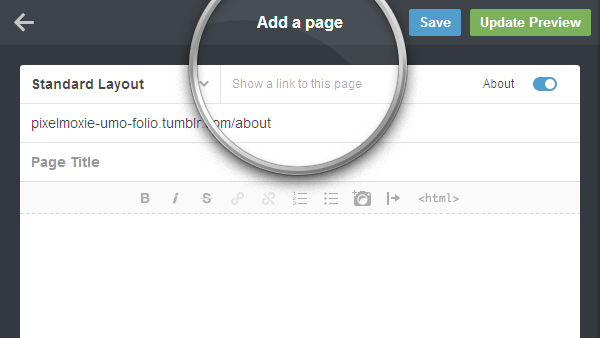
To add a static page to your site, scroll to the bottom of your customization sidebar and click on the Add a page button.
If you enable Show a link to this page, you can enter a menu label for the this page, which will appear on the navigation “Pages” dropdown, if enabled.
Tumblr allows us to create regular pages, where you enter the page title and content as if it was a regular text post, and redirect pages. You can use the later to link to external websites and resources.
To learn more about how to use pages within Tumblr, please read the following article:
http://www.tumblr.com/docs/en/pages
Your pages content will be displayed and styled in a way to look similar to the portfolio expander.
Google Fonts#
In this section we’ll cover how to work with Google Fonts, regarding the main body text and individual sections and widgets as well.
Setting the main body text font family and weight#
By default, UMO Folio will use Google Fonts for the main body text, and you can chose from a list of pre-selected specimens. We have selected this families because they look good and come in several weights, plus some of them offer support for subsets other than Western, if you need it.
- Normal Font Family
- The font family for the main body text.
Source Sans Pro, Open Sans, Cabin, Lato, Noto, Roboto, Ubuntu - Normal Text Weight
- The text weight for the main body text. Please not that not all families above come with light styles (
300).300, 400 - Bold Text Weight
- The text weight for bold text:
<strong>and<b>tags.
Please note that not all families come with a semi bold style (600)600, 700 - Italic Font Family
- The font family for text set to italic: the
<em>and<i>tags.Playfair Display, Noto Serif, Vollkorn. - Italic Font Weight
- Whether italic text should be normal or bold.
400, 700.
Choosing a Google Font Subset#
If you need support for non-western languages and characters, like Greek or Russian, you can select a script subset. Make sure the font you chose for the main body text support the script you need.
- Google Fonts Subset
Cyrillic, Cyrillic Extended, Greek, Greek Extended, Khmer, Latin, Latin Extended, Vietnamese.
Here's a list of the avaiable body fonts and their script support
| Font name | Scripts |
|---|---|
Source Sans Pro | Latin, Latin Extended, Vietnamese |
Open Sans | Latin, Latin Extended, Cyrillic, Cyrillic Extended, Greek, Greek Extended, Vietnamese |
Cabin | Latin |
Lato | Latin |
Noto Sans | Latin, Latin Extended, Cyrillic, Cyrillic Extended, Greek, Greek Extended, Vietnamese |
Roboto | Latin, Latin Extended, Cyrillic, Cyrillic Extended, Greek, Greek Extended, Vietnamese |
Ubuntu | Latin, Latin Extended, Cyrillic, Cyrillic Extended, Greek, Greek Extended |
Playfair Display | Latin, Latin Extended, Cyrillic |
Noto Serif | Latin, Latin Extended, Cyrillic, Cyrillic Extended, Greek, Greek Extended, Vietnamese |
Vollkorn | Latin |
You can also disable Google Fonts altogether for body text. If you toggle the Disable Body Google Fonts switch on, the following font stacks will be used instead, for normal and italic text:
- Normal Text
"HelveticaNeue-Light", "Helvetica Neue Light", "Helvetica Neue", Helvetica, Arial, "Lucida Grande", sans-serif- Italic Text
Georgia, Times, "Times New Roman", serif
Using Spot Google Web Fonts#
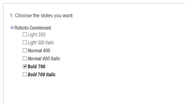
There are many spots on the theme where you can manually enter a Google web font family and weight—and sometimes size as well. For example: widget titles, the portfolio expander heading, the portfolio thumbnails titles, etc.
Once you have found a Google font that you like, you simple have to take note of the font name and weight. Lets say you want to use Roboto Condensed in its Bold variant. The font name would then be Roboto Condensed and the font weight 700.
You can see all the Google font fields, and their default values, listed below.
| Variable name | Default value |
|---|---|
| Buttons Font Family | Open Sans |
| Buttons Font Size | 16 |
| Buttons Font Weight | 600 |
| Expander Headings Font Family | Open Sans |
| Expander Headings Font Weight | 600 |
| Headings Font Family | |
| Headings Font Weight | |
| Navigation Font Family | Open Sans |
| Navigation Font Size | 16 |
| Navigation Font Weight | 600 |
| Portfolio Filter Font Family | Open Sans |
| Portfolio Filter Font Size | 14 |
| Portfolio Filter Font Weight | 400 |
| Skills Font Family | Open Sans |
| Skills Font Size | 14 |
| Skills Font Weight | 600 |
| Thumbs Title Font Family | Open Sans |
| Thumbs Title Font Size | 14 |
| Thumbs Title Font Weight | 400 |
| Welcome Font Family | Source Sans Pro |
| Welcome Font Weight | 300 |
Miscellaneous Options#
- Tooltips Color
- Background color for the tooltips used on the Skills widget and social icons, among other places. Auto: sections set to have light text will have light tooltips, sections set to have dark text will have dark tooltips. Dark: force all tooltips to be dark. Light: force all tooltips to be light.
- Google Analytics ID
- Enter a Google Analytics Property ID if you want to track analytics for your site.
- Videos Aspect Ratio
- Enter the aspect ratio or proportions your embedded videos will have. It’s better to use this option if most of your videos have the same proportions. This value should be a decimal, for example, widescreen videos have an aspect ratio of
16:9, so you should enter0.5625(9/16). If you leave this field empty, the aspect ratio will be calculated on the fly for each video, and this may not be 100% reliable. - Hide Tumblr Controls
- For a better user experience, enable this option to hide the Tumblr controls iframe on desktop and mobile and the Tumblr app button on tablets and phones.
Credits#
The wonderful illustrations shown on the demos are the work of YemaYema.
The images used for the sections background are from Unsplash.
The logos shown on the Clients section are from the Logo / Badge / Insignia Templates Bundle.
The webfont shown on the Section Headings is called Questrial, by Admix Designs.
UMO Folio integrates or borrows from the following jQuery plugins:
Smart Resize — https://github.com/louisremi/jquery-smartresize
Hammer JS — http://eightmedia.github.com/hammer.js
FlowType.JS — http://simplefocus.com/flowtype/
Responsive Elements — http://kumailht.com/responsive-elements
ImagesLoaded — https://github.com/desandro/imagesloaded
scrollTo — https://github.com/flesler/jquery.scrollTo
Isotope — http://isotope.metafizzy.co
Perfect Scrollbar — http://noraesae.github.com/perfect-scrollbar
jQuery Waypoints — https://github.com/imakewebthings/jquery-waypoints
Tooltip — https://github.com/andrewplummer/tooltip
Swiper — http://www.idangero.us/sliders/swiper
Demo Colors#
These are the theme color options as seen on the demos One and Two:
| Variable name | Description | Demo 1 | Demo 2 |
|---|---|---|---|
| Dark Text | Text color for sections with “Text Color” set to “Dark” | #494f50 | #494f50 |
| Light Text | Text color for sections with “Text Color” set to “Light” | #e6e6e6 | #e6e6e6 |
| Filters Text | Text color for the portfolio filter buttons | #e6e6e6 | #e6e6e6 |
| Thumbs Titles | Text color for the portfolio thumbnail titles | #e6e6e6 | #374149 |
| Dark Links | Link color for sections with “Text Color” set to “Dark” | #f55e47 | #f55e47 |
| Dark Links Hover | Link color for sections with “Text Color” set to “Dark”, on mouseover | #f33c20 | #f33c20 |
| Light Links | Link color for sections with “Text Color” set to “Light” | #00f6ff | #f2f2f2 |
| Light Links Hover | Link color for sections with “Text Color” set to “Light”, on mouseover | #66faff | #ffffff |
| Expander Link | Link color for the portfolio expander | #f55e47 | #f55e47 |
| Expander Link Hover | Link color for the portfolio expander, on mouseover | #f88877 | #f88877 |
| Footer Links | Link color for the footer section | #f25353 | #f25353 |
| Footer Links Hover | Link color for the footer section, on mouseover | #f2f2f2 | #f2f2f2 |
| Text Selection Bg | Background color for selected text | #435056 | #364045 |
| Header Bg | Background color for the “sticky” header | #374149 | #374149 |
| Navigation Links | Navigation menu link color | #f3f3d8 | #f3f3d8 |
| Navigation Links Hover | Navigation menu link color, on mouseover | #f55e47 | #f55e47 |
| Section About Bg | Background color for the About section | #d2cfc6 | #fffaeb |
| Section Clients Bg | Background color for the Clients section | #f5f5f5 | #fffaeb |
| Section Contact Bg | Background color for the Contact section | #f25454 | #eb5247 |
| Section Home Anim | Color of the loading animation spinning rings | #d2d0c6 | #d2d0c6 |
| Section Home Bg | Background color for the Homepage section | #3eabac | #d5b36c |
| Section Home Splash | Background color for splash page, while the site loads | #374149 | #374149 |
| Section Portfolio Bg | Background color for the Portfolio section | #63707e | #fffaeb |
| Section Services Bg | Background color for the Services section | #f5f5f5 | #2d4d58 |
| Section Team Bg | Background color for the Team section | #f5f5f5 | #2d4d58 |
| Section Testimonials Bg | Background color for the Testimonials section | #009975 | #159699 |
| Footer Bg | Background color for the Footer section | #292e32 | #292e32 |
| Service 1 | Background color for the Service 1 figure | #9bb75e | #9bb75e |
| Service 2 | Background color for the Service 2 figure | #ffd84c | #ffd84c |
| Service 3 | Background color for the Service 3 figure | #e67e22 | #e67e22 |
| Service 4 | Background color for the Service 4 figure | #bb76d6 | #bb76d6 |
| Service 5 | Background color for the Service 5 figure | #52cbcb | #52cbcb |
| Service 6 | Background color for the Service 6 figure | #64d968 | #64d968 |
| Skills Label | Text color for the labels on the Skills widget | #f5f5f5 | #f5f5f5 |
| Testimonials Accent | Color for the Testimonials “right-quote” icons | #00f6ff | #1ec5c8 |
| Thumbs Top Gradient | First color stop for the thumbnail gradients | #57697a | #364045 |
| Thumbs Bottom Gradient | Second color stop for the thumbnail gradients | #5492b4 | #364045 |
| Dark Btn Bg | Background color for buttons on sections set to have “dark” text | #3b3f44 | #3b3f44 |
| Dark Btn Bg Hover | Background color for buttons on sections set to have “dark” text, on mouseover | #474c52 | #474c52 |
| Dark Btn Text | Text color for buttons on sections set to have “dark” text | #adadad | #adadad |
| Dark Btn Text Hover | Text color for buttons on sections set to have “dark” text, on mouseover | #c7c7c7 | #c7c7c7 |
| Light Btn Bg | Background color for buttons on sections set to have “light” text | #35ade9 | #35ade9 |
| Light Btn Bg Hover | Background color for buttons on sections set to have “light” text, on mouseover | #189bdc | #189bdc |
| Light Btn Text | Text color for buttons on sections set to have “light” text | #e6e6e6 | #e6e6e6 |
| Light Btn Text Hover | Text color for buttons on sections set to have “light” text, on mouseover | #ffffff | #ffffff |
| Dark Hollow Btn | Text and border color for “hollow” buttons on sections set to have “dark” text | #444444 | #444444 |
| Dark Hollow Btn Hover | Text and border color for “hollow” buttons on sections set to have “dark” text, on mouseover | #222222 | #222222 |
| Light Hollow Btn | Text and border color for “hollow” buttons on sections set to have “light” text | #e6e6e6 | #e6e6e6 |
| Light Hollow Btn Hover | Text and border color for “hollow” buttons on sections set to have “light” text, on mouseover | #ffffff | #ffffff |
| Dark Translucent Btn | Background color for “translucent” buttons on sections set to have “dark” text | #444444 | #444444 |
| Dark Translucent Btn Hover | Background color for “translucent” buttons on sections set to have “dark” text, on mouseover | #222222 | #222222 |
| Light Translucent Btn | Background color for “translucent” buttons on sections set to have “light” text | #e6e6e6 | #e6e6e6 |
| Light Translucent Btn Hover | Background color for “translucent” buttons on sections set to have “light” text, on mouseover | #ffffff | #ffffff |
| Expander Bg | Background color for the portfolio expander | #282e33 | #282e33 |
| Expander Controls | Color for the expander controls (arrows, bullets, etc) | #687078 | #cccccc |
| Expander Text | Color for the expander text | #9299a0 | #cccccc |
| Loading Animation | Color for the expander loading animation | #9299a0 | #cccccc |
| Modal Overlay Bg | Background color for the modal window overlay (comments and notes) | #1b1f22 | #1b1f22 |
| Share Box Bg | Background color for the sharing box | #cccccc | #cccccc |