Welcome to PixelMoxie’s Ellisium Tumblr Theme documentation version 1.0.1. Ellisium is a business/corporate oriented blog, the perfect online companion for your main company website. Ellisium features a clean and beautiful homepage slider, which is very customizable and perfect for presenting your products or introducing your services, a services block where you can fit up to four services boxes and chose between bitmap and webfont icons, optional “call to action” and “page hero” blocks, a smart sticky sidebar, and much more.
Ellisium comes with a versatile homepage slider that lets you feature images, alongside a short title and description, plus a “click me” button, for each one of the slides. It adapts well to mobile so your content is never hard to read, and you can position your images to the right or left, or have them cover the whole slide. It’s powered by the awesome FlexSlider and it’s touch friendly.
Ellisium uses webfont icons for most of its interface, and high resolution image sprites for a few elements, so your website will look awesome and crisp on any device.
The sticky sidebar on the left side keeps you company as you scroll down the page and it degrades gracefully on small screens, turning itself into a masonry arrange of widgets below your important content and, of course, it can be disabled at any time.
You can optionally “pin” the footer, so it hides behind the main content and it’s revealed as you reach the bottom of the page. This behaviour is enable by default but you can choose to deactivate if you prefer a more traditional footer.
The navigation bar gracefully turns into a stylish multi level dropdown menu below a certain screen width, which you can even define yourself.
You can display up to four services blocks, each with their own bitmap or webfont icon, title, description and clickable button. You can upload your own bitmap icons, or choose from 48 glyphs from the Linecon icon set, which is included out of the box.
These blocks of content are useful to greet and engage your visitors. You can display the “call-to-action” block with a clickable button, below the homepage slider. The page hero can be shown on permalinks pages or, if you choose not to use the slider, on the index page as well.
You can optionally open your images--on photo and photoset posts--using the included touchTouch plugin, one of the best lightbox solutions for both desktop and mobile devices
Ellisium includes the following widgets: search, about, browse (tags), twitter, flickr, dribbble and instagram feeds, social, ask, and up to three text widgets you can use to display contact information or to enter custom code or buttons. Widgets are displayed by default on the right sidebar, but you can move them to the footer individually and even set the order in which they appear.
Each post can have its own interactive buttons, which include: “like”, “reblog”, and a “share” button that allows you to send the post to Twitter, Facebook, Google+, and for relevant post types, Pinterest.
You photosets will display as image sliders, and images can be viewed in their entire glory using the lightbox. You can choose to have the regular “rectangular dots” controls or the “image thumbnails” navigation for the post sliders.
Ellisium also supports:
While logged to your Tumblr account, head on to your dashboard (http://www.tumblr.com/dashboard).
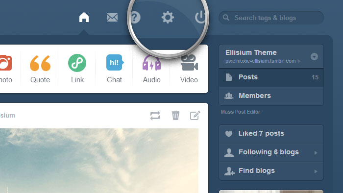
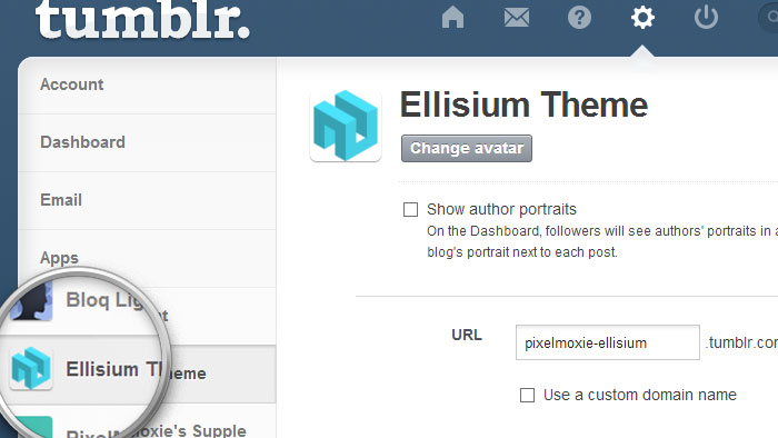
Click on the gear icon at the top (Settings) and then select the blog you want to install Ellisium on.
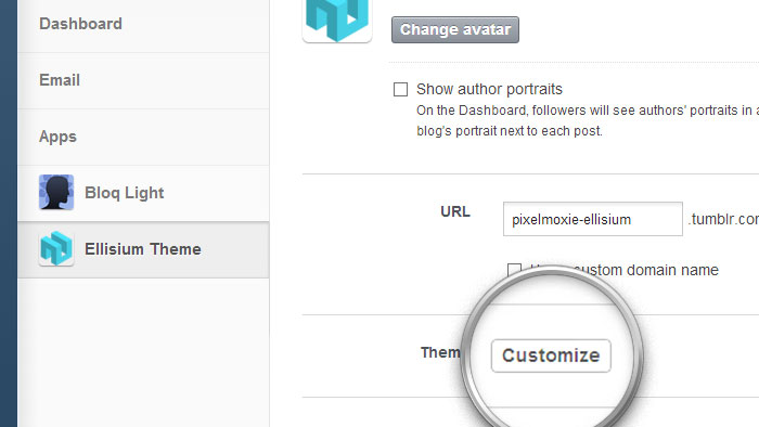
Click on the Customize button, next to the Theme label.
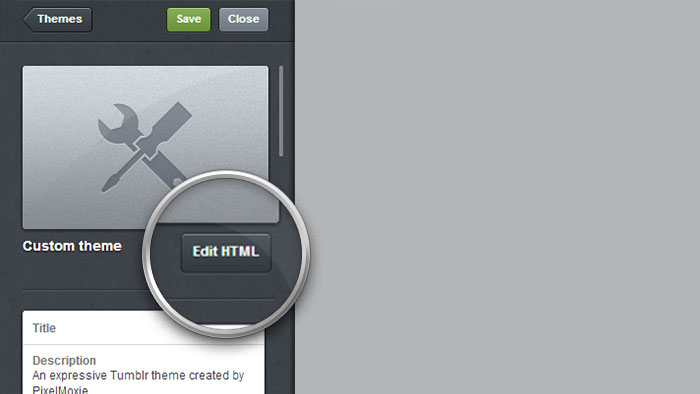
Once on the customization sidebar, click on Edit HTML.
Open the .zip file you downloaded from Themeforest and find the theme file: pixelmoxie-ellisium-1.0.1.html
Open the file using a plain text editor. If you’re working with TextEdit on a Mac, you’ll want to check Ignore rich text commands in HTML files on the preferences. Copy all the contents and paste them on the dashboard sidebar, replacing all the existing markup.
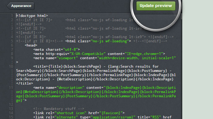
Click on Update Preview (CTRL+S). You won’t see any changes besides a solid color background. This is because Tumblr hasn’t taken into account the theme custom variables yet. Go back to Appearance, then Save your changes and refresh your browser window. Your site preview should start resembling Ellisium by now.
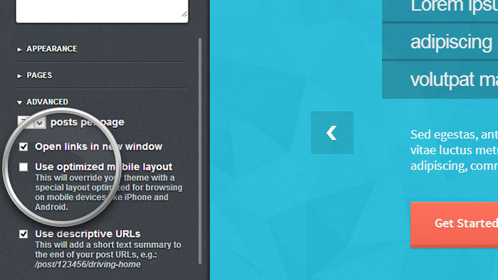
Head to the Advanced section at the bottom, make sure to uncheck “Use optimized mobile layout” if you don’t want to display Tumblr own iphone theme on mobile devices.
Do not forget to save your changes. Your Tumblr theme is now installed!
Jump To:
Ellisium expect an image based logo by default, but if you want to set you logo using type instead, you need to check the option “Use Text Logo”, and you can control its size with “Logo Font Size”. Your logo will then be rendered with the same font family and weight you chose for the headings.
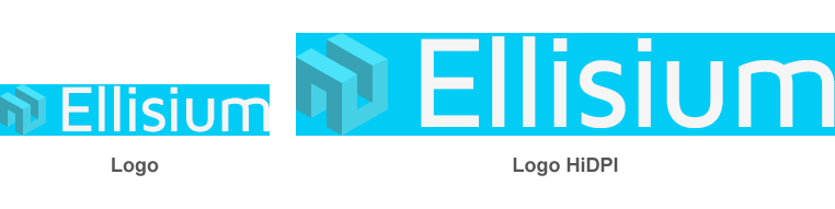
If using images, they need to be PNG images with transparency. Size is not critical, but use good judgment. Something below 300 pixels in width and no taller than 100 pixels should do fine. You can upload a high definition version of your logo, which will be displayed on “retina” and other high pixel density screens. This image needs to be effectively double the size of the regular one, so you need to have your logo on a vector format or a very high resolution bitmap. Simple upsizing a low-res bitmap won't do!
You need to upload your images on the “Logo” and “Logo HiDPI” fields.
The navigation menu will show your user created pages. You can choose to group them on a dropdown menu by checking the “Enable Pages Dropdown” option. The “Enable Tags Dropdown” will allow you to display your user defined tags in a similar fashion. These tags are the same that will be displayed on the “Browse Widget”, and you define them with the options “Browse Widget Category 1-15”.
You can also have user defined menu items outside of the dropdown menu, by setting the options “Custom Menu Item 1-3 Label” and “Custom Menu Item 1-3 Link”. The first two will be position before the dropdown, and the third after it.
You have options to show/hide the “Home” and other additional menu buttons—these are:
Show Ask Button
Show Home Button
Show Random Button
Show RSS ButtonAfter installing the theme, you’ll notice some images, text and other options are preset. We wanted the site to look as close to the demo as possible right after installation. You can, of course, edit or disable any of these options.
To use the homepage slider, make sure the “Enable Homepage Slider” option is checked. Slides are activated when you upload an image for them, using the fields “Slide 1-5 Image”. Slider images will span the full width of the slider by default, but you can choose to float them to the sides by completing the options “Slide 1-5 Image Position”—acceptable values are “left” and “right”. If you want to wrap your sldier images with a link, fill in the fields for “Slide 1-5 Image Link”. In order to show the slide title, description and button, you need to edit or complete the following options:
Slide 1-5 Title
Slide 1-5 Description
Slide 1-5 Btn Text
Slide 1-5 Btn Link
There are a few simple rules you need to follow if you want your slider to look and behave smoothly: your images should be all of the same height, and images floated to the sides should be half as wide as images that span the full width. For example, in the demo, images covering the full slide are 1140 x 500 pixels, while the images on the right and left sides are 570 x 500 pixels.
Included with your download, inside the “psd” folder, you’ll find PhotoShop documents that you can edit to display your content in the same fashion as shown on the demo, if you wish to do so. Inside the “slider_mockups” folder you’ll find the following files:
BrowserChrome.psd
Display.psd
Laptop.psd
Smartphone.psd
Tablet.psd
Inside each one of these files, there’s an “smart object” in a layer named “YOUR CONTENT HERE”, which you can double-click to place you own graphics inside the mockup. Remember to hide the background layer before exporting the slide as a PNG file with transparency using the “Save for Web” command.
Other options pertaining the behaviour of the slider are:
| Enable Slider Autostart | Check to auto-start the slider |
| Slider Animation | “fade” or “slide” |
| Slider Speed | “400” |
| Slider Timeout | “4000” Delay between each slide if autostart is enabled |
Options that control the slider appearance:
| Slider Headings Font Family | “Maven Pro” |
| Slider Headings Font Weight | “400” |
| Slider Heading Text Scale | Change to increase or decrease font size, default is “100” |
| Slider Heading Margin | Spacing between the heading “lines” (hint: can be negative) |
| Slider Heading Bg Opacity | Control the transparency of the headings background. |
You can set an image as background for the entire header, and it will show behind the navigation menu and the slider. Your image will cover the entire header area (it won’t be tiled), and can have transparency, but for performance reason we suggest you give your image a solid color background and export it as a high quality .jpeg instead.
On the “psd” folder, under “backgrounds” you’ll find the PSD files for the background images used for the header and footer of the demo. If you want to use the same one, open “header-bg.psd” and change the background color to match the one on your header.
Since version v1.1.0, Ellisium has an option to hide the Homepage slider—along with the services boxes and the call-to-action—on index pages other than the first one. If you enable the option Hide Slider On Nth Pages, the slider and its cohorts will appear only on the homepage. If you navigate to page 2, 3, etc. they will be hidden.
To display the services section, make sure the “Show Services” option is checked. You can display up to four services blocks, and need to specify how many you will show using the “Number Of Services” option.
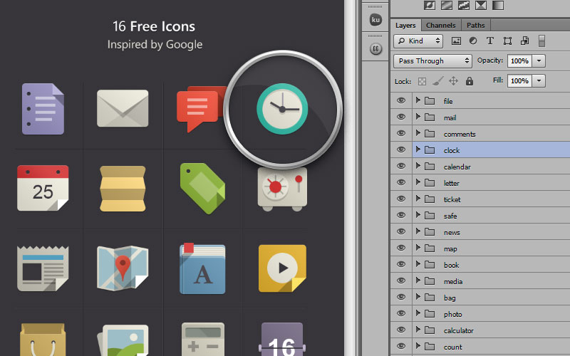
Each service can have its own accent color, icon and text. By default, the icons shown are image based. On the demo, we used the nice-looking Flat Icons (inspired by Google) which are available for free download from http://www.pixeden.com/
Here are the links for the two currently available sets:
http://www.pixeden.com/media-icons/flat-design-icons-set-vol1
http://www.pixeden.com/media-icons/flat-design-icons-set-vol2
We didn’t include the icons with the download as we weren’t sure we were allowed to for now, but we did include a couple of PhotoShop actions to help you export and resize each individual icon.
Inside the “psd” folder, you’ll find the file “Ellisium Icon Actions.atn”. You need to go the the menu at the top-right corner on the Actions panel, and from there, choose “Load Actions...”, then locate the included action file.
To export an icon, select the icon’s layer group, then run the action “New File From Selected Layers”. That should isolate the icon on a new, trimmed, document. Then you can run the “Prep Icon” action to enlarge it a bit and give it some padding. Export the file as a PNG with transparency and you’re ready to go!
If you’d rather use the included webfont icons from the Linecon icon set, you need to check the “Enable Services Font Icons” option. You can then set the icon of your choice for each service using the fields “Service 1-4 Icon Name”. Here’s the list of all available icons:
heartcloudstartvsoundvideotrashuserkeysearchsettingscamerataglockbulbpendiamonddisplaylocationeyet-shirtfoodlabstudymegaphonemusicdatabanknoteparamspaperplaneclocknotephotolikemailnewsphonecupstackbubblefireclipshopcalendarwalletvyniltruckworldFor each service block, you can set the additional following options:
Service 1-4 Accent
Service 1-4 Image
Service 1-4 Icon Name
Service 1-4 Title
Service 1-4 Description
Service 1-4 Btn Text
Service 1-4 Btn LinkTo display the “call to action” section, make sure the “Show CallToAction” option is checked, and then complete or edit the fields “CallToAction Text”, “CallToAction Btn Text”, “CallToAction Btn Link”. You can also change the font family and weight (Google Web Fonts).
The “call to action” block can display a background images. If you use an image with transparency, as the one on the demo, the background color will show through (Look for “CallToAction Background”).
Widgets go to the sidebar on the right by default. You can place individual widgets on the footer by checking the options “Move [Widget Name] Down”, for each one.
For most widgets, you can set the title and order in which they will be shown, using the options “[Widget Name] Title” and “[Widget Name] Order”. If you need to move widget down, use an integer larger than zero, or use a negative one if you wish to place it higher on the list. Similar concepts apply for widgets located on the footer.
Check “Enable Search Widget” to show the search-box on top of the sidebar. The placeholder text can be changed (“Searchbox Placeholder”).
The About Widget can be shown both on the sidebar and the footer (“Enable Sidebar About Widget”, “Enable Footer About Widget”). It will be populated with your blog description, and if you uploaded a “Custom Portrait”, it will be shown as well.
The Browse Widget will allow visitors to filter posts by tag. The tags shown here are the ones you defined using the options “Browse Widget Category 1-15”. Enable the widget by ticking the “Enable Browse Widget” checkbox.
To display your latest tweets, you need to take two steps. First, go into your “Settings” page, pick the blog you want to feed your tweets to, scroll down the page until you find the “Sign In With Twitter” button. Once you have authorized the App, go back to your customization sidebar and check the option “Enable Twitter Widget”. You can control how many tweets to display with “Twitter Count”, show a “follow” button (“Show Twitter Follow Button”) and set its label (“Follow On Twitter Label”).
Use this tool to get your Flickr user or group ID. Just enter the address of your photostream or group pool and it will find it for you.
Enter your “Flickr ID” and then check “Enable Flickr Widget”. You can use an individual or group pool ID, but if pooling from a group, you need to enable the option “Enable Flickr Group Feed” to switch to the right API. Set the number of images to retrieve in the “Flickr Count” field.
Displaying shots from your Dribbble account is just as easy. Make sure that “Enable Dribble Widget” is checked and enter you “Dribbble Username”. Edit the fields “Dribbble Count” and Dribbble Widget Title to control the numbers of shots to display and the text shown above them.
Displaying your Instagram feed requires an extra piece of info, but thanks to this tool this is quite easy as well. Besides your “Instagram User ID”, you’ll need an “Instagram Access Token”. Go to http://projects.craftedpixelz.co.uk/jqinstapics/, scroll down and press the Retrieve my details bro! button to get your details and complete the fields with the corresponding info. Some people have problems retrieving their details from that page, so make sure you visit the page using Chrome, as it’s proven to work all the time. Edit the “Instagram Count” and “Instagram Widget Title” if needed.
This widget will display the icon pointing to the social networks of your choice. Check the option “Enable Social Widget” and complete the corresponding services urls. (“URL [Service Name]”).
On this initial release we have included options for the following services, but more are to come in future updates:
Behance, Dribbble, Dropbox, Evernote, Facebook, Flattr, Flickr, Github, Google Circles, Google Plus, Instagram, LastFm, LinkedIn, Paypal, Picasa, Pinterest, Rdio, Skype, SoundCloud, Spotify, StumbleUpon, Twitter, Vimeo, Youtube.
To display the Ask Me Anything Widget form, make sure you have checked the option “Let people ask questions” on your “Settings” page, the check “Enable Ask Widget”. Keep in mind that when moving this widget to the footer, the option “Enable Pinned Footer” will have no effect. This is to prevent redraw issues on some browsers.
You can have up to three text widgets visible at the same time. To enable them, check the options “Enable Text Widget 1-3”. Set their content using the options “Text Widget 1-3 Content” and their title with “Text Widget 1-3 Title”. You can use HTML tags inside the widgets, for example, to display the contact information on the demo, this is what we entered:
<p>
    <span class="slim">ADDRESS:</span> 221 Wall Street, <br>
    New York, United States <br>
    <span class="slim">TEL:</span> +12 346-678-90 <br>
    <span class="slim">FAX:</span> +12 346-678-90 <br>
    <span class="slim">EMAIL:</span> <a href="mailto:johndoe@gmail.com">johndoe@gmail.com</a>
</p>If “Enabled Sticky Sidebar” is checked, the sidebar on the right side will stay visible as you scroll down the page, when viewing the site on a large enough screen. On smaller devices, the sidebar moves below the main content and above the footer, and both sidebar and footer will adopt a masonry layout to arrange the widgets.
If the option “Enable Pinned Footer” is check, the footer will be “pinned”, fix-positioned behind the main content, and will be revealed as you scroll to the bottom of the page. Uncheck this option to have a traditional, static footer instead.
You can upload a background image for both the footer and the “call-to-action” section. For the demo, we used a semi-transparent wood texture, which is included with your download (purty_wood.png).
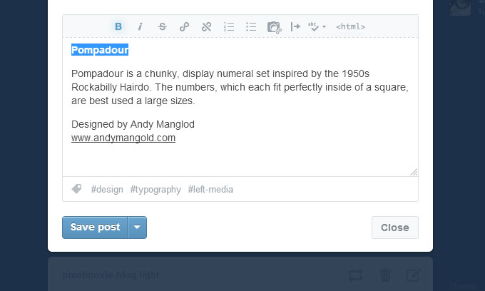
When you create a photo, photoset, audio or video post, Tumblr doesn’t give you the option to set a post title, only a caption. In order to show a title that takes you to the permalink page for the post when you click on it, we need to “fake it”.
That’s easy to do: when you write your post caption, highlight the first paragraph and make it bold. That line will be used as a title, positioned below the post media.
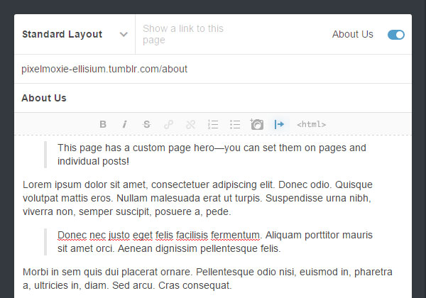
Since version v1.1.0, Ellisium has options to display custom, individual, page heroes for pages and posts.
Please notice that for this to work the option Show Permalink Page Hero needs to be enabled already, as this new function will just swap the hero text—it won’t insert a page hero if it isn’t already there.
Make sure the option Enable Custom Page Heroes is switched on. Now when you create a page on the customizer, select the first paragraph on the page content and make it a blockquote by clicking the “Block Quote” icon on the toolbar.
This works for individual posts too. On your dashboard’s post editor, simply select the first paragraph (or the second one if the first one is bolded to make a “fake” title), and turn it into a block quote. Next, add the _custom-hero tag to the post to enable this functionality.
In Ellisium, images in photosets are displayed as slides. You have the option to use regular “squared dots” controls to navigate the slides, or you can choose to have a series of mini-thumbnails below the slider for navigation. To activate the later, check the option “Enable Photosets Thumbs”.
If you visit the Typography page on the demo, you’ll see that we have styled the first paragraph a little bit differently. to achieve that effect you need to go into HTML mode and give the paragraph a class of “lead”, like so:
<p class="lead">Lorem ispum dolor sit amet... </p>Inside you pages or posts, you can have buttons, like the ones shown on the slider and “call-to-action”, or like the “hollow” buttons that invite you to “read more” at the bottom of some posts.
In the text editor, you need to create a link, using the WYSIWYG or the HTML views, and give it a class of “button”. You can further change your buttons with the classes “mini”, “small”, “large”, “has-arrow”, and “hollow”.
<a class="button" href="#">Click Me</a>
<a class="mini button" href="#">Click Me</a>
<a class="small button" href="#">Click Me</a>
<a class="large button has-arrow" href="#">Click Me</a>
<a class="small button hollow" href="#">Click Me</a>You can choose from Google’s vast library of fonts for this theme headings and a few other elements. For the body text, Ellisium uses “Source Sans Pro”, but you can edit the following fields to your heart’s content:
CallToAction Font Family
CallToAction Font Weight
Headings Font Family
Headings Font Weight
Italic Font Family
Italic Font Weight
Page Hero Font Family
Page Hero Font Weight
Pagination Font Family
Pagination Font Weight
Slider Headings Font Family
Slider Headings Font Weight
In the example below, the font family name would be Dosis, and its weight 600.
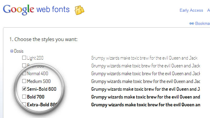
Here’s a selection of nicely designed Google Web Fonts:
To display Disqus comments, you need to enable the option “Enable Permalink Comments” and enter the “Disqus Shortname” for your site.
To track your visitors data, simple compete the “Google Analytics Id” field with your Tracking ID. Easy peasy!
| Variable Name | Description | Default Value |
|---|---|---|
| Button Background | Button background color | #18d3f0#18d3f0 |
| Button Background Hover | Button background color on hover | #2cd7f2#2cd7f2 |
| Button Bottom Border | Button bottom border | #0db0c9#0db0c9 |
| Button Bottom Border Hover | Button bottom border on hover | #0db0c9#0db0c9 |
| Button Text | Button text color | #f5f5f5#f5f5f5 |
| Button Text Hover | Button text color on hover | #ffffff#ffffff |
| CallToAction Background | Call to Action block background color | #ced6d5#ced6d5 |
| CallToAction Text | Call to Action text color | #577575#577575 |
| Chat Background | Color for posts of type Chat background | #42d1b9#42d1b9 |
| Chat Even Line Background | Color for posts of type Chat user1 background | #2cb59e#2cb59e |
| Chat Even Line Border | Color for posts of type Chat user1 border | #269c88#269c88 |
| Chat Even Line Text | Color for posts of type Chat user1 text | #ffffff#ffffff |
| Chat Heading | Color for posts of type Chat headings | #f2f2f2#f2f2f2 |
| Chat Link | Color for posts of type Chat links | #c4f3eb#c4f3eb |
| Chat Link Hover | Color for posts of type Chat links on hover | #ffffff#ffffff |
| Chat Odd Line Background | Color for posts of type Chat user2 background | #94e5d8#94e5d8 |
| Chat Odd Line Border | Color for posts of type Chat user2 border | #6bdbc9#6bdbc9 |
| Chat Odd Line Text | Color for posts of type Chat user2 text | #555555#555555 |
| Chat Text | Color for posts of type Chat text | #f5f5f5#f5f5f5 |
| Footer Background | Footer background color | #8c999b#8c999b |
| Footer Headings | Footer headings color | #f5f5f5#f5f5f5 |
| Footer Hollow Button Text | Footer hollow buttons text color | #e0e0e0#e0e0e0 |
| Footer Hollow Button Text Hover | Footer hollow buttons text color on hover | #ffffff#ffffff |
| Footer Links | Footer links color | #99f1ff#99f1ff |
| Footer Links Hover | Footer links color on hover | #333333#333333 |
| Footer Social Icons Background | Footer social icons background color | #ffffff#ffffff |
| Footer Social Icons Color | Footer social icons glyph color | #808080#808080 |
| Footer Social Icons Color Hover | Footer social icons glyph color on hover | #ffffff#ffffff |
| Footer Text | Footer text color | #f5f5f5#f5f5f5 |
| Header Background | Header background color | #2cbcd7#2cbcd7 |
| Headings Links | Text color for links inside headings | #666666#666666 |
| Headings Links Hover | Text color for links inside headings on hover | #333333#333333 |
| Headings | Text color for headings | #3c4f52#3c4f52 |
| Hollow Button Text | Hollow buttons text and border color | #808080#808080 |
| Hollow Button Text Hover | Hollow buttons text and border color on hover | #333333#333333 |
| Link Background | Color for posts of type Link background | #f5e749#f5e749 |
| Link Heading | Color for posts of type Link headings | #333333#333333 |
| Link Link | Color for posts of type Link links | #009de0#009de0 |
| Link Link Hover | Color for posts of type Link links on hover | #222222#222222 |
| Link Text | Color for posts of type Link text | #333333#333333 |
| Links | Text color for links | #00b2d6#00b2d6 |
| Links Hover | Text color for links on hover | #333333#333333 |
| Logo Text | Text color for type based logo, if enabled | #f5f5f5#f5f5f5 |
| Navi Accent | Navigation accent color | #00d4f5#00d4f5 |
| Navi Background | Navigation background color | #f0f0f0#f0f0f0 |
| Navi Background Hover | Navigation items background color on hover | #00d0f0#00d0f0 |
| Navi Dropdown Bg | Navigation dropdowns background color | #00d4f5#00d4f5 |
| Navi Dropdown Bg Hover | Navigation dropdowns items background color on hover | #00c2e0#00c2e0 |
| Navi Dropdown Text | Navigation dropdowns items text color | #ffffff#ffffff |
| Navi Dropdown Text Hover | Navigation dropdowns items text color on hover | #ffffff#ffffff |
| Navi Home Btn | Navigation Home button color | #00d0f0#00d0f0 |
| Navi Home Btn Hover | Navigation Home button color on hover | #808080#808080 |
| Navi Mobile Accent | Mobile navigation accent color | #00d4f5#00d4f5 |
| Navi Mobile Background | Mobile navigation background color | #f0f0f0#f0f0f0 |
| Navi Mobile Sub Accent | Mobile navigation level 2 accent color | #00bedf#00bedf |
| Navi Mobile Sub Bg | Mobile navigation level 2 background color | #ebebeb#ebebeb |
| Navi Mobile Text | Movile navigation text color | #808080#808080 |
| Navi Text | Desktop navigation text color | #808080#808080 |
| Navi Text Hover | Desktop navigation items text color on hover | #ffffff#ffffff |
| Page Background | Main page color background | #fafafa#fafafa |
| Page Hero Text | Page hero text color | #f5f5f5#f5f5f5 |
| Page Text | Main text color | #555555#555555 |
| Pagination Background | Pagination background color | #d7e0df#d7e0df |
| Pagination Link | Pagination links color | #798486#798486 |
| Pagination Link Hover | Pagination links color on hover | #555d5e#555d5e |
| Post Background Even | Background color for Even Posts | #edf2f1#edf2f1 |
| Post Background Odd | Background color for Odd Posts | #fafafa#fafafa |
| Quote Background | Color for posts of type Quote background | #ff7f3a#ff7f3a |
| Quote Heading | Color for posts of type Quote headings | #f2f2f2#f2f2f2 |
| Quote Link | Color for posts of type Quote links | #ffc3a3#ffc3a3 |
| Quote Link Hover | Color for posts of type Quote links on hover | #ffffff#ffffff |
| Quote Text | Color for posts of type Quote text | #f5f5f5#f5f5f5 |
| Searchbox Background | Searchform input background color | #97a3a5#97a3a5 |
| Searchbox Background Focus | Searchform input background color on focus | #6b787b#6b787b |
| Searchbox Border | Searchform input border color | #849294#849294 |
| Searchbox Icon | Searchform input icon color | #d3d8d9#d3d8d9 |
| Searchbox Text | Searchform input text color | #f5f5f5#f5f5f5 |
| Searchbox Text Focus | Searchform input text color on focus | #f5f5f5#f5f5f5 |
| Selection Background | Background color for selected text | #555555#555555 |
| Selection Text | Text color for selected text | #f5f5f5#f5f5f5 |
| Service 1 Accent | Service 1 accent color | #41d3f6#41d3f6 |
| Service 2 Accent | Service 2 accent color | #ff9988#ff9988 |
| Service 3 Accent | Service 3 accent color | #40d1ba#40d1ba |
| Service 4 Accent | Service 4 accent color | #83b6ee#83b6ee |
| Services Icons | Services webfont icons text color, when enabled | #f5f5f5#f5f5f5 |
| Sidebar Background | Sidebar background color | #dce5e4#dce5e4 |
| Slider Arrows | Homepage slider arrows color | #ffffff#ffffff |
| Slider Button Background | Homepage slider button background color | #ff6b54#ff6b54 |
| Slider Button Background Hover | Homepage slider button background color on hover | #ff725c#ff725c |
| Slider Button Bottom Border | Homepage slider button bottom border | #d85a47#d85a47 |
| Slider Button Bottom Border Hover | Homepage slider button bottom border on hover | #d85a47#d85a47 |
| Slider Button Text | Homepage slider button text color | #f5f5f5#f5f5f5 |
| Slider Button Text Hover | Homepage slider button text color on hover | #ffffff#ffffff |
| Slider Control Active | Homepage slider active control color | #00d4f5#00d4f5 |
| Slider Controls | Homepage slider controls color | #ebebeb#ebebeb |
| Slider Description | Homepage slider description text color | #fafafa#fafafa |
| Slider Heading Background | Homepage slider heading background color | #1a1a1a#1a1a1a |
| Slider Heading Text | Homepage slider heading text color | #ebebeb#ebebeb |
| Social Icons Background | Social icons background color | #f5f5f5#f5f5f5 |
| Social Icons Color | Social icons glyph color | #00b2d6#00b2d6 |
| Social Icons Color Hover | Social icons glyph color on hover | #f5f5f5#f5f5f5 |
| Tags Background | Browse widget tags background color | #dde3e2#dde3e2 |
| Tags Background Hover | Browse widget tags background color on hover | #738c88#738c88 |
| Tags Text | descriptionBrowse widget tags text color | #738c88#738c88 |
| Tags Text Hover | Browse widget tags text color on hover | #f4f6f5#f4f6f5 |
Support is provided on the comment section of the theme’s item page. If you wish to contact us directly with a support inquiry or feature request, you can do so using the form at the bottom of our ThemeForest author profile page.