Supple Tumblr Theme Documentation v1.6.2
About
Supple is a versatile Tumblr portfolio theme created by PixelMoxie. Supple is aimed at creatives—designers, illustrators, photographers, visual artists, etc. Its flexible portfolio grid lets you define the number of columns to show for different devices and screen resolutions and set the thumbnails aspect ratio to landscape, square, portrait and anything in between. You can also display a gapless portfolio grid or set a gutter between thumbs to let your artwork breathe. Since version 1.3.0, you can make the grid full width as well, to take advantage of all the available screen real estate. Supple supports all post types, including Vimeo, Youtube, Spotify and Soundcloud embeds.
Features
Retina Ready
Supple uses a combination of raster images and webfont icons. The images and icons used on SUPPLE user interface are neatly organized on standard and high resolution sprites and their PSD sources are included, in case you want to modified them to customize your website even further.
Homepage Slider
The responsive homepage slider can display up to five slides. Each slide can have a heading and sub-heading, and these can be vertically centered or aligned to the baseline. You can define text and background colors for each individual slide heading and subheading, and assign a URL so the slide acts as an hyper-link.
Photoset Grids
Drag and drop your photos to arrange them on the dashboard when creating or editing a photoset and Supple will match your layout with its responsive photoset grids. The images will open on a touch-friendly image lightbox when clicked.
Photosets As Sliders
Alternatively, display your photosets as responsive image sliders. Define its options independently from the homepage slider: autostart, loop, smooth height, etc.
Customizable Look
Supple has plenty of options to change colors, fonts, layout and many other settings to create a website tailored to your needs.
Ajax Post Loading
You can use the default pagination links, enable Ajax Post Loading to load more posts on demand by clicking a “Load More” button, or enable Endless Scrolling to load the next set of post without the need for manual interaction.
Flickr, Instagram, and Dribbble Photostreams
Display photos from your Flickr account, Instagram pictures and Dribbble shots on your site’s footer.
Bespoke Twitter Pager
Display your latest tweets with Supple’s exclusive tweet feed scroller.
Audio and Video Embeds
Responsive embeds for YouTube, Vimeo, Soundcloud and Spotify.
Social Icons
Supple includes an icon set covering the most ubiquitous social sites and services: 500px, Behance, Blogger, DeviantArt, Dribbble, Email, Facebook, Flickr, Google+, Instagram, LastFm, LinkedIn, MySpace, Picasa, Pinterest, Quora, Rdio, Reddit, Society6, SoundCloud, Spotify, Twitter, Vimeo, Vine, and Youtube.
Customizable Footer
Supple allows you to display one, two or three columns on your site footer. The About Widget allows you optionally upload a custom user portrait to replace your avatar. The first column can display a navigation menu that mimics the one on the header. The Text Widget can be useful to display your contact info or any other tidbit of information. The third column will show the Flickr, Instagram and Dribbble photostreams, as well as the Ask Me Anything box. The Twitter Widget cycles your tweets in ticker-like fashion and can span two or three columns. The Text Widget, Ask Widget and Photostreams can all be shown on alternate locations.
Filter Posts By Tag
You can define custom tags on the customizer and then enable the option to display the Tags Dropdown on the header navigation menu. Then simply tag your posts accordingly to allow your visitors to filter your projects by type.
Support For All Post Types
Although Supple excels at displaying visual content, all Tumblr post types are supported, including Text, Photo and Photosets, Quote, Link, Chat, Audio, Video, and Answer posts.
Support For User Created Pages
Create your custom pages on the customizer and enable the option to add a link to them so they are accessible from the navigation menu. Supple supports the Ask and Submit pages as well.
Disqus Commenting System
Supple includes support for comment count and comments threads on each post permalink page.
Google Web Fonts
You can set a custom Google Web Font family and weight for the following website elements: body text, footer text, headings, navigation, logo, thumbnails text and titles, slider captions, and pagination.
Image or Text Logo
You can upload a custom image for your logo (both standard resolution and high-res or “retina”), or optionally display the logo as text with a Google Font of your choice.
More Features
- Enable or disable the header fixed positioning.
- Enable or disable the header overlapping the slider.
- Show or hide the homepage slider, make its layout fullwidth or “boxed”.
- Show or hide navigation dropdowns for pages and custom tags.
- Show Like and Reblog buttons on the portfolio grid thumbnails (optional).
- Enable or disable the grid blur effect on hover.
- Enable or disable the footer copyright and theme credits.
- Use Supple custom image lightbox or Tumblr’s native one.
- Optional “scroll to top” button.
- Optional “faux” full width footer.
- Custom thumbnail images for photo and photoset posts (independently of the actual images on the post/set).
- Cap the photosets to a certain width.
- Option to open permalinks on a new browser tab.
Compatibility
Supple is compatible with all modern browsers and Internet Explorer 9.
Installation
Login to your Tumblr account, and once on your dashboard, click on the Account icon on the top-right corner of the page.
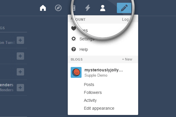
From the drop-down list, select the blog where you want to install the theme, and then click on Edit appearance.
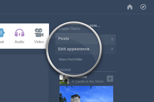
Once on the Settings page, click on the Edit theme button.
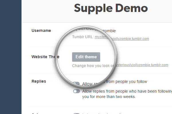
Click on the Edit HTML link, right below the current theme name.
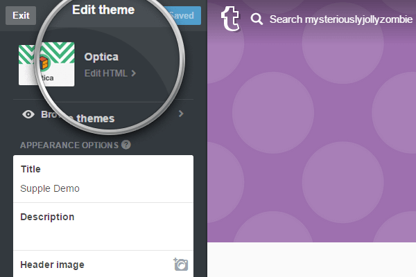
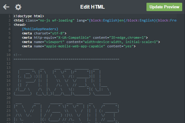
Open the .zip archive you downloaded and locate the file pixelmoxie-supple-1.6.2.html or pixelmoxie-supple-1.6.2.txt inside the theme folder. Open the file with a text editor of your choice.
If you’re on Windows, Notepad++ is a free and lightweight text editor. If you’re on a Mac and you’re using TextEdit, follow the steps outlined on this article to set up TextEdit to work with HTML files. Or you could download TextWrangler—a no-frills text editor for the Mac—and give it a try.
Copy the contents from the file you just opened and paste it on the HTML editor, replacing the old theme code on its entirety. It’s important that the code looks pretty much as in the image below, or the theme won't install properly; if it doesn’t, your text editor probably parsed the code and what you pasted isn't the raw HTML markup. Make sure your text editor is properly configured to work with HTML files and that the code isn't altered.
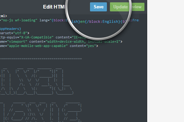
Click on the Update Preview button, and once the preview is updated, click on the Save button and reload the page.
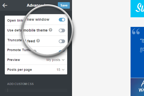
Before you start customizing your theme and populating your portfolio, click on Advanced options at the bottom of the customizer.
Make sure Use default mobile theme is off, or the theme will not be used when viewing your blog on mobile devices. You should also set the Posts per page to fifteen, the maximum possible value, so that your portfolio projects load as quickly and seamlessly as possible.
Congratulations! Your theme is now installed.
Notice: If you’re updating from an older version of the theme, some icons may be missing or displaying incorrectly, especially arrows and icons on retina screens. This happens because Tumblr “remembers” the old image assets instead of using the new ones. To remedy this, simply find the options Sprite and Sprite Hires, click on the pencil icon and choose “Remove” for both images. This will force the theme to use the newest image assets.
Customization
Your Custom Logo
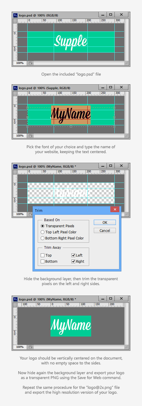
Upload the standard and high-resolution (“retina”) versions of your logo using the Logo and Logo Hires image upload fields respectively. The high-res version is optional. Your logo should be exported from Photoshop (or any image editing software) as a PNG image with a transparent background.
Your logo should be 72px tall to match the default height of the page header. If you need your logo to be taller than that, set a different height for the header using the option Header Height and make sure your logo matches that height.
Whitespace above and below your logo is Ok, just make sure to trim any transparent pixels from the sides before you export your images. The retina version of your logo should be exactly twice as large as the standard version.
You can use the included PSD files (logo.psd and logo@2x.psd) as a basis or template for your logo, just make sure to trim the transparent pixels to the left and right before you save the file and export the images using the Save For Web command. The font used on the included PSDs is Mission Script by Lost Type.
We highly recommend you further optimize your logo image (and all of your images) using a tool like Optimizilla to improve page load times.
Displaying Your Logo As Text
Alternatively, you can display your logo as text. To do so, you need to switch on the option Enable Text Logo.
The logo will then match the title of your blog. You can set the text color for your logo using the Logo Text color picker.
By default the logo font family will match the one set for body text. If you wish to use a different Google Web Font, you need to enter the font family name and weight into the fields Logo Font Family and Logo Font Weight.
Use the Logo font Size field to alter the size of the logo text—make sure to enter the size as a number, with no units. The default value is 36.
The option Enable Logo Offset On Hover will control whether the logo is displaced a few pixels to the right when hovering over it.
The Homepage Slider
You can display up to five slides on the homepage slider. The following options control whether the slider is shown or not and how it behaves.
Slide [1-5]
Use these image upload fields to set the image for each slide. Please note that only slides which are assigned an image are displayed on the slider. For most purposes images between 1600-1900 pixels wide will work well. If you notice your artwork shows artifacts on large screens, you can make your images wider (about 2500px). Remember heavier images will make your website load slower. Make sure to optimize your images, even if they are saved for the web, using a tool such as Optimizilla.
Pattern Overlay and Pattern Overlay Hires
Use these image fields to upload the standard and retina versions of a PNG image pattern if you want it to overlay the slider images. Patterns should be PNG images with transparency. Have a look at the included dotted_pattern.png and dotted_pattern@2x.png as an example.
Enable Slider
Show or hide the slider.
Enable Slider Autostart
If enabled, the slideshow will start automatically when the page loads.
Enable Slider Centered Captions
If enabled, the slider captions will be vertically centered, otherwise they will align to the slider baseline.
Enable Slider Control Nav
Show or hide the slider pagination dots.
Enable Slider Direction Nav
Show or hide the slider right and left arrows.
Enable Slider Fullwidth
If enabled, the slider will span the full width of the browser window, otherwise the slider will be boxed.
Enable Slider Individual Colors
If enabled, each slide will use individual colors for headings and subheadings, otherwise they will share the same common values for text and background colors.
Enable Slider Large Captions
Embiggen the slider captions text.
Enable Slider Loop
If enabled, the slider will go back to the first slide once it reaches the end.
Enable Slider Pause On Hover
Pauses the slideshow when hovering over the slider.
Enable Slider Smooth Height
Animates the height of the slider when transitioning between slides of different size. Leave this option disabled if all your slides have the same dimensions and proportions (this is recommended for smoother behavior).
Swap Slider Headings Positions
When enabled, the slides sub-heading will be on top of the larger heading.
Hide Slider On Tag Pages
Enable this option to hide the slider when visiting a tag page.
Slider Animation
Set the transition style for the slider. Type either fade or slide.
Slider Animation Speed
The duration for each slider transition. Defaults to 600.
Slider Slideshow Speed
The interval in between each slide (when autostart is on). Defaults to 5000.
Slider Headings Separation
The gap, in pixels, between the slides headings and sub-headings. Defaults to 1.
Slider Heading Base Font Size
Use a smaller or greater value to control the text size of the slider headings. Defaults to 17.
Slider Heading Font Family
The family name of the Google Web Font to be used on the slider headings. Uses Dosis by default.
Slider Heading Font Weight
The weight of the Google Web Font to be used on the slider headings. Generally, 400 corresponds to normal weight and 700 to bold, but some Google fonts support other font weights, such as 200, 300 or 600.
Slider Subheading Base Font Size
Use a smaller or greater value to control the text size of the slider sub-headings. Defaults to 17.
Slider Subheading Font Family
The family name of the Google Web Font to be used on the slider sub-headings. Uses Dosis by default.
Slider Subheading Font Weight
The weight of the Google Web Font to be used on the slider sub-headings. Generally, 400 corresponds to normal weight and 700 to bold, but some Google fonts support other font weights, such as 200, 300 or 600.
Slider Maximum Height
If left empty, the slider height will match the tallest of the slides. Enter a unitless value (meant as pixels) to prevent the slider for becoming too tall on large displays. Defaults to 400.
Slide [1-5] Heading
The main heading text for each slide.
Slide [1-5] Subheading
The sub-heading text for each slide.
Slide [1-5] URL
Optionally enter a URL for each slide.
The Site Header and Navigation Menu
While earlier versions of the theme had the header set to a fixed height of 72px, since version 1.3.0 you can set a different header height, in case you need to accommodate a bigger logo, or just for aesthetic reasons. To change the header height, look for the Header Height text option, and enter the new height as a unitless value (it defaults to 72).
Here are more options to customize the header and navigation menu:
Enable Fixed Header
If enabled, the header position will be fixed, otherwise the header will be laid out in its normal position in the flow and scroll normally with the rest of the page contents.
Enable Header Gradient
Show or hide the gradient underneath the logo.
Enable Header Slider Overlap
If enabled, the header will overlap the slider, obscuring part of it. If disabled, the header will be positioned above the slider and it will span the full width of the page.
Navigation Vertical Align
This controls whether the navigation and search-box will be vertically centered inside the header, or aligned to the top or bottom. This is useful when setting the header height to a value greater than 72. With the default height this option will not have a noticeable effect. The available values are bottom, middle and top.
Enable Navigation [Home|Random|RSS] Button
Show or hide the Home, Random and RSS buttons from the navigation menu.
Enable Pages Dropdown
When enabled, links to your custom pages will be grouped inside a dropdown menu, taking a lot less menu real state. Otherwise the links will be display as inline elements, side by side.
Enable Tags Dropdown
Show or hide the dropdown menu containing your custom tags (used to filter your posts) on the navigation bar.
Enable Tags Dropdown Block Style
If enabled, tags inside the dropdown will be displayed as block items (same style as the links on the pages dropdown). Otherwise they will be shown as smaller, inline links.
Custom Tag [1-10]
Enter up to ten custom tags. These will be displayed on the tags dropdown on the navigation bar. This will allow your visitors to filter your content using these tags. Remember to use the exact same tags on your posts for them to show on your filtered results (tag pages).
Navigation Font Family
The family name of the Google Web Font to be used on the navigation. Default value is Open Sans.
Navigation Font Size
The text size for the navigation menu items, set as pixels. Default value is 14.
Navigation Font Weight
The weight of the Google Web Font to be used on the navigation. Generally, 400 corresponds to normal weight and 700 to bold, but some Google fonts support other font weights, such as 200, 300 or 600.
Navigation Link Opacity Hover
The opacity of the navigation menu items on hover. Enter an integer or decimal value between 0 and 1. Defaults to 0.8.
Navigation Pages Dropdown Label
The label to be displayed on top of the pages dropdown. If left empty will default to Pages.
Navigation Tags Dropdown Label
The label to be displayed on top of the tags dropdown. If left empty will default to Tags.
Navigation Tags Font Family
The family name of the Google Web Font to be used on the navigation tags dropdown. Default value is Open Sans.
Navigation Tags Font Size
The text size for the navigation tags dropdown links, set as pixels. Default value is 14.
Navigation Tags Font Weight
The weight of the Google Web Font to be used on the navigation tags dropdown. Generally, 400 corresponds to normal weight and 700 to bold, but some Google fonts support other font weights, such as 200, 300 or 600.
Navigation Tags Radii
The border-radius value for the navigation tags dropdown links. Use to make the links less or more rounded. Defaults to 3.
Welcome Message
Since version 1.4, you have the option to display a Welcome Message to your visitors. This block will be inserted between the image slider and the portfolio grid. To enable this feature, make sure the Enable Welcome Message toggle is switched on.
Enter a title for the message using the Welcome Message Title option, and paste the welcome message content into the Welcome Message Content field. For the content, you can use some HTML tags for paragraphs, bold or italic text, and hyperlinks.
<p>This is the welcome message content. You can use HTML tags for paragraphs, <strong>bold</strong> text, <em>italic</em> text and <a href="#">hyperlinks</a>.</p>
<p>Look, we have buttons too!</p>
<p><a class="button" href="#">Click me</a></p>
Additionally, we added some CSS classes you can use to turn any link into a nifty looking button. This buttons can be displayed not only on the welcome message, but also within the project details on permalink pages. After creating a hyperlink, turn the post editor into HTML mode and add the class button to the <a> tag. You can also make your button bigger or smaller by adding the classes large and small.
For example, the following code
<p><a class="button small" href="//mysite.com/contact" target="_blank">Get in touch</a></p>
<p><a class="button" href="//mysite.com/contact" target="_blank">Get in touch</a></p>
<p><a class="button large" href="//mysite.com/contact" target="_blank">Get in touch</a></p>
Will render these buttons:
The welcome message is left-aligned by default. This is to match the layout of the content on permalink pages. You will also notice that the captions inside the image slider match the alignment of the message when enabled. if you’d rather have the welcome message centered on the page, just enable the option Center Welcome Message.
The Portfolio Grid
Setting The Grid Layout
Since version 1.5.0, two different layout types are available for the portfolio grid, and can be set via the Grid Layout dropdown.
The Default layout is the old behaviour. When selected, the thumbnails heights will be uniform and defined by the option Thumbnail Height Percentage.
If you select the Masonry layout, the thumbnails heights will be variable, depending on the post contents. For Photo and Photoset posts, the single image or the first image of the set will determine the thumbnails proportions. Or if you set a custom thumbnail image, that image will be used instead.
If Text posts become too tall on the grid when the masonry layout is enabled, you can insert a "read more" link to truncate the post content on the homepage. For Audio posts, you will need to set a set a custom thumbnail image, or the post height will equal zero. It's a good idea to set a custom thumbnail for Video posts as well.
Setting The Number Of Columns
While on smartphones the posts in the grid will be displayed on a single column, you have complete control over the number of columns to display on larger devices and different screen sizes.
Grid Phone Portrait Cols
This option targets phones in portrait mode, as long as the device screen is at least 360px wide. You can set it to one or two columns.
Default value is 1.
Grid Phone Landscape Cols
This option targets phones in landscape mode. You can set it to one or two columns.
Default value is 1.
Grid Tablet Portrait Cols
This option targets tablets in portrait mode. You can set it to one, two, or three columns.
Default value is 2.
Grid Tablet Landscape Cols
This option targets tablets in landscape mode. You can set it to one, two, three, or four columns.
Default value is 3.
Grid Desktop Cols
This option targets smaller desktop screens (1280px and up). You can set it to one, two, three, four, or five columns.
Default value is 4.
Grid Wide Desktop Cols
This option targets larger desktop screens (1440px and up). You can set it to one, two, three, four, five, or six columns.
Default value is 4.
Setting The Thumbnails Height
On the portfolio grid, the thumbnails height is defined as a percentage of the thumbnails width. This way you’re not locked into any fixed proportions or aspect ratios.
Use the Thumbnail Height Percentage option to set the thumbnails height as a percentage of their width. Enter an integer value with no units. For example: a value of 75 will give you landscape oriented thumbnails, 100 will result in squares, and 134 will make your thumbs portrait oriented.
Use Thumbnail Vertical Align to set the alignment of the thumbnail images inside their container. The available options are center, top and bottom, the default being center.
Setting The Thumbnails Spacing
Look for the option Portfolio Grid Gutter to set the gap between thumbnails. A value of 0 will give you a gapless grid. If you want to give your artwork a little breathing space, set this to a higher value, something like 10 or 20. If you leave this option empty, there will be a 1px gap in between thumbs, which is the default gutter value.
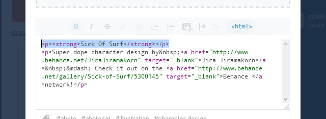
Titles For All Post Types
Photo, Photosets, Audio and Video posts don’t have a proper title in Tumblr—as opposed to Text posts, for example. In order to display titles for these post types, both on the portfolio grid and on their permalink pages, we have to “fake” them.
It’s quite simple, actually. When creating or editing a post on the dashboard, edit the post caption and make sure the first paragraph is a single line of text. This will be your post title. Now, select the entire line and make it bold, the save your changes. That’s all!
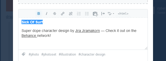
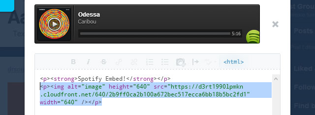
If you want to make sure your post markup is well-formed, enter <html> mode and make sure your code looks similar to the one below.
Using Inset Titles
To give your thumbnail titles an alternative, softer style, switch on the option Enable Inset Thumbnail Titles.
Custom Thumbnail Images
Thumbnail Images For Audio And Video Posts
Audio and Video posts don’t have an associated image that can be shown on the portfolio grid. For Audio posts, if you upload an mp3 file from your computer—in which case it will be reproduced using Tumblr’s audio player—you can select an image for the album art after the audio file is done being processed, and that image will be shown as the thumbnail. But this isn’t the case for Soundcloud or Spotify embeds.
For Video posts, if you embed a Vimeo or Youtube video, Supple will attempt to fetch a thumbnail using those services respective APIs, but sometimes the resulting image doesn’t look that good or isn’t very indicative of the video content. If you upload a video from your computer it will be reproduced using Tumblr’s native video player, and in this case a video thumbnail won't be available.
No matter what, it’s possible—and recommended—to insert a custom image for the video thumbnail using the following method:
On a new paragraph below the “fake” title you created for your post, insert an image by clicking on the camera icon (Insert/Edit Image). You will need to enter the image URL, so your image will have to be hosted somewhere.
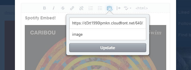
For this, you could use one of the many image hosting services available (imgur comes to mind), link to your image from your Dropbox account, or even host the image on Tumblr itself. To do that, create a Photo post and upload as many images as you need, then set the post as “private” so it’s not facing the public, right-click on your image (or hold the Control key while clicking on a Mac) and select “Copy image URL”.
You need to use this method when uploading a video from your computer or if you’re embedding audio from Soundcloud or Spotify, otherwise your thumbnail won’t have an image. With YouTube and Vimeo videos, you can use this method too if you don't want to display the default video thumbnail.
Custom Thumbnail Images For Photo and Photoset Posts
By default, the thumbnail image for Photo posts will be the post image, or the first image on the set in the case of Photoset posts with multiple images. However, there might be occasions when you want the thumbnail to be something else, to use an image that fits better in the grid, or for art directing reasons. In those cases, you can use the same method outlined for Audio and Video posts to define a custom thumbnail image (i.e.: insert it into the post caption).
After you insert your custom thumbnail image, you need to add the tag _custom-thumbnail to your post for it to work.
Thumbnail Images For Text Based Posts
Since version 1.4, Supple adds the ability of using thumbnail images for text-based posts, making them effectively look the same way photo posts do on the grid. This is possible for Text, Quote, Link and Answer posts.
You can enable this globally by switching on the option Enable Text Posts Thumbnail Images, or you can only target individual posts by adding the tag _thumbnail-image to the post. Targeted posts need to have an image inserted into the caption/description for this to work. The first image found will be used as the post thumbnail, and hidden from view when visiting the post permalink page. If no image is found, the post will be displayed in the traditional way.
“Like” and “Reblog” Buttons
To display “Like” and “Reblog” buttons on the portfolio thumbnails, switch on the options Enable Thumbs Like Buttons and Enable Thumbs Reblog Buttons, respectively.
On desktop screens, the buttons will be visible when hovering over the thumbnails, while on mobile devices, they will be visible at all times.
You can also set the icons opacity and have options to use “white”, “grey” or “black” buttons.
Enabling The Grid Image Lightbox
Since version 1.5.0, you can optionally view the full resolution images (for Photo and Photoset posts) by enabling the option Launch Image Lightbox From Grid.
When this option is enabled, an additional magnifier icon will be shown on the thumbnails overlays for these post types. Clicking the thumbnail inside this icon will launch the image lightbox (custom or native), and clicking outside the icon will redirect to the post permalink page.
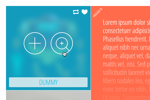
On touch-enabled devices, this second icon won't be shown, but an appropriate one will appear on the top-left corner of the thumbnail.
More Options
Enable Fullwidth Portfolio Grid
Enable this to make the portfolio grid span the full width of the browser window.
Padded Fullwidth Portfolio Grid
When the fullwidth portfolio grid is enabled, having this option switched on will add the portfolio gutter to the left and right ends of the grid.
Enable Grid Blur Effect On Hover
Enable or disable the blur effect when hovering over the portfolio grid thumbnails. This only work on Chrome and webkit browsers at the time of writing. This option is disabled by default.
Enable Grid Text Overflow
If this is enabled, the copy on Text, Quote, Link, Chat and Answer posts will flow a few pixels past the right of the thumbnail.
Enable Unclickable [Text|Quote|Chat|Link|Answer] Blocks
Enabling any of these options will make these post types on the grid “un-clickable”, so that their contents can be accessed and selected. When this option is switched on, the post type icon becomes the link to the post permalink page.
Thumbnail Title Font Family
The family name of the Google Web Font to be used on the thumbnails titles. Default value is Open Sans Condensed.
Thumbnail Title Font Size
The text size for the thumbnails titles, set as pixels. Default value is 23.
Thumbnail Title Font Weight
The weight of the Google Web Font to be used on the thumbnails titles. Generally, 400 corresponds to normal weight and 700 to bold, but some Google fonts support other font weights, such as 200, 300 or 600.
Thumbnail Title Opacity
Set the opacity of the thumbnails title. Enter an integer or decimal value between 0 and 1. Defaults to 1.
Thumbnail Title Padding
Padding around the thumbnail title, in pixels. Defaults to 5.
Thumbnail Inset Title Margin
When using inset titles, this is the gap between the title and the thumbnail edges. Defaults to 10.
Thumbnail Inset Title Opacity
When using inset titles, this sets the title's opacity. An integer or decimal value between 0 and 1. Defaults to 0.8.
Thumbnail Inset Title Radii
The border-radius value for the inset titles. Use it to make the title boxes less or more rounded. A value between 0 and 5 Defaults to 3.
Thumbnail Text Font Family
The family name of the Google Web Font to be used on the thumbnails text (Text, Quote, Link, Chat and Answer posts). Default value is Open Sans Condensed.
Thumbnail Text Font Size
The text size for the thumbnails text, set as pixels. Default value is 23.
Thumbnail Text Font Weight
The weight of the Google Web Font to be used on the thumbnails text. Generally, 400 corresponds to normal weight and 700 to bold, but some Google fonts support other font weights, such as 200, 300 or 600.
Thumbnail Overlay Opacity
Opacity of the thumbnail overlay tint. An integer or decimal value between 0 and 1. Defaults to 0.7.
Thumbnail Post Type Icon Opacity
Opacity of the thumbnail icon on the top left corner of text based posts. An integer or decimal value between 0 and 1. Defaults to 0.4.
Thumbnail Image Blur Radii
Intensity of the blur effect for thumbnail images. Defaults to 8.
Thumbnail Text Blur Radii
Intensity of the blur effect for thumbnail text. Defaults to 3.
Tumblr Button Opacity
Opacity of the “like” and “reblog” buttons on the thumbnail overlays. An integer or decimal value between 0 and 1. Defaults to 1.
Use Tumblr Black Buttons
Show “like” and “reblog” black buttons. Overrides default white buttons.
Use Tumblr Grey Buttons
Show “like” and “reblog” grey buttons. Overrides black and white buttons.
Thumbnails Use Hires Images
Enable this option if you have set your grid to a small number of columns and the thumbnails are really wide as a result. This will cause the full resolution images to be displayed on the grid, otherwise 500px wide images will be used.
Pagination and Ajax
To paginate your portfolio content, you can use the standard pagination links below the grid (“Newer Posts” and “Older Posts” buttons), or you can enable Ajax post loading to load your content dynamically, and—additionally—the Endless scroll option.
The following options control how the pagination works:
Enable Ajax Post Loading
Enable this to load your content dynamically, replacing the static pagination links with a “Load More Posts” button.
Enable Endless Scroll
Enable this to allow actual endless scrolling. The next set of posts will be loaded as soon as the user scrolls past the end of the portfolio grid. For this option to work, Enable Ajax Post Loading needs to be enabled too.
Keep Ajax Complete Alert Visible
Enable this to keep the “No More Projects To Display” message visible after all posts were loaded. Disable this option to fade out and hide the alert after a timeout.
Open Permalinks In New Tab
Enable this option to open projects on a new browser tab.
Pagination Font Family
The family name of the Google Web Font to be used on the pagination. Default value is Open Sans.
Pagination Font Size
The text size for the pagination buttons, meant as pixels. Default value is 14.
Pagination Font Weight
The weight of the Google Web Font for the pagination buttons. Generally, 400 corresponds to normal weight and 700 to bold, but some Google fonts support other font weights, such as 200, 300 or 600.
Pagination Prev Post Label
Label for the previous post button. Default value is Older Post →.
Pagination Next Post Label
Label for the next post button. Default value is ← Newer Post.
Pagination Prev Posts Label
Label for the previous page button. Default value is Older Posts →.
Pagination Next Posts Label
Label for the next page button. Default value is ← Newer Posts.
Pagination Load More Label
Label for the "Load More Posts" button. Default value is Load More Posts.
Pagination Loading Label
The text that will show while the posts are being loaded. Default value is Loading, Please Wait.
Pagination Loading End Label
Message to display after all posts have been loaded. Default value is No More Posts to Display.
Extra Scroll Pixels
This is the amount of pixels you will need to scroll past the bottom end of the grid before Ajax post loading is triggered. The default value is 150, but you can set it to a negative value (-150 for example) to start loading the next set of posts before you reach the end of the grid.
Permalink Pages
Use the following options to control the way post permalink pages—the project details—look and behave:
Enable Permalink Blocky Headings
When enabled, the post title will be shown as a large solid block on top of the post content. This applies only to Text posts.
Enable Permalink Comments
Turn Disqus comments on and off. Don't forget to enter you Disqus Shortname or the Disqus thread won't show up. If you don't have a Disqus account, you will need to sign up and add a profile for your site.
Since version 1.6.0, you can display Facebook comments instead. You need a public Facebook App in order to provide the Facebook App ID. Head over to Facebook Developers and register a new website application under "My Apps > Add a New App", or use an existing one. You can select "Skip and Create App ID", enter a Display Name and Category, and click on "Create App ID". Once on the App dashboard, copy the value of App ID and paste into the Facebook App ID setting.
As long as the Facebook App ID setting isn't empty, the Disqus commenting system will be replaced with the Facebook comments plugin. If you want to be able to moderate the comments, make sure the App is publicly available — go to "Status and Review" and make the App available to the general public (you'll need to provide a valid contact email address.)
Enable Permalink Date
Show or hide the post publication date.
Enable Permalink Notes
Show or hide the post notes.
Enable Permalink Sharing
Show or hide the share counter and the AddThis popup.
Enable Permalink Tags
Show or hide the post tags on permalink pages.
Enable Permalink Tumblr Button
Show or hide the “like” and “reblog” buttons on permalink pages.
Override Perma Headings Background Color
When this option is switched off, the colored blocks at the top of permalink pages (for Text, Quote, Chat and Answer posts) will match the colors set for the same post types on the portfolio grid. Enable this option if you want to override this colors with uniform values, set by Perma Heading Background Override and Perma Heading Text Override.
Open Single Images In Lightbox
When enabled, single images in Photo posts will open in a lightbox when clicked, just like photosets.
Use Tumblr Native Lightbox
Enable to use Tumblr’s native image lightbox instead of the custom one that comes with the theme.
Prevent Image Upscaling
Prevents images on Photo posts (single image) to be enlarged beyond their natural width. Useful to prevent small images from becoming blown-up.
Heading Font Family
The family name of the Google Web Font to be used on the permalink headings. The default value is Open Sans.
Heading Font Weight
The weight of the Google Web Font to be used on the slider headings. Generally, 400 corresponds to normal weight and 700 to bold, but some Google fonts support other font weights, such as 200, 300 or 600.
Body Font Family
The family name of the Google Web Font to be used on the body text. The default value is Open Sans.
Body Font Weight
The weight of the Google Web Font to be used on the body text. The value will depend on your choice of font, generally is 400 (medium or book font weight) but some font support lighter weights (200 or 300).
Body Bold Font Weight
The weight of the Google Web Font to be used for the bold text on the site body. The most common value is 700, but some families offer support for 600 as well (semi-bold).
Photoset Gutter
The gap in between images when displaying your photosets as grids. The value should be an integer (no units) and it defaults to 1.
Photoset Max Width
Use this option to cap the photoset width to a certain value. Useful when your images are small and become too blurry because of the stretching. Sample values could be 600, 700 or 800.
Edge Project Media On Phones
Enable this option to make the project media on permalink pages stretch horizontally to the edges of the device display (only for phones in portrait mode.)
Displaying Your Photosets As Sliders
If you don't want to display your images on a grid, you can show them using a slider similar to the one on the homepage. for this you will need large enough images and it will look and work better if the images are all the same size or close enough.
Display Photosets As Sliders
Toggle displaying photosets as sliders on and off.
Enable Photoset Slider Autostart
If enabled, the photoset slideshow will start automatically when the page loads.
Enable Photoset Slider Loop
If enabled, the slider will go back to the first slide once it reaches the end.
Enable Photoset Slider Pause On Hover
Pauses the slideshow when hovering over the slider.
Enable Photoset Slider Smooth Height
Animates the height of the slider when transitioning between slides of different size. Leave this option disabled if all your slides have the same dimensions and proportions (this is recommended for smoother behavior).
Photoset Slider Animation
Set the transition style for the photoset slider. Type either fade or slide.
Photoset Slider Animation Speed
The duration for each slider transition. Defaults to 600.
Photoset Slider Slideshow Speed
The interval in between each slide (when autostart is on). Defaults to 5000.
Goggle Web Fonts
You can choose from Google’s vast library of fonts for most of the theme elements—simply enter the font family name and weight into the corresponding text fields. You can set separate Google font options for the body text, permalink headings, slider captions, thumbnails text and titles, desktop and mobile navigation, pagination, footer widgets text and headings, and for the logo when using the text version.
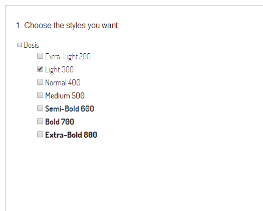
Go to Google Fonts homepage and select your font. You can click on the “Pop out” icon to see the specimen details and the available styles. To get the font family name and weight, click on the “Quick-use” icon. For this example we’re using Dosis, which comes in seven styles. Let’s say we want to use the light version for our headings. In this case the family name would be Dosis and the weight 300.
Narrower fonts will work best for the footer headings, slider captions and thumbnail titles. Here’s a selection of well designed fonts you can peruse:
Josefin Slab, Arvo, Lato, Abril Fatface, Ubuntu, PT Sans, Droid Sans, Source Sans Pro, Cabin, Gudea, Rokkitt, Glegoo, Asap, Amaranth, Armata, Cutive, Abel, Dosis, Varela, Quattrocento Sans
Specifying Script Subsets
If you need support for characters not available on the default Latin script subset that loads by default, you can specify a custom script subset to load.
Some of the fonts in the Google Font Directory support multiple scripts (like Latin and Cyrillic for example). It’s fundamental that you pick a font that includes the characters you need for the text in your website to display correctly, then specify the correct subset using the select box labeled Google Fonts Subset.
The available options are: Latin (default), Latin extended, Cyrillic, Cyrillic extended, Greek, Greek extended, Khmer, and Vietnamese.
Text Transformations
You can apply a text-transform property to many of the theme elements using the following select boxes:
Heading Text Transform
Slider Heading Text Transform
Slider Subheading Text Transform
Thumbnail Title Text Transform
Pagination Text Transform
Footer Heading Text Transform
The available options are capitalize, uppercase, lowercase and none.
Disabling Media Queries
Media queries can be sequentially disable in order to make the website content more narrow, making the desktop layout closer to the one on tablets or phones. Please not that media queries need to be disabled sequentially and in the following order, so no visual glitches are introduced:
Enable 1440px Media Query
Enable 1280px Media Query
Enable 1024px Media Query
Enable 768px Media Query
Enable 480px Media Query
Filtering Posts By Tag
To allow visitors to filter your content using custom tags of your choice, make sure the option Enable Tags Dropdown is switched on, and then enter you tags into the fields Custom Tag [1-10]. Make sure to tag the relevant posts using the same tags for the filters to work. A dropdown menu with your custom tags will be shown on the navigation bar, and each link will redirect to a specific tag page.
The Page Footer
The following options control the appearance of the site footer:
Enable Footer Second Column and Enable Footer Third Column
Show or hide the footer second and third columns.
Enable Footer Equal Column Widths
Make all footer columns width the same, whenever possible.
Enable Footer Navigation
Display a navigation menu on the footer mimicking the nav on the header, underneath the “About Me” section.
Enable Footer Copyright and Enable Footer Credits
Show or hide the footer copyright notice and theme credits.
Enable Footer Gradients
Show or hide the gradients between the footer columns and above the Twitter ticker.
Enable Social Links
Show or hide the social links.
Enable Social Links Gradients
Show or hide the gradient the social links sit atop.
Enable Fullwidth Twitter Ticker
Make the Twitter ticker full-width, spanning three columns instead of two.
Enable Faux Fullwidth Footer
Enable this option to visually extend the footer, making it looks as if it spans the whole page width.
Enable Faux Fullwidth Footer On Permalinks
Same as above, but for permalink pages as well.
Footer Heading Font Family,
Footer Heading Font Size,
Footer Heading Font Weight,
Footer Widget Font Family,
Footer Widget Font Size,
Footer Widget Font Weight,
Footer Widget Bold Font Weight
This options should be familiar by now. They set the family name of the Google Web Font to be used on the footer widgets and headings, their size and weight.
Footer Widgets
Social Icons Widget
To display your social icons, make sure the Enable Social Links option is switched on. Enter the URL for each one of the services you want to display on the fields URL [social service name], including the http:// portion at the beginning of the website address.
The available services are: 500px, ArtStation, Bandcamp, Behance, Blogger, DeviantArt, Dribbble, Email, Etsy, Facebook, Flickr, Google+, Instagram, LastFm, LinkedIn, MySpace, Picasa, Pinterest, Quora, Rdio, Reddit, Society6, SoundCloud, Spotify, Twitter, Vimeo, Vine, and Youtube.
Additionally, a generic “shopping cart” icon is available, that you can use to direct visitors to your online shop (URL Shop).
About Widget
Toggle the option Enable Footer About Widget to show or hide this widget. The widget will display your blog avatar and description. You can show a custom avatar or portrait if you upload an image using the Portrait image upload field. If you want your portrait image to be a link, enter a web address into the Portrait Link URL field. Set the widget title using the option About Widget Title. If left empty will default to About me.
Text Widget
The Text Widget will be displayed on the second column by default. Toggle its visibility using the option Enable Footer Text Widget. This widget can be useful to show your contact details or any kind of extra information about yourself. The widget contents should be pasted into the Text Widget Description field. You can use some HTML tags, for example:
<em>ADDRESS:</em> 221 Wall Street, <br>
New York, United States <br>
<em>TEL:</em> +12 346-678-90 <br>
<em>FAX:</em> +12 346-678-90 <br>
<em>EMAIL:</em> <a href="mailto:johndoe@gmail.com">johndoe@gmail.com</a>
If you check Enable Text Widget Alt Location, the widget will be moved to the first column. Use the Text Widget Title option to set the widget title.
Ask Me Anything Widget
If you allow users to ask questions on your site, you can display the Ask me anything box on the footer third column. Use the option Enable Footer Ask Widget to toggle its visibility. If you check Enable Dribbble Widget Alt Location the ask box will be moved to the second column. You can display an additional message underneath the ask box if you type it into the Ask Widget Description field. Use the Ask Widget Title option to set the widget title.
If you have enabled questions but leave this widget disabled, a link to the Ask page will be shown on the Pages navigation dropdown.
Flickr Widget
To display images from your Flickr account, make sure the Enable Footer Flickr Widget option is switched on. Enter your Flickr ID, which you can obtain here, and set the Flickr Count option to limit the number of images shown (default is 6). If you're pulling from a group instead of an individual feed, you need to check Enable Flickr Group Feed. To move the widget from the third column to the second one, check Enable Flickr Widget Alt Location. Use the Flickr Widget Title option to set the widget title.
Dribbble Widget
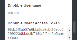
To display your Dribbble shots, make sure the Enable Footer Dribbble Widget option is switched on. Enter your Dribbble Username and set the Dribbble Count option to limit the number of shots (default is 6). To move the widget from the third column to the second one, check Enable Dribbble Widget Alt Location. Use the Dribbble Widget Title option to set the widget title.
In version 1.6.0, the Dribbble widget was updated to wotk with the new Dribbble API, and all calls to to API must be authenticated. Besides the Dribbble Username, you’ll need to register an application and provide a Dribbble Client Access Token, which wasn’t a requirement before.
To register an application, head over to https://dribbble.com/account/applications/new. Fill in all the fields and register the app. You can enter your portfolio URL for both Website URL and Callback URL.
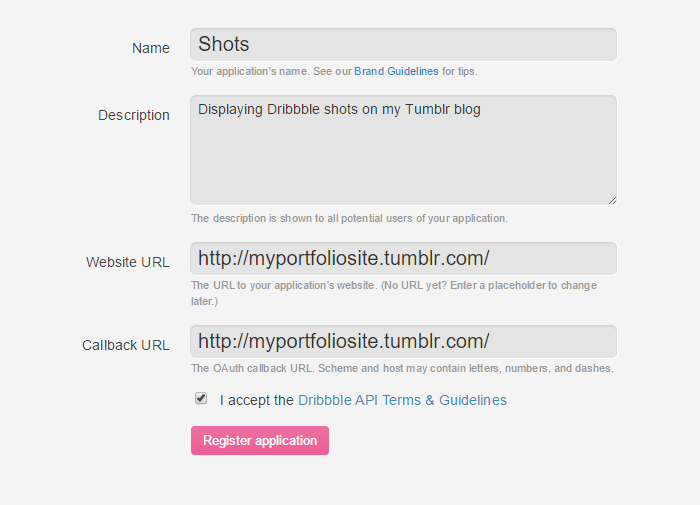
After registering the app, you’ll be presented with a few pieces of info—a Client ID, a Client Secret, and a Client Access Token. Copy the value for your Client Access Token and paste it into the Dribbble Client Access Token field.
Instagram Widget
To display your Instagram pictures you will need a piece of info called an access token. Go to the jQInstaPics homepage and scroll down until you see the Retrieve my details bro! button.
You will be directed to Instagram's authentication page where you will be required to login. Once logged in, you will be redirected back, and your User ID/Access Token will be shown on the page. Some users have reported having trouble with certain browsers, but it should work fine with Chrome. you only need to copy the Access Token info, which should have the following format:
309546888.674061d.879f8f19f2a94b29ad5d9fb7135bb658
Make sure the Enable Footer Instagram Widget option is switched on. Fill in the Instagram Access Token field and set the Instagram Count option to limit the number of images (default is 6). To move the widget from the third column to the second one, check Enable Instagram Widget Alt Location. Use the Instagram Widget Title option to set the widget title.
Image Feeds Alternative Styling
When the Enable Image Feed Alt Styling is checked, all the image feed or photo-streams widgets (Flickr, Dribbble, and Instagram) will be shown using alternative CSS styles: a greater gap between thumbnails and cast shadows.
Twitter Widget
To show your latest tweets, you need to authorize Tumblr to use Twitter on your behalf. Go to the Settings page, select your blog, and scroll down until you see the Share on Twitter button. After authorizing the application Tumblr will be able to read the tweets from your timeline. Use the option Twitter Count to set how many tweets should be displayed (default is 6). Use the Twitter Widget Title option to set the widget title (it will be shown only on mobile devices and small screens).
Color Options
Body
- Body Background
- Main background color.
#f5f5f5 - Body Text
- Text color for body text.
#707070 - Selection Background
- Background color for selected content.
#97a0a8 - Selection Text
- Text color for selected content.
#f5f5f5
Header, Logo, Navigation and Search
- Header Background
- Header background color.
#00c4f5 - Logo Text
- Text color for the text logo when enabled.
#f5f5f5 - Navigation Text
- Text color for the navigation items on normal state.
#f5f5f5 - Navigation Text Hover
- Text color for the navigation items on hover.
#f5f5f5 - Navigation Dropdown Background
- Background color for the navigation dropdown and dropdown links on their normal state.
#f5f5f5 - Navigation Dropdown Background Hover
- Background color for the navigation dropdown links on hover.
#00c4f5 - Navigation Dropdown Text
- Text color for the navigation dropdown links on their normal state.
#707070 - Navigation Dropdown Text Hover
- Text color for the navigation dropdown links on hover.
#f5f5f5 - Navigation Tags Background
- Background color for the navigation tags.
#97a0a8 - Navigation Tags Background Hover
- Background color for the navigation tags on hover.
#00c4f5 - Navigation Tags Text
- Text color for the navigation tags.
#f5f5f5 - Navigation Tags Text Hover
- Text color for the navigation tags on hover.
#f5f5f5 - Mobile Navigation Background
- Background color for the mobile navigation menu.
#f5f5f5 - Mobile Navigation Text
- Text color for the mobile navigation links.
#707070 - Mobile Navigation Text Hover
- Text color for the mobile navigation links on hover.
#a8a8a8 - Searchbox Background
- Background color for the header search box (the color will be dimmed because it has opacity applied.)
#363430 - Searchbox Text
- Text color for the header search box.
#f5f5f5
Homepage Slider
- Slider Background
- Background color for the homepage slider.
#f5f5f5 - Slider Accent
- Homepage slider accent color.
#00c4f5 - Slider Arrows
- Background color for the homepage slider arrows.
#00c4f5 - Slider Controls
- Color for the homepage slider navigation controls (dots).
#bbbbbb - Slider Controls Active
- Color for the homepage slider active navigation control.
#00c4f5 - Slider Heading Background
- Background color for the slider larger headings.
#f5f5f5 - Slider Heading Text
- Text color for the slider larger headings.
#707070 - Slider Subheading Background
- Background color for the slider smaller headings.
#322850 - Slider Subheading Text
- Text color for the slider smaller headings.
#f5f5f5 - Slide [1-5] Heading Background
- Custom background color for the slider headings, set per slide.
#f5f5f5 - Slide [1-5] Heading Text
- Custom text color for the slider headings, set per slide.
#707070 - Slide [1-5] Subheading Background
- Custom background color for the slider sub-headings, set per slide.
#322850 - Slide [1-5] Subheading Text
- Custom text color for the slider sub-headings, set per slide.
#f5f5f5
Portfolio Grid
- Thumbnail Text
- Text color for the Text, Quote, Link, Chat, and Answer post thumbnails.
#f5f5f5 - Thumbnail Title Background
- Background color for the thumbnails titles.
#f5f5f5 - Thumbnail Type Answer
- Color for the Answer posts thumbnails.
#707070 - Thumbnail Type Audio
- Color for the Audio posts thumbnails.
#ff4c4c - Thumbnail Type Chat
- Color for the Chat posts thumbnails.
#ff78b2 - Thumbnail Type Link
- Color for the Link posts thumbnails.
#ff9933 - Thumbnail Type Photo
- Color for the Photo posts thumbnails.
#00c4f5 - Thumbnail Type Quote
- Color for the Quote posts thumbnails.
#0054b4 - Thumbnail Type Text
- Color for the Text posts thumbnails.
#ff6b4b - Thumbnail Type Video
- Color for the Video posts thumbnails.
#af65d7
Pagination
- Pagination Link Background
- Background color for the pagination buttons.
#97a0a8 - Pagination Link Background Hover
- Background color for the pagination buttons on hover.
#00c4f5 - Pagination Link Text
- Text color for the pagination buttons.
#f5f5f5 - Pagination Link Text Hover
- Text color for the pagination buttons on hover.
#f5f5f5 - Pagination Alert Background
- Background color for the pagination message after all posts have been loaded.
#d8e4f0 - Pagination Alert Text
- Text color for the pagination message after all posts have been loaded.
#707070
Footer
- Footer Background
- Background color for the page footer.
#4b4f53 - Footer Accent
- Accent color for the page footer.
#00c4f5 - Footer Title
- Text color for the footer widgets titles.
#a2a3a4 - Footer Text
- Text color for the footer widgets body text.
#a2a3a4 - Footer Emphasized Text
- Text color for the footer emphasized text.
#898a8b - Footer Link Background
- Background color for the footer links.
#4b4f53 - Footer Link Background Hover
- Background color for the footer links on hover.
#44474b - Footer Link Text
- Text color for the footer links.
#00c4f5 - Footer Link Text Hover
- Text color for the footer links on hover.
#0aceff - Footer Link Border
- Border color for the footer links.
#00c4f5 - Footer Link Border Hover
- Border color for the footer links on hover.
#00a3cc - Footer Arrow Background
- Background color for the footer arrows (Twitter ticker).
#4b4f53 - Footer Arrow Background Hover
- Background color for the footer arrows on hover.
#44474b - Footer Copyright Background
- Background color for the footer copyright area.
#373b3e - Footer Copyright Text
- Text color for the footer copyright area.
#707375 - Footer Copyright Link
- Text color for the links on the footer copyright area.
#707375 - Footer Copyright Link Hover
- Text color for the links on the footer copyright area on hover.
#a4a6a8
Permalinks
- Heading Text
- Text color for permalink headings.
#707070 - Link Background
- Background color for the permalink links.
#f5f5f5 - Link Background Hover
- Background color for the permalink links on hover.
#ccf5ff - Link Text
- Text color for the permalink links.
#00c4f5 - Link Text Hover
- Text color for the permalink links on hover.
#00a3cc - Link Border
- Border color for the permalink links.
#00c4f5 - Link Border Hover
- Border color for the permalink links on hover.
#00a3cc - Perma Heading Background Override
- Override permalink headings background color with this value.
#97a0a8 - Perma Heading Text Override
- Override permalink headings text color with this value.
#f5f5f5 - Perma Tumblr Buttons Background
- Background color for the "like" and "reblog" button containers on permalink pages.
#cccccc
Miscellaneous
- Spinner
- Main color for the loading spinner.
#00c4f5 - Disqus Accent
- Disqus accent color, to be used on links inside the Disqus comments thread.
#00c4f5 - Scroll To Top Button Bg
- Background color for the "Scroll to top" button.
#373b3e
Miscellaneous Options
Enable Link Padding On Hover
Switch this off to disable the animated padding when hovering over links.
Enable Scroll To Top Button
Show or hide the Scroll To Top button.
Enable Tumblr Controls Alt Position
If this option is enabled, the Tumblr controls iframe on the top-right corner will be positioned below the header on certain screen sizes and devices, so it doesn't conflict with the navigation.
Disqus Shortname
You need to enter your Disqus Shortname to display the Disqus comment threads and comment counts. When you add a site profile to your account, you get to choose a unique Disqus URL, which will become your site’s “shortname”.
Google Analytics ID
Create a new Google Analytics Property for your website and enter you property Tracking ID to start tracking your stats.
AddThis Profile ID
Enter your profile ID here if you want to track your AddThis stats.
Searchbox Background Opacity
Controls the opacity of the search-box background color. Defaults to 0.2.
Included PSD Files
As described on the Your Custom Logo section, you can use the included logo.psd and logo@2x.psd files to place your logo text into the allocated space. don't forget to trim transparent pixels to the left and right, and to export your logo (standard and retina versions) as PNG images with transparency. You can further optimize your images using a tool such as Optimizilla.
Additionally, we included the PSD files for the sprites with all the icons and graphics use through the site (sprites.psd and sprites@2x.psd). You can alter this files if you need to change the color of the icons or to alter their appearance completely to further customize the theme. Remember to make your changes into both files, export the sprites as PNG images with transparency, and then upload them on the customizer using the image upload fields Sprite and Sprite Hires.
Help and Support
Thank you for choosing our themes!
For help and support regarding any of our themes, please contact us using the form on our ThemeForest profile page, or leave a comment on the theme discussion page.
Assets Credits
The following resources have been used in some way or another on the making of this theme:
Sass
Prepros App
normalize.css
Frameless Grid
Open Sans, Open Sans Condensed, and Dosis.
IcoMoon App
FlexSlider
Cycle2
jFlickrFeed
Jribbble
jQInstaPics
FitVids.js
imagesLoaded
HiSRC
Velocity
Photoset Grid
Spin.js
TouchTouch
imgLiquid
Image Credits
These talented illustrators were kind enough to allow us to display their works on the theme demos:
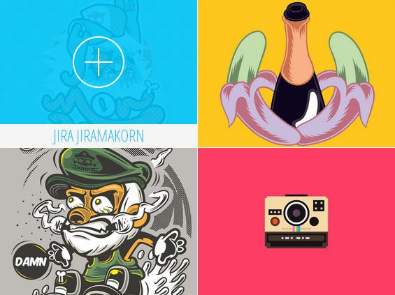
Jira Jiramakorn – http://www.behance.net/JiraJiramakorn
WARHEAD – http://www.behance.net/WARHEAD
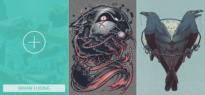
Brian Luong – http://www.behance.net/brianluong
Ignacio Valicenti – http://www.behance.net/idvalicenti
Paul Nolan – http://www.behance.net/pnodesign