Bloq Tumblr Theme Documentation v1.6.0
Introduction
Welcome to Bloq v1.6.0 Tumblr Theme documentation. Bloq is a blocky portfolio theme for designers and creatives. It features two grid layout modes, a filterable color-coded portfolio grid, a touch optimized image slider, dark and light preset skins to get you started, and much more!
Features
Retina Ready
Bloq uses Scalable Vector Graphics (SVG) and pseudo elements to render most of the UI components and icons, ensuring your website looks crisp on all devices, specially on high-density displays.
Homepage Slider
The Homepage Slider allows you to display up to five image slides, each with its custom caption and optional URL. The Homepage, Featured Projects, and Photo-stream Widgets sliders are powered by Swiper, a lightweight touch slider that works great on mobile devices and desktop browsers.
Featured Projects
Since version v1.3.0, Bloq supports Featured Projects. You can feature any post just by adding a special tag to it—featured projects will be displayed above the portfolio grid and optionally wrapped in a touch-friendly content swiper.
Filterable Portfolio Grid
The Portfolio Grid can use two different layout modes, Masonry and Segmented Rows. You can filter the portfolio with Ajax and color-code it with up to nine project categories.
Ajax Post Loading
After the first page worth of posts is shown, you have the option of using regular pagination links, or load the next set of posts with Ajax, replacing the standard pagination with a "load more on click" button.
Endless Scrolling
Since version v1.3.0, Bloq features endless or infinite scrolling. When this option is enabled, the next set of posts will be loaded as soon as you scroll past the end of the portfolio grid, without the need of manual interaction.
Ajaxified Project Expander
You can display your projects on regular permalink pages, or enable Ajax Permalinks, to load the post dynamically above the portfolio grid, without having to navigate away from the homepage.
Collapsible Widget Area
The Widget Area can display your Twitter, Flickr, Dribbble and Instagram feeds, and up to three Text Widgets. On large screens the collapsible widget area lives at the top of the pages, and on smaller displays—most mobile devices—the widgets are relocated to the right aside.
Homepage Hero and Call to Action
You can display Homepage Hero and Call to Action blocks right below the main slider. These widgets accept HTML markup, so you can include links and use bold text and italics.
Supercharged Photosets
Photosets have been reworked so you can choose between the classic stacked-images layout or custom photoset grids. Images can be viewed using Tumblr built-in lightbox or a custom one, and you can enable jQuery Zoom, so large images can be seen at full size when you hover over them.
Image Covers For Text Based Posts
Now text based posts can look just like photo posts on the portfolio grid, by adding a special tag to the post and inserting a cover image on the post description. This feature is available for Text, Quote and Link posts.
Application Recall with Sammy.js
Now the state of the application—currently displayed filter, page and portfolio project—can be managed using the URL hash (#), so you can use your browser back and forward buttons to navigate through the application states, and the page will "remember" the state it was in if you reload it.
Social Icon Links
Links to your favorite social networks are displayed on the site footer. The included services are: 500px, Behance, Blogger, DeviantArt, Dribbble, Email, Etsy, Facebook, Flickr, Forrst, Google Plus, IMDb, Instagram, Lastfm, LinkedIn, MySpace, Picasa, Pinterest, Quora, Rdio, Reddit, Shop, Skype, Society6, SoundCloud, Spotify, StumbleUpon, Twitter, Vimeo, and Youtube. Since version v1.3.0 you can enter your email address and display an email icon as well.
Supported Post Types
Bloq offers support for the following post types: Text, Photo and Photoset, Quote, Link, Chat, Audio and Video. User created pages are also supported.
Tons Of Customization Options
All theme colors can be edited on the customization sidebar, plus there's plenty of typography and layout options, more than enough to adapt the theme to your specific needs.
Even More Features
- Support for user created pages.
- Flexible navigation menu with optional dropdowns and custom navigation links.
- Custom image logo with optional retina version and hover state.
- Optional text based logo.
- Google Web Fonts.
- Support for Disqus commenting system.
- Support for Facebook comments.
- Code Syntax Highlighting on pages and posts captions.
Installation
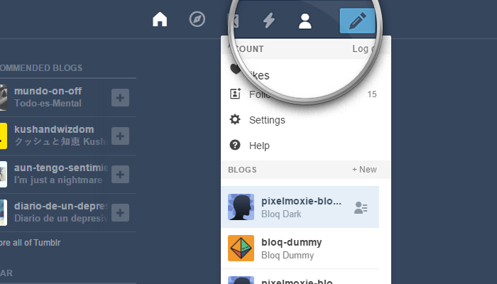
Login to your Tumblr account, and once on your dashboard, click on the Account icon on the top-right corner of the page.
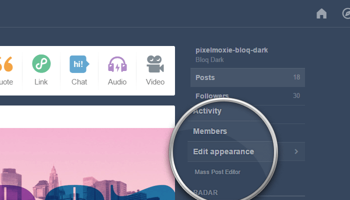
From the drop-down list, select the blog where you want to install the theme, and then click on Edit appearance.
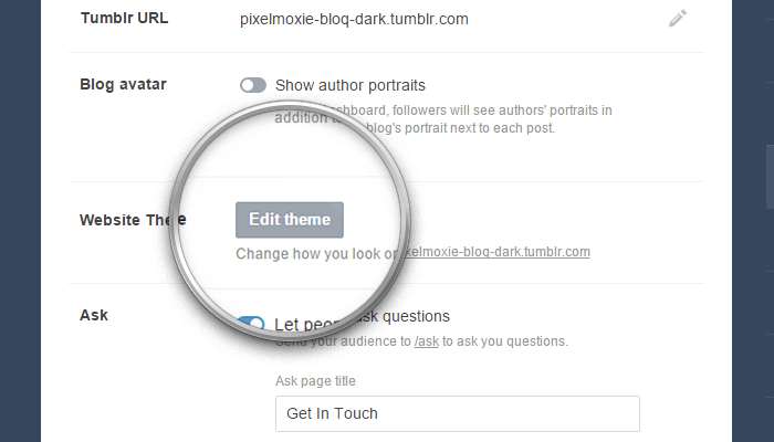
Once on the Settings page, click on the Edit theme button.
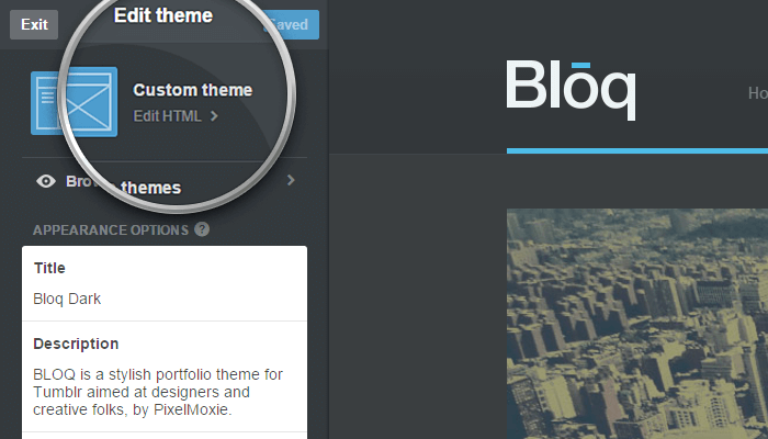
Click on the Edit HTML link, right below the current theme name.
Open the .zip archive you downloaded and locate the file pixelmoxie-bloq-dark-1.5.1.html or pixelmoxie-bloq-light-1.5.1.html inside the theme folder. Open the file with a text editor of your choice.
It's important to install the right file from the beginning, depending on the color scheme of your choice. If you decide to switch skins later, Tumblr will "remember" the old color variable values and the colors won't change; you will have to change each color manually or reinstall the theme from a black slate, losing all your customization configurations in the process. (The only difference between the "dark" and "light" versions of the theme are the color option values.)
Inside the theme/plaintext folder, you’ll find similarly named files with a .txt extension. The contents are exactly the same, but these are plain text files. If you’re having trouble opening the HTML files, use one of these files instead.
If you’re on Windows, Notepad++ is a free and lightweight text editor. If you’re on a Mac and you’re using TextEdit, follow the steps outlined on this article to set up TextEdit to work with HTML files. Or you could download TextWrangler—a no-frills text editor for the Mac—and give it a try.
Copy the contents from the file you just opened and paste it on the HTML editor, replacing the old theme code on its entirety. It’s important that the code looks pretty much as in the image below, or the theme won't install properly; if it doesn’t, your text editor probably parsed the code and what you pasted isn't the raw HTML markup. Make sure your text editor is properly configured to work with HTML files and that the code isn't altered.
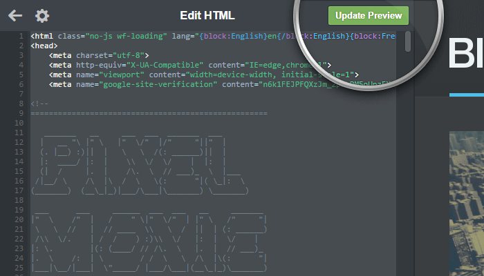
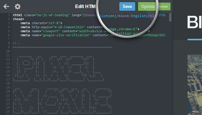
Click on the Update Preview button, and once the preview is updated, click on the Save button and reload the page.
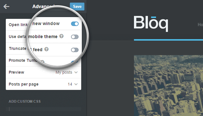
Before you start customizing your theme and populating your portfolio, click on Advanced options at the bottom of the customizer.
Make sure Use default mobile theme is off, or the theme will not be used when viewing your blog on mobile devices. This is also a good time to set the Posts per page. We recommend setting it to the largest value that works visually well with the configuration you've choosen for your portfolio grid.
Congratulations! Your theme is now installed and ready to be customized.
Customization
Background Image
Even though Bloq was designed with a solid color background in mind, you can upload a background image using the Background field, and the image will be tiled and repeated to cover the main site background.
The Page Header
Header Heights
Both header heights, the normal height and the height of the header when it becomes compact once you scroll down the page, are set by the options Header Height and Header Height Compact. Remember that the nomral height should be greater htan the compact height, and values should be entered without units, just digits. The default values are 140 and 100.
Your Custom Logo
Bloq gives you the option to use either an image logo—the default option—or a text logo.
When using the image logo, besides the image for the logo "normal" state, you can upload a different image for the "hover" state, and high resolution (retina) images for both.
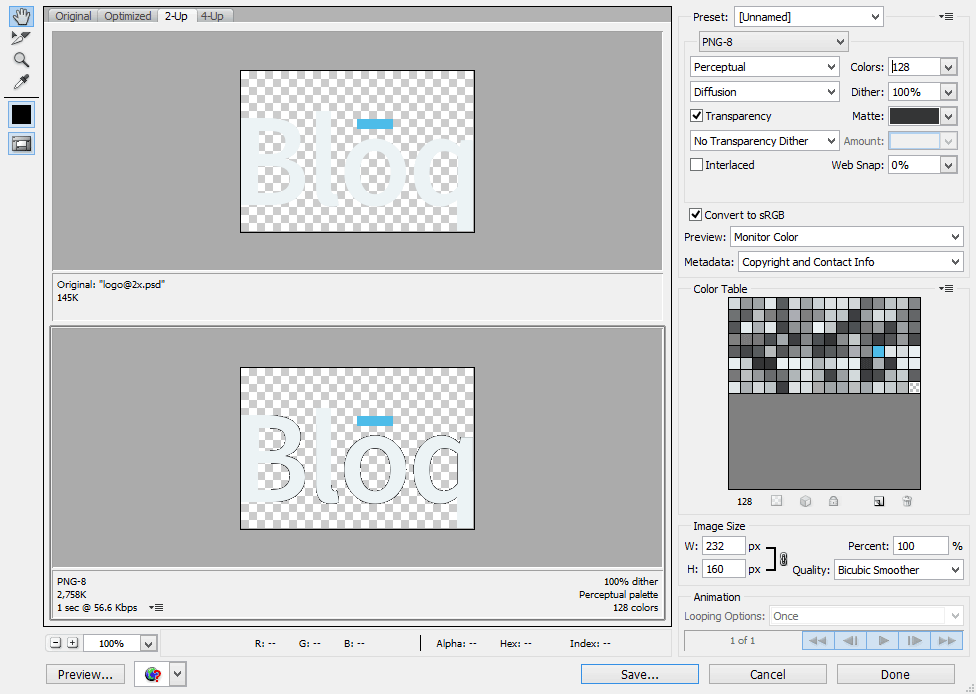
Ideally, your logo images should be PNGs with transparent backgrounds, and no more than 80px tall (so the logo doesn't get clipped when the header becomes small once you scroll down the page). The logo should be aligned to the bottom of your canvas. Width isn't really critical, but make sure the logo isn't too wide and do not leave transparent pixels on the sides. The high resolution (retina) versions of the images should be exactly twice as big as the standard ones.
Depending on your logo, sometimes you may get some weirdness on hover as the "hover" image fades in and the standard image fades out. This really depends on you logo design and font, and most times it isn't noticeable, but if you want to minimize the artifacts, you can export your logo from Photoshop (Save for Web) as a PNG-8 image and match the "Matte" color to your site header background.
To make the process of creating your logo images a little easier, we have included a few logo PSD templates on the "psd" folder with your download. These files are named:
logo.psd
logo@2x.psd
logo-hover.psd
logo-hover@2x.psd
After your images are ready, you should upload them using the following fields on the customization sidebar:
Logo
Logo HiDPI
Logo Hover
Logo Hover HiDPI
To use a text based logo instead, make sure to enable the Use Text Based Logo option. The logo will read as your blog name by default, but you can change that by typing your desired text into the Logo Text option.
The following options will allow you to use a different Google Web Font for your logo. If these are empty, the logo will be rendered using the font you chose for the main body text.
Logo Font Family
Logo Font Weight
Logo Font Size
You can set the colors for you logo on it's normal state and on hover using the color pickers labeled as Logo Text and Logo Text Hover.
Depending on the size of your logo—whether is an image or just text—you may need to adjust the Navigation Left Offset option. This number is the amount of pixels the navigation will be offset from the left edge of the entire header (it's not the margin between the logo and the navigation!) and its default value is 200.
The Navigation Menu
The navigation menu will show links to pages you create on the customization sidebar, as long as you check the option Show a link to this page before you save it. If you check the option Enable Navigation Pages Dropdown, links to your pages will be grouped in a dropdown menu, otherwise they will be shown inline, side-by-side. to learn more about pages in Tumblr, check the Working With Pages section down below.
If you check the option Enable Navigation Tags Dropdown, a second dropdown listing your filter categories will be added to the menu right before the pages dropdown.
for both dropdowns, you can set the label, using the options Pages Dropdown Label and Tags Dropdown Label. The default values are Pages and Tags.
Enable Navigation Home Button will show a Home link at the beginning of the menu. You can also add Random, RSS, and Archive entries to the menu vis the options Enable Navigation Random Button, Enable Navigation RSS Button, and Enable Navigation Archive Button.
You can add up to three custom menu items, which can be link to a page or post permalink URL or to an external resource. The first two custom menu items will be placed before the dropdowns and after the Home button, while the third one will be placed after the dropdowns. To enable these menu entries, use the options Custom Menu Item [1-3] Label and Custom Menu Item [1-3] URL.
The Search Box
The search box visibility is toggled on and off by the icon shown on the header right end. If the option Use Alt Search Icon is enabled, an alternative icon will be used. If you wish to display a text label instead of an icon, enable the option Enable Text Based Search Button. The font family, size and weight of the text based search button are defined by the options:
Searchbox Toggle Font Family Searchbox Toggle Font Weight Searchbox Toggle Font Size
The Search Input Placeholder option sets the placeholder text for the form input and its default value is Search projects by tag.
To disable the search form, uncheck the option Show Search Form.
On smart phones and other devices with smaller screens, the navigation menu and search form are relocated to the left-hand aside.
The Homepage Slider
To display the Homepage Slider the option Enable Homepage Slider need to be switched on, and you need to upload at least one slider image. You can upload up to five images using the fields Slider Image [1-5], set the caption for each one (typing on the fields Slider Caption [1-5]), and make each slide point to a custom URL (Slider URL [1-5]).
To enable "autostart" for the slider, enter the timeout between each slide in milliseconds on the Slider Timeout field. For example, entering 5000 will cause the slider to advance to the next slide every 5 seconds. If you enter 0 or leave this field empty, "autostart" will be disabled.
For the slider to look neat and work smoothly, your images should all have the same size or proportions. The images shown in the demos are 1200 pixels wide by 500 pixels tall.
Use Enable Homepage Slider Loop Mode to toggle loop mode on and off, and Disable Slider Autoplay On Interaction to control if autoplay should be disabled after the user interacts with the slider.
The Portfolio Grid
Thumbnails on the portfolio grid can load the 500 pixels wide version of your images, or a larger version (provided your images are large enough). The option Thumbnails Use Large Images determines which image versions are used. Leave if off if your thumbnail blocks are not too large, and turn it on if the thumbnails are wide, to avoid image pixelation.
If the option Use Wide Thumbnails On Mobile is on, the portfolio blocks will be rectangular on phones, instead of square.
The portfolio grid has two different layout modes: Masonry and Segmented Rows. Masonry is enabled by default; to use the rows layout instead, disable the option Use Masonry Layout.
Masonry Layout
When Masonry is enabled, project thumbnails will be square by default. The size of each block will depend on the Max Number Of Columns option (you can enter a number between 2 and 5).
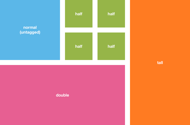
You can use special tags on posts to alter the size of their thumbnails, simply add the necessary tags when creating or editing a post on the dashboard. Posts with the tag double will be rectangular blocks spanning the wide of two square blocks. Posts with the tag half will be square, but half the size of regular blocks. And posts tagged as tall will be vertical rectangles, spanning the height of two regular blocks.
Segmented Rows
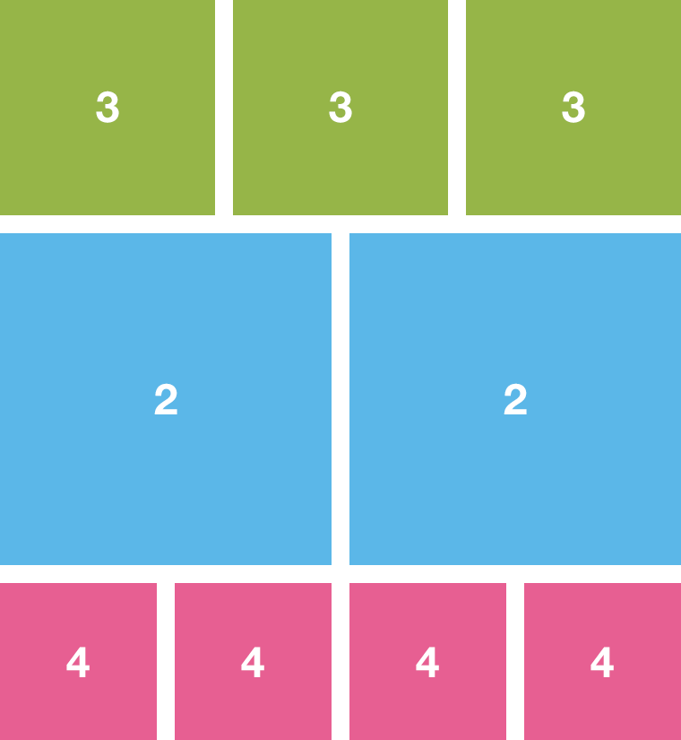
The Segmented Rows layout is similar to the way Tumblr arranges photosets. You don't need to use any special tags on your posts. The layout will be set by the Segmented Rows Layout option. The default value for this option is 32432. Each number determines how many blocks are displayed on a particular row. So if you enter 123, for example, the first row will have a single—and huge!—thumbnail, the second row will have two of them, and the third row will display three blocks. After the last digit, the sequence starts over, until there are no more posts to display.
Portfolio Gutter
Regardless of the layout mode you chose, you can display a gap-less grid, or you can have spacing between the thumbnails. The Gutter option will set the separation between blocks. You can enter something like 15 or 20 to make some room between projects, or 0 to leave no margins (leaving the option empty does this too).
If you enabled the option Add Padding To Grid, you will create some room around all blocks,s o the thumbnails won't "touch" the grid edges. The padding added to the grid will match the value of the Gutter option, but now the space will be added to each side of each thumbnail, thus effectively doubling the separation between thumbs. In this case, you may want to adjust the value of Gutter to compensate, halving it down or making it a tad smaller.
The portfolio grid is transparent by default, but it can have a solid background color and border, if the option Use Transparent Grid is disabled. This option should be used in combination with Add Padding To Grid for best results.
Remember than the number of projects initially shown in the grid depends on the Post per page value you set on the Advanced options section of the customization sidebar.
Hiding Posts From The Grid
Sometimes you may want to hide a particular post from the grid but still be able to access it using the post permalink URL. To accomplish this, simply use the tag hideme when creating or editing a post on the dashboard (prefix the tag with an underscore to hide it from view).
This will only hide the posts visually, meaning that your post will still be accessible through it permalink URL, and it will be shown on the Ajax expander when using the arrows to navigate between projects!
Use this feature sparingly, only on the odd post or two. Hiding lots of posts may confuse your visitors when loading more posts with Ajax, as it may seem that no posts are being loaded when they are, in fact, just hidden from view.
New: Hidden Tags
The new Hidden Tags option in version v1.3.6 allows you to define a set of tags (or just a single one) that will be used to hide certain posts from the portfolio grid.
Posts matching these tags will be hidden from the grid on the index page, but they will be available on the corresponding tag page. If one of these “hidden” tags is also present on the portfolio filter, the posts will be shown when selecting said tag on the filter.
Example use: you want to display a bunch of text posts on a tag page showing all all posts that are tagged “journal” (let’s say that will be your blog), but you don’t want them to show up on the main grid.
The hidden tags should be comma separated and match the actual tags used on the posts exactly. For example:
asks, journal, hide me too
Changing Thumbnail Title Sizes
Each thumbnail on the portfolio grid is assigned a special class according to its width. These classes are attached on page load, and every time the viewport changes size, and they are: .content-tiny, .content-small, .content-medium, .content-large and .content-huge.
The thumbnail title sizes will be different for each one of these classes. If you want to change the text size of the thumbnails titles (sometimes they may be too large for your text), you need to edit the CSS snippet below to fit your needs and paste it into the "Add Custom CSS" box, in the "Advanced options" section of the customization sidebar.
/* Default title sizes */
#portfolio-grid .content-huge .project-title   { font-size: 72px }
#portfolio-grid .content-large .project-title  { font-size: 60px }
#portfolio-grid .content-medium .project-title { font-size: 42px }
#portfolio-grid .content-small .project-title  { font-size: 24px }
#portfolio-grid .content-tiny .project-title   { font-size: 18px }
/* Smaller title sizes */
#portfolio-grid .content-huge .project-title { font-size: 60px }
#portfolio-grid .content-large .project-title { font-size: 42px }
#portfolio-grid .content-medium .project-title { font-size: 36px }
#portfolio-grid .content-small .project-title { font-size: 24px }
#portfolio-grid .content-tiny .project-title { font-size: 18px }You can do the same for the tags/categories shown at the bottom of each thumbnail:
/* Tags font sizes */
#portfolio-grid .content-huge .categories   { font-size: 36px }
#portfolio-grid .content-large .categories  { font-size: 36px }
#portfolio-grid .content-medium .categories { font-size: 30px }
#portfolio-grid .content-small .categories  { font-size: 24px }
#portfolio-grid .content-tiny .categories   { font-size: 18px }
The Portfolio Filter
You can filter your posts with up to nine color-coded project categories. to do so, make sure the option Enable Portfolio Filter is enabled.
To define you filter categories, use the options Category [1-9] Slug. These categories should match the tags you will use on your actual posts to filter them. Make sure you don't use any special characters, only letters and spaces. In older versions of Bloq, you had to separate words with underscores and check a special option if your categories used non-western characters (Greek, Cyrillic, etc.); This is no longer the case since version v1.3.0
To filter your projects, just tag the relevant posts making sure you tag matches one of the entered categories. So when selecting "Graphic Design" from the portfolio filter, for example, all your posts tagged as graphic design will be shown.
To set your category colors, use the color pickers labeled as Category [1-9]. These colors will be applied on the portfolio filter and on the thumbnails overlays.
When on a "tagged" page, the portfolio filter will behave a little different: it won't use Ajax to retrieve the posts, it will reload the page instead with the relevant results.
If you land on a "tagged" with a tag doesn't match any of the portfolio filer categories, the filter will display a custom text that you can define using the option Fallback Filter Label (the default value is Click for More).
The legend the filter displays by default (used when showing all posts) can be set via the option All Categories Label, and its default value is Everything.
Titles For All Post Types
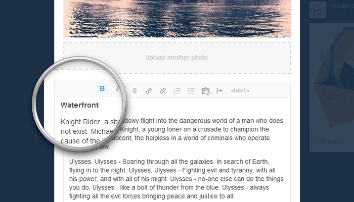
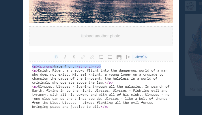
Tumblr doesn't show a dedicated field to enter a title when you create a Photo, Audio or Video post, just an area to enter a caption. In order for these post types to display a title on the homepage grid, we need to fake them.
To do so, simply type the project title at the beginning of your post caption, select the entire paragraph, and make it bold. Keep your titles short and to the point, so they display nicely on the grid thumbnails. You may want to click on the <html> button on the editor to make sure the markup for the title looks alright.
Cover Images For Audio And Video Posts
When embedding YouTube and Vimeo players into a post, Bloq will attempt to retrieve the thumbnail images using these services APIs. However, the fetched images may not look good enough sometimes, and this of course doesn't work when you upload your own video and Tumblr uses its own video player, or when embedding SoundCloud or Spotify players on audio posts.
In these cases, you have to manually insert a cover image right after the fake title on your post caption. Click on the "Insert/Edit Image" icon and enter your image URL. Tumblr doesn't offer you an option to upload an image here, so the image will need to be hosted somewhere else. You could use a service such as imgur, or even throw your images on you public Dropbox folder. If you're out of other options, you can even create a Photo post on your Tumblr dashboard, then grab the image URL (right-click on the image and select "Copy image URL"), and then set the post to private.
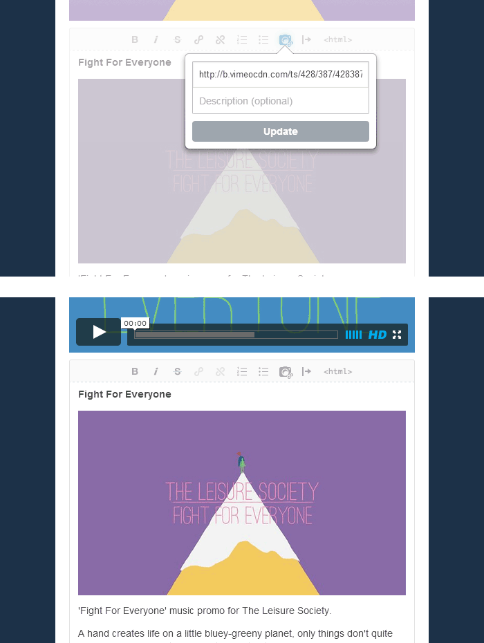
Bloq will use the first image it finds on the post caption as the thumbnail, and hide it when you're viewing the project details.
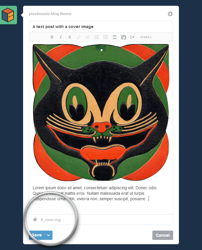
Cover Images For Text Based Posts
Since version v1.3.0, Bloq lets you display Text posts in the same way as Photo post are shown on the grid.
You can enable this feature for all text based posts if you switch on Enable Text Posts Cover Image, but keep in mind that this will affect all Text, Quote, Link, and Answer posts as well, but only if you insert a cover image in the post.
You can also enable this feature on a post-by-post basis by using the tag _cover-img only on selected Text, Quote and Link posts.
For this to work though, you need to insert a cover image, just like we did before for Audio and Video posts. It doesn't matter where in the post description you insert it, it could be at the beginning or at the end of the post—the script will fetch all inserted images, only the first one will be used as the cover and will be hidden when viewing the project permalink page.
If you're displaying a Text post on the grid on the traditional way, sometimes the post may have images inserted on its description, which can be unsightly on the portfolio grid. To hide these images from view on the grid only, select the option Hide Text Posts Images On Grid.
Since version v1.5.1, if you disable the option Hide Cover Image On Permalinks, then the custom cover image won’t be hidden when visiting the post permalink page or displaying it on the expander (text posts only).
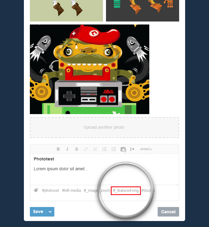
Photosets Featured Images
This new feature can be handy when art-directing your portfolio grid. The cover image for a Photoset always defaults to the first image on the set. Sometimes you may want the thumbnail to be a different image—let’s say you want to crop the image differently, zoom in to a particular detail, or display a different image altogether for whatever reason. Now you can do this for any Photo post containing more than a single image.
You simply need to tag your post as _featured-img, and the last image on the set will be used as a thumbnail, but it will be hidden when viewing the post details on the Ajax expander or on the permalink page.
Please note that this changed with the 1.3.6 version of Bloq. Before, the custom cover would be the first image on the set, but that broke the layout when displaying photoset grids. To avoid this, the theme uses the last image on the photoset as the custom cover image now. Make sure to arrange the last image to span the full width of the set when using this feature to avoid layout inconsistencies.
(and hidden when viewing the post details)
Loading More Posts With Ajax
You can display standard pagination links on the homepage ("Next page", "Previous page"), or you can load the next set of posts with Ajax by clicking on a "Load more posts" button, without having to refresh or navigate away from the page. This behavior is set by the Enable Ajax Post Loading option, and it's enabled by default.
After the next set of posts is loaded, the page will scroll down by an amount of pixels defined by the option Scroll Distance. The default value is 200, but you can just type 0 if you don't want any scrolling to happen.
When the Ajax expander is open, you can navigate through posts using the arrows at the top. There are two ways Ajax post pagination works, Cycle through all posts, and Cycle through visible posts, which can be set using the Ajax Pagination Method select box. When the first method is selected, the arrows will cycle through all your portfolio projects, no matter if they are visible or not. when you select the second option, they will cycle only through the projects that are visible on the portfolio grid at any given time.
To customize the text of the "Load more posts" button on its default state, while the posts are loading, and when there are no more posts to load, modify the options Pagination Load More Label, Pagination Loading Label and Pagination Loading End Label. The default values are: Load More Projects, Loading, Please Wait..., and No More Projects to Load.
While posts are loading, the activity indicator or spinner is shown. The spinner has a semi-transparent background because that makes it easier to tell it apart for the underlaying content. If you wish to hide the spinner background color, unselect the option Show Spinner Background.
Enabling Infinite Scrolling
To enable infinite or endless scrolling, make sure the options Enable Ajax Post Loading and Enable Infinite Scroll are both set. With endless scrolling enabled, the next set of posts will be loaded automatically once you scroll past the portfolio grid bottom end, without the need to click on any button or any manual interaction.
Enabling The Ajax Expander
If the option Enable Ajax Permalinks is enabled, when you click on a project thumbnail, the Ajax expander will open above the grid, and the contents from the project permalink page will be fetched and displayed using Ajax. With this option disabled, you will be taken to the post permalink.
The option Ajax Expander Animation sets the animation style when opening and closing project details. When set to To top the project's contents will slide in from the bottom, and when set to To left they will animate from the right side of the screen.
Limiting The Site Width
The site layout can go as wide as 1440 pixels on large screens. If that's a little too wide for your taste, you can limit the width to 1280 or 1024 pixels, by enabling the options Limit Site Width To 1280px and Limit Site Width To 1024px.
The Project Details
Permalink Layouts
The following concepts apply whether you're viewing the Ajax expander or regular post permalink pages.
Posts that contain media (Photo, Audio and Video posts) have an split layout, one block displaying the media and the other the post caption or description.
The post media is displayed on top of the description by default, spanning the full width of the page.
You can chose to "float" the media to the left or right, enabling a two-column layout. To do so for all posts, set the option Permalink Layout to either Media to the left or Media to the right (the default value is Fullwidth media). Keep in mind that this will affect all Photo, Audio and Video posts.
To enable this column layouts for individual posts, simply use the tags _left-media or _right-media when creating or editing a post on your dashboard.
Pro-tip: you can use Tumblr's Mass Post Editor to add, edit, or remove tags from several posts at once.
The column displaying the post media will be wider than the one with the description by default, spanning about 64% of the page width. If you want the two columns to have equal width, you can enable the option Enable Equal Width Columns.
Supercharged Photosets
Besides the now classic "stacked images" layout for photosets, you can also use custom grid layouts. Photoset grids will mimic the way you arrange your images when you create a Photoset post on your dashboard.
As with most things Bloq, you can enable photoset grids globally for all your posts via the option Enable Photoset Grids, or in a post-by-post basis by adding the _photoset-grid tag to individual posts.
The option Photoset Gutter will set the spacing between each image in the set (leave it empty or type 0 for a gap-less grid).
Images will open on a custom light-box when click, but if you prefer the behavior of Tumblr's native light-box, you can enable the option Use Tumblr Native Lightbox.
jQuery Zoom
If the option Enable Image Zoom is switched on, jQuery Zoom will be enabled for single images and photosets displayed using the "stacked" layout (when Enable Photoset Gridsis turned off). This behavior only applies if the image natural width is greater than the displayed width.
Preventing Image Upscaling
Single images (and images in photosets displayed as image stacks) are styled to span the full width of their container by default. We recommend you upload your images big enough so that they look good at this large sizes (1280 pixels wide or more if you care about retina displays).
There might be cases, however, where you don't have access to such large images, if you're displaying Dribbble shots for example. If your images are stretched way beyond their natural width, pixelation and compression artifacts may become visible.
In these cases, you can use a split layout (by floating the media to the left or right), so the image doesn't span the full width of the page. If that isn't enough to make your images look good, you can enable the option Prevent Image Upscaling. This will prevent images from getting larger than their natural size.
Enabling Comments And Notes
Post notes will be enabled by default, if you wish to hide them, you need to uncheck the option Enable Notes. You can also display Disqus and Facebook comments.
To show the Disqus commenting system, switch Enable Disqus Comments on, and make sure to enter your Disqus Shortname. A shortname is the unique identifier assigned to a Disqus site.
The implementation of Facebook Comments has changed a little bit since version v1.3.6 of the theme. To display Facebook comments, now you will need a little token called a Facebook App ID. To get an application ID, you will need to register with Facebook as a developer (How to create a Facebook Developer account).
After that, you should head over the Developers homepage, and create a new App (Apps > Create a New App). Just enter the name for the App, select a category (don’t worry, you’re not really creating an App), and click on the Create App button. After completing the security step, you will be redirected to your App dashboard. Copy the App ID and paste it into the Facebook App ID field.
Make sure Enable Facebook Comments is switched on, and enter the Facebook Comments Count (default is 10). You can also set the Facebook Widget Color Scheme ("Dark" or "Light").
Notes and comments sections can be displayed stacked one below the other, or they can be wrapped in collapsible panes. To enable these, switch the option Enable Collapsible Panels on.
When the panels enabled, you can choose to show each block as expanded or collapsed when the page or the project details load. You can set these individually: Collapse Notes, Collapse Disqus Comments, and Collapse Facebook Comments.
For these collapsible blocks, you can set the title: Disqus Comments Title and Facebook Comments Title.
Displaying Links As Buttons
On posts descriptions and captions, and on pages you create on the customization sidebar, you can stylize any link to look as a button. after you insrted a link, you need to switch the editor into <html> mode, and add the class "button" to your link, like so:
<p><a class="button" href="https://www.tumblr.com" target="_blank">I Am a Button</a></p>You can also add the classes "dark", "small" and "large" to alter the button size and color.
<p><a class="button small" href="https://www.tumblr.com">Small Button</a></p>
<p><a class="button dark large" href="https://www.tumblr.com">Dark Large Button</a></p>
Typography Classes
Bloq includes some helper typography classes that may come handy when customizing projects descriptions.
Use "align-left", "align-right", and "align-center" to align images to the left or right when wrapping text around them, or to center them.
<img src="path/to/image" class="align-left">
<img src="path/to/image" class="align-right">
<img src="path/to/image" class="align-center">
Use the classes "text-align-left", "text-align-right", and "text-align-center" to align the text inside a paragraph.
<p class="text-align-left">Lorem ipsum dolor sit amet...</p>Use the classes "padded" to add extra padding to an element, "padded-tb" to add extra padding to the top and bottom of the element only, and "padded-sides" to add padding to the left and right sides.
<p class="padded">Lorem ipsum dolor sit amet...</p>
<p class="padded-tb">Lorem ipsum dolor sit amet...</p>
<p class="padded-sides">Lorem ipsum dolor sit amet...</p>
Enabling Code Syntax Highlighting
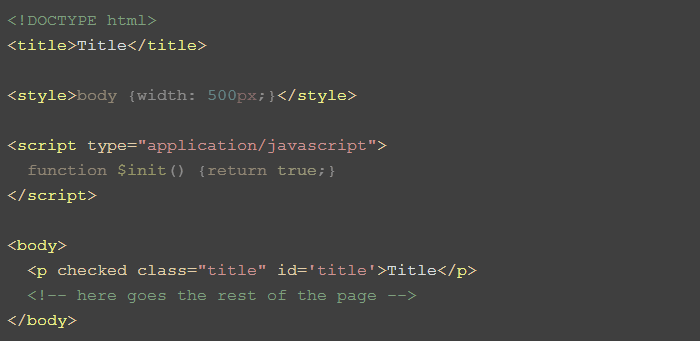
Since version v1.3.0, Bloq supports syntax highlighting for code blocks, if the option Enable Code Syntax Highlighting is switched on.
For it to work, you code needs to be wrapped in proper <pre> and <code> blocks, so you will need to edit your post or page description or caption in <html> mode, and make sure to properly escape your actual code before pasting it into the editor!
So, for example, the following code inside a post caption (HTML with inline CSS and JavaScript)
<pre><code><!DOCTYPE html>
<title>Title</title>
<style>body {width: 500px;}</style>
<script type="application/javascript">
function $init() {return true;}
</script>
<body>
<p checked class="title" id='title'>Title</p>
<!-- here goes the rest of the page -->
</body><br /></code></pre>would produce the following result:
The plugin (highlight.js) will detect the language automatically, but sometimes it will guess wrong. In fact, with short code fragments the probability of an error is high, and in these cases you should assign a class to the <code> element to explicitly set a language:
<pre><code class="language-html">...</code></pre>Supported languages include: Apache, Bash, C#, C++, CSS, CoffeeScript, Diff, HTML, XML, HTTP, Ini, JSON, Java, JavaScript, Makefile, Markdown, Nginx, Objective C, PHP,Perl, Python, Ruby and SQL.
You can also set the Syntax Highlight Style. There are 44 options in total, which can be previewed here.
Dropcaps
Switch on the option Enable Dropcaps to display the first letter of the first paragraph on your post caption/description as a dropcap.
Sometime you may not want dropcaps on all of your posts, or maybe you want them on a paragraph other than the first. In that case, leave the option off, and edit your posts in HTML mode, in order to add the class “dropcaps” to the targeted paragraph, like so:
<p class="dropcaps">Donec nec justo eget... </p>Font Awesome Icons
To enable support for Font Awesome icons—to be used inside buttons or for general use—make sure the option Enable Font Awesome is on. When this option is enabled, the styles for the icons will be loaded from the Bootstrap CDN. The option is disabled by default to avoid loading unnecessary resources.
You could use the icons inside buttons, as inline elements on paragraphs, or as list bullets, for example. Check out the examples on the Font Awesome website (http://fontawesome.io/examples/) to learn about the possibilities. However, we’ve found that Tumblr doesn’t like empty <i> tags, so use <span> tags instead to create the icons if they don’t show up on your site.
The following code shows a spinning loader icon inside a large button, for example:
<p>
    <a class="button dark large" href="#"><span class="fa fa-spinner fa-spin fa-2x" style="vertical-align: middle; margin-right: 0.25em;"></span> Dark Large Button</a>
</p>
Other Options
When using the Ajax expander to display the project details, you can chose to hide the button pointing to the standard post permalink if that makes more sense to you (Hide Permalink Button).
When visiting a project permalink page directly, you can chose to hide the navigation links ("Next post", "Previous post"), by unchecking the option Show Permalink Navigation.
The tags assigned to a post are shown below the project description. You can change this widget title using the option Responsibilities Label (the default value is Our role).
The Widget Area
The collapsible widget area are is available on the right aside on phones and other small-screen devices, and above the site header on wider viewports. To enable or disable the widget area, look for the option Enable Widget Area.
Each one of the available widgets need to be enabled individually:
Enable Twitter Widget
Enable Flickr Widget
Enable Dribbble Widget
Enable Instagram Widget
Enable Text Widget [1-3]
The widgets can be reordered, via the following options. For each option, you should enter a number, and negative values are allowed, so the following are all valid, for example: -10, -5, 0, 5, 10.
Twitter Widget Order
Flickr Widget Order
Dribbble Widget Order
Instagram Widget Order
Text Widget [1-3] Order
Twitter Widget
To display your tweets, you first need to authorize Tumblr to access your Twitter account information. go to the Settings page (the "gear" icon at the top), select your blog from the right sidebar if you have more than one under your account, and click on the Share on Twitter button. You will be asked to "Authorize Tumblr to use your account". Click on Authorize app and you will be taken back to your dashboard. You'll see a Share posts on your Twitter switch—turn this on nly if you want each post you make to be shared on Twitter.
Set the number of tweets that should be displayed with the Twitter Count option. If you enter a value for the Twitter Widget Interval the widget slider will autostart. You should enter a value in milliseconds, e.g: 5000 for a five second interval. Leave it empty or just type 0 to disable autostart.
Flickr Widget
Use idGettr to find your Flickr user or group id. Just enter the address of your photostream or group pool and it'll find the number for you.
Enter your Flickr id into the field Flickr ID. If you're pulling images from a group feed, you need to enable the option Enable Flickr Group Feed. Use the Flickr Count field to limit the number of images shown, and the Flickr Widget Title field to set the widget title.
If you enter a value for the Flickr Widget Interval the widget slider will autostart. You should enter a value in milliseconds, e.g: 5000 for a five second interval. Leave it empty or just type 0 to disable autostart.
Dribbble Widget
Important: Since Bloq v1.4.5, the Dribbble widget uses the new Dribbble API, and all calls to to API must be authenticated. Besides the Dribbble Username, you’ll need to provide a Dribbble Client Access Token, which wasn’t a requirement before.
To register an application, head over to https://dribbble.com/account/applications/new. Fill in all the fields and register the application. You can enter your portfolio URL for both Website URL and Callback URL.
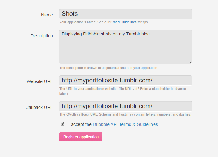
After registering the app, you’ll be presented with a few pieces of info—a Client ID, a Client Secret, and a Client Access Token. Copy the value for your Client Access Token and paste it into the Dribbble Client Access Token field.
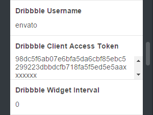
Then to display your Dribbble shots you need to fill in your Dribbble Username. Use the Dribbble Count field to limit the number of images shown, and the Dribbble Widget Title field to set the widget title.
If you enter a value for the Dribbble Widget Interval the widget slider will autostart. You should enter a value in milliseconds, e.g: 5000 for a five second interval. Leave it empty or just type 0 to disable autostart.
Instagram Widget
To display your latest Instagram pics you'll need a little piece of info, something called an Access Token. Go to the jQInstaPics homepage to retrieve your access token. Scroll down the page and click on the Retrieve my details bro! button. Once you authorize the app, you should be taken back to the jQInstaPics homepage and see something like this at the bottom:
Your Access Token is:
309546888.674061d.879f8f19f2a94b29ad5d9fb7135bb658
Paste the entire token into the Instagram Access Token field. Use the Instagram Count field to limit the number of images shown, and the Instagram Widget Title field to set the widget title.
If you enter a value for the Instagram Widget Interval the widget slider will autostart. You should enter a value in milliseconds, e.g: 5000 for a five second interval. Leave it empty or just type 0 to disable autostart.
Text Widgets
You can display up to three text widgets on the widget area. Set their content using the options Text Widget [1-3] Content. Some HTML tags are allowed, you can use <h4> for headings and <p> for paragraphs. The widgets are only about 200 pixels tall, so keep your content short.
Homepage Hero & Call To Action
the Homepage Hero and Call to Action are useful blocks of content you may use to greet your visitors and engage them with your site. You can use some HTML tags in them, such as <strong></strong>, <em></em>, and <a></a> tags to display links. Just make sure the HTML is well formated and all tags are properly closed, or the layout may break.
This is the code we used on the demos, which you could use as an starting point:
<strong>BLOQ</strong> is a stylish portfolio theme—the perfect medium to showcase your work. <a href='http://themeforest.net/user/PixelMoxie?ref=PixelMoxie' target='_blank'>Get it now.</a>Welcome to <strong>BLOQ</strong>. A blocky <a href='http://themeforest.net/user/PixelMoxie?ref=PixelMoxie' target='_blank'>portfolio theme</a> for designers & creatives.You should paste the contents for each block in the fields Homepage Hero Text and Call To Action Text. Make sure the options Show Homepage Hero and Show Call To Action are switched on as well.
Featured Projects
Since version v1.3.0, Bloq gives you the option to display featured projects. Featured projects are just regular posts that you tag with a special tag. They are retrieve with Ajax after the site loads and inserted above the regular portfolio grid, with their own special styling.
Featured projects can flow down the page, stacked one below the other, or they can be shown wrapped inside a touch-friendly slider, powered by the Swiper plugin.
To display the featured projects block make sure the option Enable Featured Posts is on. You can enable or disable the slider by toggling the option Enable Featured Posts Slider. Then simply tag the posts you want to feature with the tag defined by the Featured Tag option (the default value is featured ). The Featured Button Text option lets you set the text shown on the featured posts CTA buttons (View Project by default).
Pro tip: if you don’t want the featured tag to be visible on the posts thumbnails and on the dashboard, you should prefix it with an underscore, i.e.: _featured. Just make sure to update the Featured Tag option as well!
Since version v1.4.0 you can enable autostart for the Featured Posts slider. Look for the option Featured Slider Timeout. The value should be entered in milliseconds—enter 5000 for a five seconds interval between slides, for example. Leave this option empty if you don’t want the slider to autostart. Keep in mind that autostart will be disabled after the user interacts with the slider.
Since version v1.5.1, you can enable loop mode for the featured projects carousel by checking the option Enable Featured Posts Loop Mode.
If you want to limit the number of posts that are retrieved, you can do so via the option Featured Posts Limit. The value should be an integer (3 or 5, for example). If you leave this option empty, up to 20 posts will be retrieved if they match the featured posts tag.
Sometimes the image shown on the portfolio grid for a particular post isn't right when you want the post to be a featured one. It may be too small, or the proportions may be off—or you may want to display a different, better tailored image, but for the featured section only.
To accomplish this, you need to insert an image anywhere on the post description or caption (you can insert it after the fake title or at the very end), then go into <html> mode, and add the class "featured-post-cover" to the image, like so:
<img class="featured-post-cover" src="path/to/the/image" alt="featured post cover">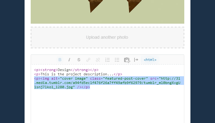
This image will be hidden when viewing the post details, and only be shown on the featured posts section of the homepage.
Hiding Stuff From Tagged Pages
By default, all the content blocks that appear above the portfolio grid will be shown to when you land on a "tagged" page, such as the Homepage Slider, Homepage Hero and Call to Action, and the Featured Projects section.
You can chose to hide these blocks from "tagged" pages selectively using the following options:
Hide Slider On Tagged Pages
Hide Hero On Tagged Pages
Hide CTA On Tagged Pages
Hide Featured Posts On Tagged Pages
Hiding extra stuff on pages other than the first one
Bloq v1.3.6 introduces a new option that lets you hide all this extra stuff (slider, hero, call-to-action, featured posts) on index pages that aren’t the first page. This can be useful if you’re using the standard pagination and want to display some of this elements on the homepage but not on page 2, 3, etc. To enable this behavior, make sure the option Hide Extra Stuff On Nth Pages is enabled.
The Page Footer
The page footer displays your social media icons and the copyright notice and credits. You ca hide the copyright and credits by unchecking the options Show Copyright and Show Credits. To display something else where the theme credits go, type your desired text into the field Credits Text.
To enable the social media icons you have to enter the URL for each service into the fields URL [Service Name]. We have included icons for the following services: 500px, Behance, Blogger, DeviantArt, Dribbble, Email, Etsy, Facebook, Flickr, Forrst, Google Plus, IMDb, Instagram, Lastfm, LinkedIn, MySpace, Picasa, Pinterest, Quora, Rdio, Reddit, Shop, Skype, Society6, SoundCloud, Spotify, StumbleUpon, Twitter, Vimeo, and Youtube.
To display an email icon, enter your email address into the Email field. The icon URL will become: mailto:youremail@email.com.
Google Web Fonts
Bloq comes with a few preset Google Web Fonts options for the main body text. We picked these families based on their design quality and flexibility—the availability of font weights and the support for script subsets.
Look for the Body Text Font dropdown to set the main body font family—it's set to Source Sans Pro by default. Since Source Sans Pro support only the Latin subset, you may want to chose a different one if your blog displays non-western characters, such as Cyrillic and Greek.
These are the font family options and the scripts that they support:
| Font family | Script Subset |
|---|---|
| Source Sans Pro | Latin, Latin Extended |
| Open Sans | Latin, Latin Extended, Cyrillic, Cyrillic Extended, Greek, Greek Extended, Vietnamese |
| Cabin | Latin |
| Lato | Latin |
| Roboto | Latin, Latin Extended, Cyrillic, Cyrillic Extended, Greek, Greek Extended, Vietnamese |
| Ubuntu | Latin, Latin Extended, Cyrillic, Cyrillic Extended, Greek, Greek Extended |
Depending on the font family, you may need to change the font weight for normal and bold text, via the options Normal Text Weight and Bold Text Weight. The default values are 300 and 600 respectively.
These are the font weight supported by each family:
| Font Family | Normal | Bold |
|---|---|---|
| Source Sans Pro | 300, 400 | 600, 700 |
| Open Sans | 300, 400 | 600, 700 |
| Cabin | 400 | 600, 700 |
| Lato | 300, 400 | 700 |
| Roboto | 300, 400 | 700 |
| Ubuntu | 300, 400 | 700 |
You have more control over the fonts display on key elements of the site though. You can specifically set a custom Google Web Font for the text based Logo, Homepage Hero and Call to Action, all site Headings, and for the text based search box toggle. Simply visit the Google Web Fonts repository, pick a font you like, and take note of its name and weight.
In the example below, the font name would be Dosis and the weight, 500.
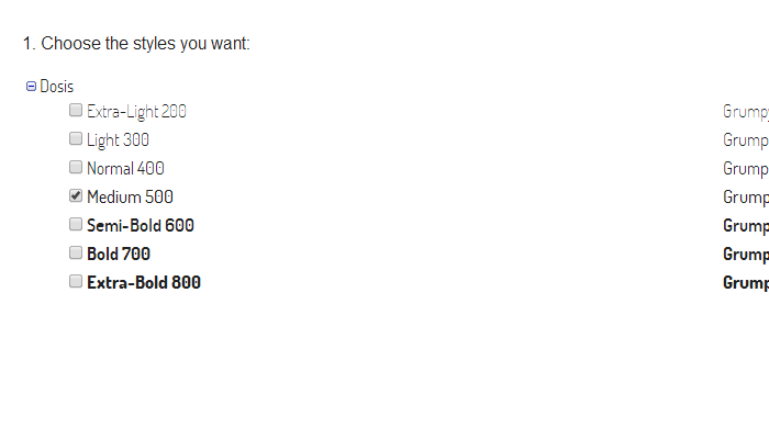
With that info, you can enter the font family and weight for the following fields:
CTA Font Family
CTA Font Weight
Headings Font Family
Headings Font Weight
Logo Font Family
Logo Font Weight
Searchbox Toggle Font Family
Searchbox Toggle Font Weight
Here's a selection of nicely designed Google Web Fonts to get you started:
- Josefin Slab
- Arvo
- Lato
- Abril Fatface
- Ubuntu
- PT Sans
- Droid Sans
- Source Sans Pro
- Cabin
- Gudea
- Rokkitt
- Glegoo
- Asap
- Amaranth
- Armata
- Cutive
- Abel
- Dosis
- Varela
- Quattrocento Sans
Specifying Script Subsets
If you need support for characters not available on the default Latin script subset, you can specify a custom script subset to load.
Some of the fonts in the Google Font Directory support multiple scripts (like Latin and Cyrillic for example). It's extremely important that you pick a font that includes the characters you need in order for the text on your website to display correctly, then specify the correct subset using the Google Fonts Subset select box. The available options are:
Latin (default)
Latin extended
Cyrillic
Cyrillic extended
Greek
Greek extended
Khmer
Vietnamese
MailChimp newsletter signup
Since version v1.6.0 you can display a MailChimp newsletter signup form on the homepage, between the portfolio grid and the footer. Follow the instructions on the MailChimp help center to generate the code for your embed form:
Add a Signup Form to Your Website
Using the form builder, create a Classic form with just a couple of fields—just First Name and Email Address works best with the minimal style of Bloq's form. Leave out the form title and required field indicators as well. Your embed code should look something like this:
Paste your embed code on the Newsletter Signup Code field on the customizer. You can then customize the form colors and the text beside it via the following options:
Newsletter Background
Newsletter Border
Newsletter Button Bg
Newsletter Button Text
Newsletter Error
Newsletter Heading
Newsletter Text

Newsletter Signup Heading
Newsletter Signup Lead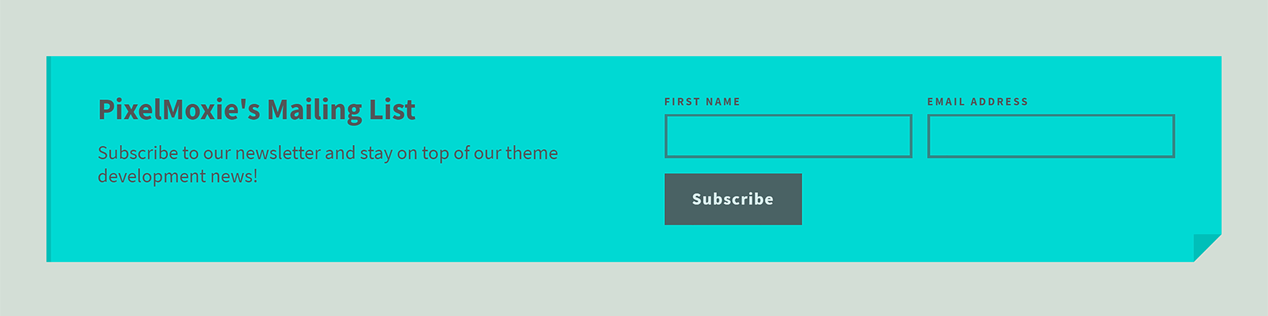
Working With Pages
To add a static page to your site, scroll to the bottom of your customization sidebar and click on the Add a page button.
If you enable Show a link to this page, you can enter a menu label for the page, to be displayed on the header's navigation menu.
Tumblr allows us to create regular pages, where you enter the page title and content as if it was a regular text post, and redirect pages. You can use the later to link to external websites and resources.
To learn more about how to use pages within Tumblr, please read the following article:
http://www.tumblr.com/docs/en/pages
Colors Options
| Variable Name | Description | Dark Skin | Light Skin |
|---|---|---|---|
| Aside Navi Text | Navigation text color on the left aside (mobile) | #61666b | #52585b |
| Aside Navi Text Hover | Navigation text color on the left aside on hover (mobile) | #798086 | #dadcdd |
| Asides Background | Background color for the asides (widget area and sidebars) | #2c2f30 | #afbdb4 |
| Asides Close Buttons | Color for the asides close buttons | #ebf2f4 | #525557 |
| Asides Toggle | Color for the icon that toggles the asides open/close states | #ecf3f5 | #525557 |
| Asides Toggle Hover | Color for the icon that toggles the asides open/close states, on hover | #4ebde9 | #e5454a |
| Body Background | Main body background color | #3a3e40 | #d3ded6 |
| Body Text | Main body text color | #898f94 | #525557 |
| Buttons Background | Background color for main buttons | #8dab36 | #e5454a |
| Buttons Background Hover | Background color for main buttons, on hover | #819b31 | #e0292f |
| Buttons Background Dark | Background color for secondaty (darker) buttons | #52585b | #b9c6bd |
| Buttons Background Dark Hover | Background color for secondaty (darker) buttons, on hover | #5c6366 | #aebcb2 |
| Buttons Text | Text color for main buttons | #ebf2f4 | #eef0f1 |
| Buttons Text Hover | Text color for main buttons, on hover | #f8fbfb | #f9fafa |
| Buttons Text Dark | Text color for secondary (darker) buttons | #b9bfc0 | #525557 |
| Buttons Text Dark Hover | Text color for secondary (darker) buttons, on hover | #c4c8ca | #5e6164 |
| CallToAction Background | Background color for the Call To Action | #9aba3b | #00d9d3 |
| CallToAction Border | Border and corner color for the Call To Action | #819b31 | #00bfb9 |
| CallToAction Text | Call To Action text color | #383c3e | #525557 |
| CallToAction Link | Text color for links inside the Call To Action | #ffffff | #ffffff |
| CallToAction Link Hover | Text color for links inside the Call To Action, on hover | #383c3e | #525557 |
| Category 1 | Portfolio filter category color | #5bb7e8 | #00d9d3 |
| Category 2 | Portfolio filter category color | #96b548 | #ff6161 |
| Category 3 | Portfolio filter category color | #ff7b22 | #ae78ff |
| Category 4 | Portfolio filter category color | #e75f92 | #fb64a5 |
| Category 5 | Portfolio filter category color | #e5d51f | #00d863 |
| Category 6 | Portfolio filter category color | #e85b5b | #e8e84d |
| Category 7 | Portfolio filter category color | #e85b5b | #00d9d3 |
| Category 8 | Portfolio filter category color | #e85b5b | #00d9d3 |
| Category 9 | Portfolio filter category color | #e85b5b | #00d9d3 |
| Close Buttons | Color for the Ajax expander close button and arrrows | #ebf2f4 | #525557 |
| Featured Project Background | Featured Projects background color | #3a3e40 | #c7d2c9 |
| Featured Project Text | Featured Projects text, border and button color | #d0dfe7 | #525557 |
| Featured Slider Control | Color for the Feature Projects Slider controls | #5c6366 | #5c6366 |
| Featured Slider Control Hover | Color for the Feature Projects Slider controls, on hover | #f5f5f5 | #f5f5f5 |
| Featured Slider Control Active | Color for the Feature Projects Slider controls, when active | #4ebde9 | #e5454a |
| Filter Dropdown Background | Portfolio filter dropdown background color | #52585b | #b6c3bb |
| Filter Dropdown Text | Portfolio filter dropdown text color | #b9bfc0 | #525557 |
| Filter Dropdown Item Background | Portfolio filter dropdown item background color | #4b5053 | #abbab0 |
| Filter Dropdown Item Background Hover | Portfolio filter dropdown item background color, on hover | #61686b | #a0b1a6 |
| Filter Dropdown Item Border | Portfolio filter dropdown separation between items | #222425 | #9fafa5 |
| Filter Dropdown Item Text | Portfolio filter dropdown item text color | #b9bfc0 | #525557 |
| Filter Dropdown Item Text Hover | Portfolio filter dropdown item text color, on hover | #ffffff | #ffffff |
| Grid Background | Background color for the portfolio grid (when not transparent) | #35393b | #c4cfc8 |
| Grid Border | Border color for the portfolio grid (when not transparent) | #3f4346 | #b9c6be |
| Grid Overlay | Overlay color for portfolio items that don't match filter categories | #5bb7e8 | #00d9d3 |
| Grid Overlay Text | Text and border color for the thumbnails overlays | #d0dfe7 | #525557 |
| Grid Panel Background | Background color for the text based posts (text, quote, chat, link) | #ff6600 | #5c5f61 |
| Grid Panel Text | Text color for the text based posts (text, quote, chat, link) | #eee4dd | #d3ded6 |
| Grid Panel Accent | Accent color for the text based posts (headings, blockquotes) | #ffd4b8 | #cbd2d6 |
| Grid Panel Link | Text color for links inside text based thumbnails | #ffede0 | #d3ded6 |
| Grid Panel Link Hover | Text color for links inside text based thumbnails, on hover | #ffffff | #ffffff |
| Header Background | Page header background color | #35393b | #c9d4cd |
| Header Border | Page header bottom border color | #4ebde9 | #e5454a |
| Headings | Color for headings (h1, h2, h3, h4, h5, h6) | #d0dfe7 | #525557 |
| Homepage Hero Text | Text color the Homepage Hero | #ebf2f4 | #525557 |
| Homepage Hero Link | Text color for links inside the Homepage Hero | #4ebde9 | #e5454a |
| Homepage Hero Link Hover | Text color for links inside the Homepage Hero, on hover | #ffffff | #3a3c3d |
| Lightbox Caption Background | Background color for the lightbox captions | #111213 | #e3eee5 |
| Lightbox Caption Text | Text color for the lightbox captions | #898F95 | #525557 |
| Lightbox Close Button | Color for the lightbox close button | #ebf2f4 | #525557 |
| Lightbox Overlay | Background color for the lightbox overlay | #161718 | #d3ded6 |
| Links | Links color | #ebf2f4 | #e5454a |
| Links Hover | Links color, on hover | #4ebde9 | #121212 |
| Logo Text | Text color for the text based logo | #4ebde9 | #e5454a |
| Logo Text Hover | Text color for the text based logo, on hover | #ebf2f4 | #121212 |
| Navi Dropdown Background | Navigation dropdowns background color | #2c2e30 | #373a3d |
| Navi Dropdown Background Hover | Navigation dropdowns background color, on hover | #222425 | #2f3133 |
| Navi Dropdown Border | Navigation dropdowns border color | #3a3d40 | #4f5458 |
| Navi Dropdown Text | Navigation dropdowns text color | #61666b | #7e868b |
| Navi Dropdown Text Hover | Navigation dropdowns text color, on hover | #798086 | #999fa3 |
| Navigation Link | Navigation links color | #798086 | #798186 |
| Navigation Link Hover | Navigation links color, on hover | #afb3b6 | #4e5357 |
| Scrollbar Dragger | Color for the widgets scrollbar dragger | #6b7076 | #525557 |
| Scrollbar Dragger Hover | Color for the widgets scrollbar dragger, on hover | #4ebde9 | #e5454a |
| Scrollbar Rail | Color for the widgets scrollbar rail | #222222 | #525557 |
| Search Form Toggle | Color for the icon that toggles the searchbox | #4ebde9 | #e5454a |
| Search Form Toggle Hover | Color for the icon that toggles the searchbox, on hover | #505458 | #505458 |
| Search Input Background | Searchbox input background color | #292b2e | #d3ded6 |
| Search Input Border Focus | Searchbox input border color when focused | #4ebde9 | #e5454a |
| Search Input Text | Searchbox input text color | #65707b | #797c80 |
| Search Input Text Focus | Searchbox input text color, when focused | #ebf2f4 | #222222 |
| Selection Background | Background color for selected text | #2e3538 | #2e3538 |
| Selection Text | Text color for selected text | #f8fbfb | #f8fbfb |
| Slider Arrow | Slider arrow color | #494e50 | #d3ded6 |
| Slider Arrow Background | Slider arrow background color | #4ebde9 | #e5454a |
| Slider Border | Slider bottom border color | #4ebde9 | #e5454a |
| Slider Caption Background | Slider caption background color | #4ebde9 | #e5454a |
| Slider Caption Text | Slider caption text color | #ebf2f4 | #ebf5ed |
| Slider Control | Slider controls color | #4ebde9 | #e5454a |
| Slider Control Hover | Slider controls color, on hover | #ebf2f4 | #ebf2f4 |
| Slider Control Active | Slider controls color, when active | #494e50 | #535c54 |
| Social Links Icons | Social links icon and border color | #6b7076 | #919997 |
| Spinner | Spinner color | #ebf3f5 | #525557 |
| Spinner Background | Spinner background color | #2e3133 | #d3ded6 |
| Twitter Bird | Twitter widget bird icon color | #ffffff | #ffffff |
| Widget Area Toggle | Color for the icon that toggles the top widget area | #4ebde9 | #d3ded6 |
| Widget Area Toggle Hover | Color for the icon that toggles the top widget area, on hover | #ebf2f4 | #e4f0e7 |
| Widget Arrow | Widget arrows color | #c9cccf | #d3ded6 |
| Widget Arrow Background | Widget arrows background color | #2e2e2e | #525557 |
| Widget Background | Widgets background color | #ff6600 | #ff4c52 |
| Widget Text | Widgets text color | #eee4dd | #dfebe2 |
| Widget Link | Text color for links inside widgets | #ffede0 | #f5dcdd |
| Widget Link Hover | Text color for links inside widgets, on hover | #ffffff | #ffffff |
| Widget Title Background | Widget titles background color | #2c2f30 | #afbdb4 |
| Widget Title Text | Widget titles text color | #deeaed | #3a3c3d |
Other Options
- Google Analytics ID
- To enable Google Analytics statistics for your site, enter your google analytics property id into this field.
- Disable URL Hash Params
- If you have enabled loading posts with Ajax, your site URL will be populated with has parameters when certain actions are performed (loading more posts, filtering the portfolio, expanding a post detailed view). This allows the browser to remember the state of the application, so if you reload the page you will land at the same spot you were before. You can enable this option to disable this behaviour if you want cleaner looking URLs, but you will lose the ability to recall the application state.
- Thumbnail Title Max Chars
- Enter the maximum numbers of characters for the thumbnail titles if some of them are too long to fit and you want to trim them down. For example:
30. - Hide Tumblr Controls
- For a better user experience, enable this option to hide the Tumblr controls iframe on desktop and mobile and the Tumblr app button on tablets and phones.
New: Ajax Permalink JS Callback
Since version v1.3.9, Bloq supports calling a JavaScript function after a post has been loaded with Ajax on the homepage.
Since JavaScript code that is present on posts captions or descriptions won’t be executed when loading a post with Ajax, this will let you execute JavaScript code after the fact.
Possible scenario: you embedded a bunch of tweets into the caption of your post. When visiting the post permalink, those embedded tweets will be rendered correctly, but when loading the post with Ajax on the homepage, the tweets will be just plain text blockquotes.
To render the tweets after the post has loaded, you could add the following JavaScript code into the Ajax Permalink JS Callback field:
if ( twttr.widgets ) { twttr.widgets.load(); }That’s exactly what we did to display the embedded tweet on this post.
Please use this option responsibly and only if you know what you’re doing! Otherwise you may end up inserting buggy or malicious code that may break your website.
Support
Support for all out Tumblr themes is provided though the Comments section of the items details page on ThemeForest. You can also reach us thought the contact form in our profile page. We try to answer all inquiries within 24-48 hours.
Keep in mind that the provided support covers resolving issues with the theme and fixing bugs, and maybe very minor customizations made possible by a few lines of CSS, but installation services and custom modifications are not provided free of charge.
If you want to request a custom job, send us an email to check pricing and availability first.
Credits
Isotope - An exquisite jQuery plugin for magical layouts.
Swiper - Mobile touch slider with hardware accelerated transitions.
jQuery custom content scroller - Custom scrollbar plugin.
Jflickrfeed - A jQuery Flickr feed plugin.
Jribbble - A jQuery plugin for fetching shots from the Dribbble API.
jQInstaPics - Showcase your Instagram photos using jQuery.
FitVids.js - A lightweight, easy-to-use jQuery plugin for fluid width video embeds.
ImagesLoaded - Detect when images have been loaded.
jQuery Superfish - Dropdown menu plugin.
HiSRC - A simple jQuery plugin for adaptive images in responsive web design.
Simple Effects For Drop-down Lists - A jQuery plugin for transforming select inputs into drop-down lists.
Spin.js - Dynamically created spinning activity indicator.
Image Lightbox - Responsive and touch-friendly.
jQuery Zoom - A plugin to enlarge images on mouseover.